HOME | DD
 marc2o — AppsIndex crate icon
by-sa
Published: 2011-09-03 15:14:36 +0000 UTC; Views: 3653; Favourites: 25; Downloads: 671
Redirect to original
Description
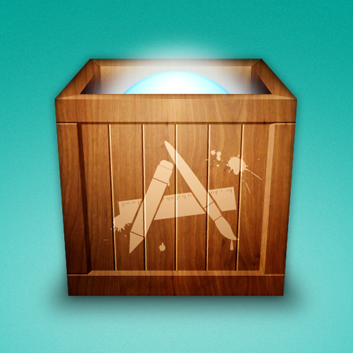
Yes, it’s a crate icon. I originally made this one by request for ~BlindSoul10 and his OS X application package.Related content
Comments: 12

Thanks for your hint! My understanding was that it is rather a bundle of freeware apps and shareware trial versions. But I will check that closely. For the time being I removed the website link from the description.
👍: 0 ⏩: 0

For all interested here: v2.0 has been released yesterday! [link]
Thank you!
👍: 0 ⏩: 0

don't be directing people to a "under construction" site.
👍: 0 ⏩: 2

We're now working on the new website, Please don't blame him.
👍: 0 ⏩: 0

Well, since it is not my website I have no influence on that. But I’m pretty sure, the site will soon be up again.
👍: 0 ⏩: 0

couple things. Not sure I like the paint splatter. doesn't quite fit. If you gonna do that make the whole logo an industrial spraypaint color. (like black or orange). Next, I would be willing to bet this is your first 3d wood icon. When you switch from a front to a top, you need to switch texture. Take you texture then using the perspective transform, make it fit the top. I can plainly see that the insides and top parts share the same texture as the rest.
Sorry if that was confusing, hard to say in words.
Overall, looks very good, and you did a good job!
👍: 0 ⏩: 1

Thanks for your elaborate comment. :c) You’re right, I didn’t switch or rotate the texture, nor did I use perspective transform. It is not my first 3d wood icon, though. Well, pseudo-3d, as I’m doing my icons in Illustrator, mostly without any of the 3d-related functions. This texture-thing I did intentionally, so to speak. Because at the smaller sizes, icons are usually used, you don’t actually see the texture. The spray paint color is a matter of taste, I think, although you're right, that crates usually aren’t sprayed beige. I tried black at first but didn’t like it at all. — But I’m really glad to hear that you seem to like the icon after all. :c)
👍: 0 ⏩: 1

Your correct about the small size thing, but I scaled it to 128x128 and could still tell. And true about the matter of taste.
👍: 0 ⏩: 0

Thank-you. :c) Yes, I’m planning to add the download once the app package is available.
👍: 0 ⏩: 1


