HOME | DD
 MarchiMArrow — Reverse Falls pg 3

Published: 2019-05-25 11:10:00 +0000 UTC; Views: 1391; Favourites: 21; Downloads: 0
Redirect to original
Description
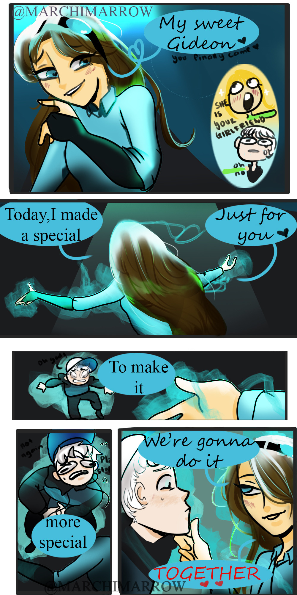
So far so good.Previous page : www.deviantart.com/marchimarro…
Next page: www.deviantart.com/marchimarro…
First page: www.deviantart.com/marchimarro…
Related content


Comments: 6

Hello, I'm from ProjectComment
Well this is a rather interesting comic you have going on here. The art in them looks great. I like the shading of the characters and how they pop out from the background characters, such as the butler who is looking over them. I do like how you blurred the TV in the background of the third panel, and have the character- the one narrating I suppose- looking in on them on the TV. The pose looks great, and the expressions look rather nice on them.
There is just one slight problem… the boxes are all too crowded for us to really see what’s going on in them. The first one is okay, and you can get away with it, but the dialogue boxes they go over the entire art. Not sure why you didn’t draw these in a bigger panel, or shrink the character art down a bit so we could fully see them without being covered up by words. The best solution I would say is to plan out your boxes, making sure there is room for the dialogue and the art as well. This especially fits well with the bottom one which is too crowded- I’m not sure what order to read “$399?!!” in, as it overlaps both panels 3 and 4.
Overall though the panel boxes are nice. We can follow them from the first one to the last one- there’s good enough room in the gutter to suggest time passing by- so it’s not confusing to read. The expressions on the characters look great, and we get a sense of what they’re feeling in those particular panels, and they don’t look too stiff, until you get to the green shirted character in panel 3.
Keep up the good work.

👍: 0 ⏩: 0

Hello, I’m here as a part of Big Comment Contest!
Reverse Falls, huh? Could that be a reference to Gravity Falls I hear?
Pros:
The butler looks especially “butlery” lol.
I like how you use a slightly darker shade of the characters skin color to draw the outline when a character is over lapping themselves (the head is over the neck, arm over arm, etc.). I’ve seen this done before, and I’m a fan of it, so I’ll hope you’ll continue to do that (though, certainly not for my sake)!
Issues:
I think someone pointed out that the shading is somewhat lacking, so I’ll leave that point. What I will mention is the read noses on the girls. Are they supposed to be sick, or drunk or something? Like, the rosy cheeks on the girl in the second panel are fine, but in the first panel she looks like she hit the sauce a bit hard here
I’ll admit I can be a bit OCD, so this may not bother most people, but when I enlarged your image, I noticed that the words in the first panel were not centered. The other ones are fine!
I hope this is helpful and not too harsh
👍: 0 ⏩: 0

I see a few problems in the art hear.
One is that shading is to weak. Even in light their would be more.
And second Dipper's nose looks undefined in the first pannl. I have this problem too at times.
But over all I like the art hear.
It's charming. Thought I don't know why.
👍: 0 ⏩: 0

I'm not really a fan of the original Gravity Falls, but this is getting interesting.
")
👍: 0 ⏩: 0

