HOME | DD
 MarcWeiz — Portrait of a Finnish Family
Published: 2010-12-28 14:47:14 +0000 UTC; Views: 1833; Favourites: 42; Downloads: 46
Redirect to original
Description
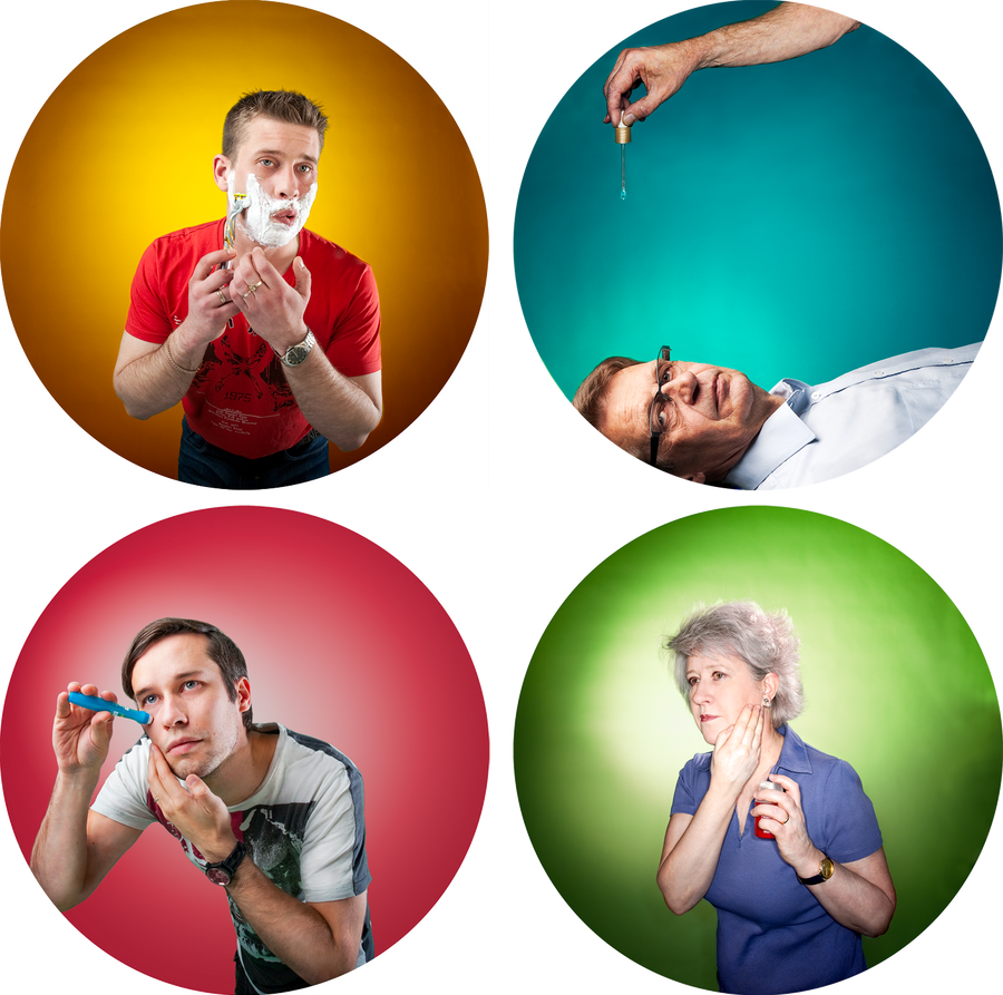
Portrait of a Finnish Family. Finland, 2010.Part of an exhibition titled 'Kestämä' (an old Finnish word, which translates roughly to 'the present tense'), which examined time through the works of several artists.
I approached the concept through generations in a Family while also linking the imaginary to the cosmetics world, which is very age centric (or could be said very age-prevention centric). The result, a series of four photographs finished in an acrylic, glossy board 70cm * 70cm in size (so please take a closer look).
The individual photographs, with lots of details, can be seen here:
Related content


Comments: 16

Overall

Vision
Originality
Technique
Impact
starting yellow:
-the yellow color is too dark to be yellow, and there for looks brown and stands out in a bad way amongst the others.
-the top left of his forehead is blown out from a flash it looks like, harsh lighting either needs to be corrected in real life or in whatever you are using to edit these images.
-there is banding almost like wrinkled paper in the top and on the sides of the circle.
next blue:
-i don't know why you turned it side ways, it doesn't look right side ways, it would have worked if at least one other was sideways to make it fit in, instead of stand out to such a large degree. if it were me i would have turned all of them a bit askew from a normal view instead of one being unbalanced. just under the hand the circular gradient of the lighting is incorrect.
next green:
- this ones gradient is so uneven, if you compare it to the red it failed in terms of technique.
-the banding is also completely garish in this one, it looks winkled or blurred out or something.
-the tones at the top and bottom are so different its almost like two different colors, unlike any of the other circles.
- the face is completely blown out making it look like a terrible use of flash, her skin lost detail from it, and because of the super whites your lighting isn't circular its horizontal, and that changes the balance within the circle, and its also weighted more on the left side, wih nothing to even it out on the right side.
over all the concept was alot different than many i have seen. but since i couldn't tell the significance of what they are doing, it didn't mean much to me, seeing as i have never seen a guy apply anything like the red circle is applying, and its very similar to the mothers actions, when they should all be doing something different.
👍: 0 ⏩: 2

Btw, you didn't mention whether you enjoyed the piece or not?
👍: 0 ⏩: 1
i appreciate the effort. and i like the idea.
👍: 0 ⏩: 1
Kind thanks for giving your opinion.
👍: 0 ⏩: 0
Hi and thank you a lot for taking the time to give critique.
I'd like to give a few comments on the points given.
On "yellow" & "green":
- The head / faces actually aren't blown out, there's plenty of tones left in all parts of the images. Maybe it's your screen?
On all:
- There were no gradients used at all, just lightning in the studio. That's why the background isn't even (and thankfully, it wasn't supposed to be either)
- on the banding, you're right, but I'm not sure do you mean a) the line on the circles edge or the wrinkled parts inside the image. The real versions were for cut-out models and these were made fast as PNG's with the magic wand as a selection tool. It clearly left some disturbances on the sides, which I was too lazy to correct purely for on-screen display purposes. The wrinkles inside the images were due to use of uneven background paper in studio (my choice  (Smile)")
On other parts, I honor your perspective though I rate the images much higher.
Thank you again for your comment!
👍: 0 ⏩: 0

This is fantastic, I love it! The quality of the photos alone is very good, and the design makes it even better.

👍: 0 ⏩: 1

nice portrait, congratulations for your photo gallery.
👍: 0 ⏩: 1

I just read the critique but since I"m not a premium members I can't comment on it, but I will comment on it here.
I think that the critique is hugely unfair, and just frankly bashes your work. I think this is an amazingly eye catching piece of art, and that you did a great job capturing these moments. I think that the critiquer needs to keep in mind that there are no rules about art. If a gradient isn't perfect, or if one of the pictures is at a different angle than the others, then that isn't WRONG, it's simply ART. That's the beauty of art, that there are no rules, and that the composition of the piece is entirely up to the artist. Maybe some won't like it, but most people will appreciate it for what it is.
I think here are some very interesting ideas, and I think you did them really well! The colors are so eye catching, and I love the way the gradients aren't even because it makes the photos seem more real, and less 'staged.' I also don't think you mis used the flash.
Commendable work and commendable effort!!
👍: 0 ⏩: 1
All I can say is my deepest thank you!!
I didn't agree with many of the mentioned critiques points, as the basis for it was something that the works were not meant to be in the first point and there were also some quite wrong observations on the technique and used techniques. But I thought that an opinion is an opinion and one has to take the good with the bad.
But again, thank you! And have a great 2011.
👍: 0 ⏩: 1
You're very welcome
You also have a great 2011!!
~Bella
👍: 0 ⏩: 0


