HOME | DD
 MarcWeiz — Vile 2
Published: 2010-05-04 17:34:13 +0000 UTC; Views: 935; Favourites: 20; Downloads: 0
Redirect to original
Description
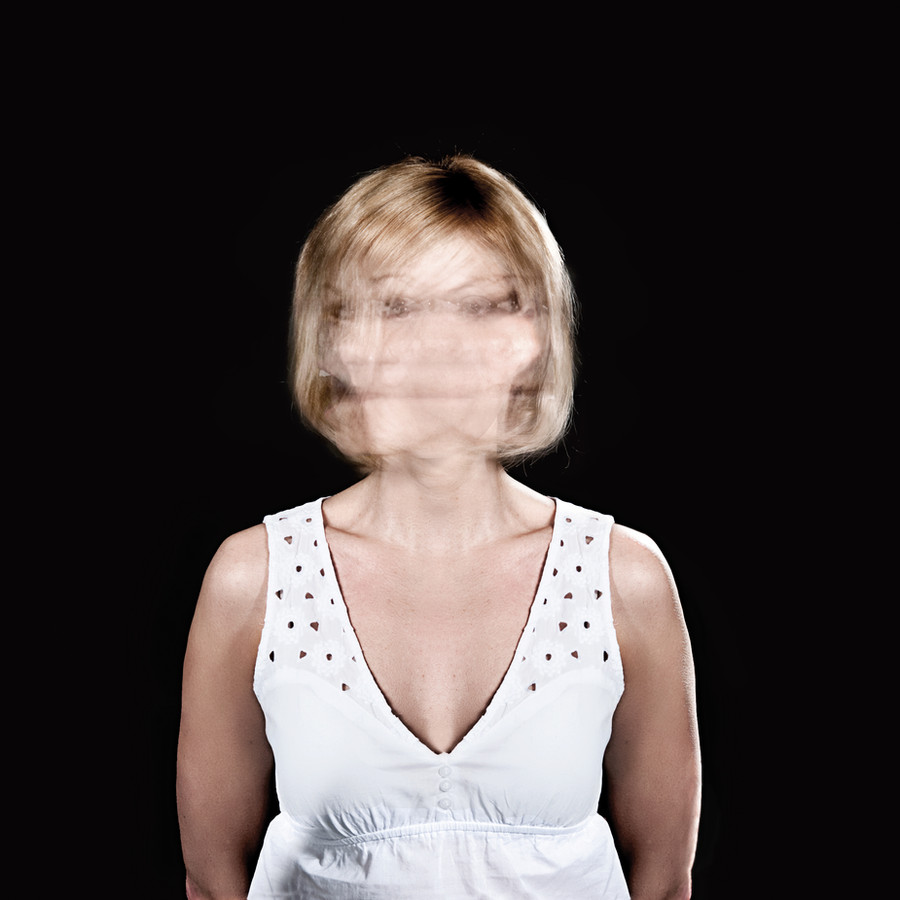
2010. Photograph for a band named Under Halo - Vile (EP) cover.Concept & Photography: me
Edit: E. Lipiäinen, see more at [link]
The photograph set for the front and back cover design, you can see here (full view makes a difference):
See also the finished cover, back cover and the mid-element for the full experience:
Related content


Comments: 10


An interesting piece?
When I first laid eyes on this the face seemed to be moving!
It was kind of weired I won't say scarey because I do not scare, but it made me look again.
I think it is a very unique picture, would like to see how effective it would be in black and white though.
I'm intrigued and would like to hear the sound that inspired this.
I think that it would be suitable for a very deep sound almost disturbing so something that would depict torment of the mind?
I love it because it actually makes me want to look again and again so for an ep cover it will draw attention to the public ey.
I often buy stuff because the cover looks good and not been dissapointed, although as I say Black and White would be really good with perhaps a hint of one contrasting colour!
Otherwise a great piece, an eye catcher to say the least.a.deviantart.net/avatars/x/p/x… " alt=" " title="Xpose-it"/>
👍: 0 ⏩: 0

Ha that's a good original idea love how the rest of the body is in focus, so sharp aswell. Good job!
👍: 0 ⏩: 1

Hey nice. Looks exactly the same like the "Meds" Album by Placebo. Don't believe me?
Assure yourself of it: [link]
I like it, when photographer have own ideas -.-
👍: 0 ⏩: 1

Well do I know it... We brainstormed ideas on what the cover should be, and all thought that this was by far the best angle (the three pics combined, the front -cover, middle and back -cover) to the theme of the album. And then after a day or two, the cover designer sent us a link that btw sh&%t, placebo had exactly same type of cover a while back...
After thinking about it, I and we (me + the band and designer) came back to one of the core thoughts I have... 'Everything has already been done // if you haven't seen it, it just means you haven't looked hard or wide enough'. Plus, I thought, that at least the concept is different in so that you cannot understand it, unless you see all three pics... But somebody has probably had that idea already too.
But hey, if you compare my pic to that taken by Nadav Kander, I cannot but take it as a compliment.  (Wink)")
👍: 0 ⏩: 0

great work .. does it work with 1 hand in the shot shaking . .
👍: 0 ⏩: 1
Thank you. It hardly even worked with just the model moving...  (Smile)")
👍: 0 ⏩: 1
brilliant stuff . . good luck with your work and above all have fun.
👍: 0 ⏩: 0
