HOME | DD
 markerguru — its devastating

Published: 2008-08-31 23:52:58 +0000 UTC; Views: 54209; Favourites: 730; Downloads: 561
Redirect to original
Description
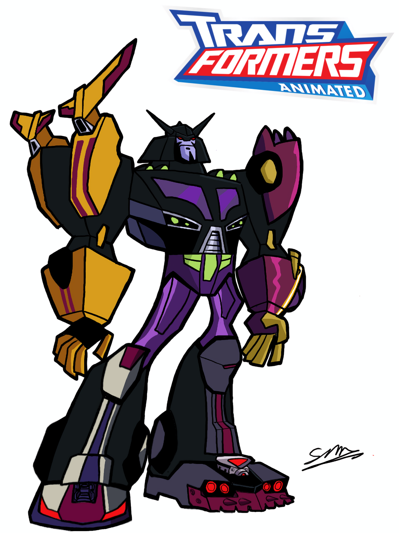
ok, this is the last pic for a bitit be devastator.
i would have had him done sooner, but i was searching for the best paper to match him.
on a side note, putting the white in is hard on this paper. i had to go over it a lot and i'm still not 100% with it.
Related content


Comments: 100

👍: 0 ⏩: 0

")

Devastator is my favorite combiner for being the first, the others are also cool, but this guy was the first, the original!!! You´re not just a marker guru, you´re a paper guru, a robot guru, and a gel pen guru hehehe!!! Great stuff you got here!!!
👍: 0 ⏩: 1

Devastator has always been my favorite Transformer and this does him justices in spades. Awesome job!
👍: 0 ⏩: 0

What kind of coloured paper is this - I thought it was just plain construction paper, no?
nice touch with the destruction in the background lol
👍: 0 ⏩: 1

no, most of it is canson paper, but some is another kind of art paper. but its a lot more durable then construction paper.
👍: 0 ⏩: 1
ah - that would expain why you were having trouble with the whites ^_^
👍: 0 ⏩: 0

Now THAT is the Devastator that we all know and love!
👍: 0 ⏩: 0

I like how you put the destroyed building in the back thus the transformer's name
👍: 0 ⏩: 0


I dont understand why half the time Devastator has eyes and the other half he has a visor
👍: 0 ⏩: 1
it depends on if you want to draw the cartoon devastator, or the manga/toy devastator.
👍: 0 ⏩: 0


Marvellous, I love this one to, well it's just perfect still like this.
👍: 0 ⏩: 0


I think you're just having waaaay too much fun now.  (Smile)")
👍: 0 ⏩: 0

what kind of white are you using? I use one i got at the japanese book store here that goes on really well, it's a white gel pen.
anyway. he look AWESOME~ love it!
👍: 0 ⏩: 0

Very good work my friend.As a hyper-detail enthusiast, i can appriciate the all the detail more than most. Love the background, awesome.
👍: 0 ⏩: 0


I would love to see more like these if possible!
👍: 0 ⏩: 0

Dude, totaly amazing as always. Your style is really slick. Will you marry me. lmao Ok, that was just retarded.
👍: 0 ⏩: 1

You can never have enough DEVASTATOR.
interesting.
I'm liking the art on colored paper.
Here's to hoping for a Shockwave on Purple Paper
👍: 0 ⏩: 1
hmmm that must be a hint of things to come
👍: 0 ⏩: 0

what type of paper are you using. And are you using white India ink. I've personally had good result on many papers using D.r Ph Martins inks.
Oh back on topic.. love the perspective in this it's something Ive been trying to work on myself. Way back when I used to think that perspective drawing only had a place in cityscapes not so since try my hand a mechanical and Mechanika drawing.
👍: 0 ⏩: 2
i'm using canson paper, and a few different types of paint markers. its quicker and i don't have to worry about any of the color running out like a brush would. but i have a deleter white ink that works very well also.
👍: 0 ⏩: 1
I was reading Doug Chiang's book Mechanika - Creating the art of science fiction. One of t he tools he uses before taking his image to Photoshop for some tweaking is white india ink for hi lights. Thats the only reason why I suggested that particular brand of ink.. If found that on regular copy paper it works great, even better results on Bristol. But I guess it's like my Mentor says... Different types of media require different "receivers" : as he calls them. You're a little more advanced than I. I haven't been drawing since .. well since I quit art school 15 years ago. so I'm a little behind the curve. anyway im blabbering on...
keep doing what your doing. looks great.
👍: 0 ⏩: 0
LOL disregard what I said about the ink. Just looked at your gallery and I have no place to offer suggestions on anything. Your work is crazy beautiful.
👍: 0 ⏩: 0


Something about the pose makes him look a bit squashed, probably due to not being able to see his abdomen below his chest, but seeing his hips directly 'attached' instead. Perhaps also because the upper leg is rather short and wide rather than long. Not sure if the whites around the one fist help more than they distract.
Overall nice work though, detailing and shading is good; especially liking the shovel and background in that regards.
Given that you said you had some problems with getting the white to be white enough on this paper, what other problems have you encountered when colouring on coloured paper? Are there a lot of differences between working on different colours?
👍: 0 ⏩: 0


The white was a great touch. I recently learned that a little white paint pen can make a world of difference.
Also, this may be nitpicking, but does Devastator really smile? I really love the drawing though.
👍: 0 ⏩: 1
i'm sure he can if he be lovin the havoc he's causin. he probably stepped on a few people and likes the sound they made when he crushed them.
👍: 0 ⏩: 1
I'll accept that. I probably would too.
👍: 0 ⏩: 0


this shade of green dosen't suit him but he still looks good
👍: 0 ⏩: 1
the paper color is exact to the cartoon reference i have of him. i took it around when shopping for the paper. so maybe on screen its off, but up close its dead on.
👍: 0 ⏩: 1
well i have the visual works book and the generation guide book which would disagree with you. as i put the paper right up to the images in the book. so i do think so.
👍: 0 ⏩: 0

Awsome! One of my favourite characters, excellent job, another 
👍: 0 ⏩: 0

Another fantastic job from you and the white colour came out really well.
👍: 0 ⏩: 0

and japanese manga version head aswell.
👍: 0 ⏩: 1
| Next =>