HOME | DD
 MarkHRoberts — Conan remix

Published: 2012-07-26 15:52:24 +0000 UTC; Views: 5663; Favourites: 137; Downloads: 135
Redirect to original
Description
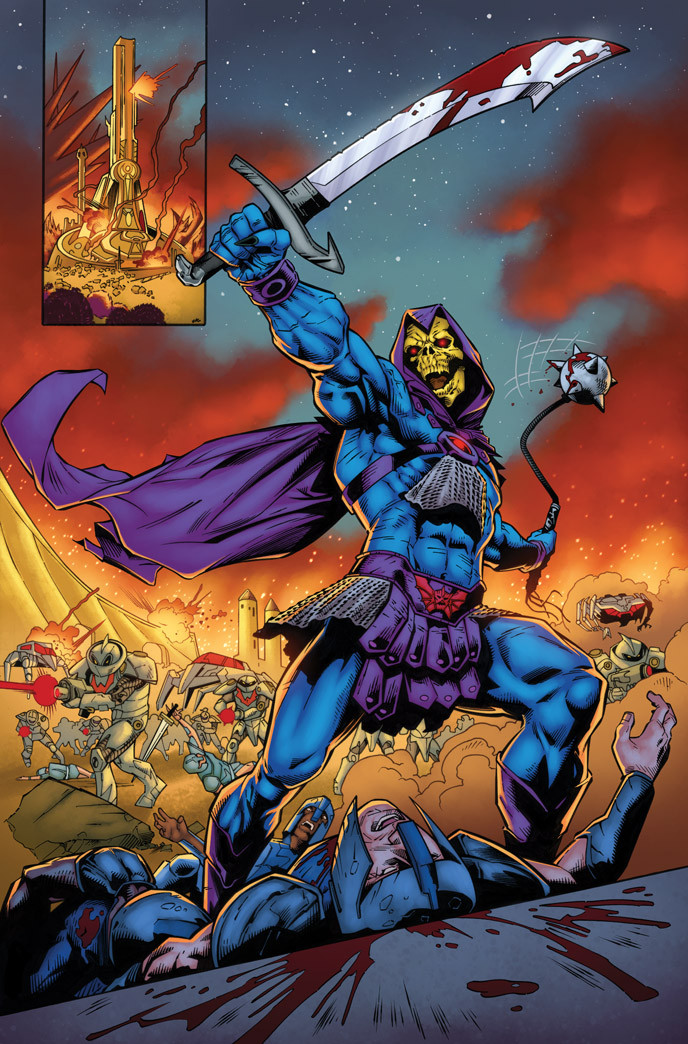
This is a slightly different version of the Conan piece from yesterday. I altered the color scheme to be a bit cooler all around. Normally I can make a decision and stick by it but for some reason I'm having trouble making a choice here. The first version is how I envisioned it when I first saw the line-art but I kinda like the melancholy feel from this one. I dunno. What do you think?Lines by Bart Sears.
Colors by me.
Related content


Comments: 14


You're welcome, my friend! All the best...
👍: 0 ⏩: 0

You overexpose sholuders on perpous or by accident?
Either way its realu, realu great. If i hade one % of Your talent i would be heapy
 (Smile)")
👍: 0 ⏩: 1

I went over the head and shoulders with a brush on an overlay layer to help brighten the area and drawn attention to Conan.
👍: 0 ⏩: 1
I have almost no idea waht are You wrighting abut, but i understand that You wanted it
But,since You making other version i allow myself to give a sugestion (i hope You dont mind). Try "cut down" shoulder muscle, like along arch of the triceps. I think that this huge arms will still drawn atention
👍: 0 ⏩: 0