HOME | DD
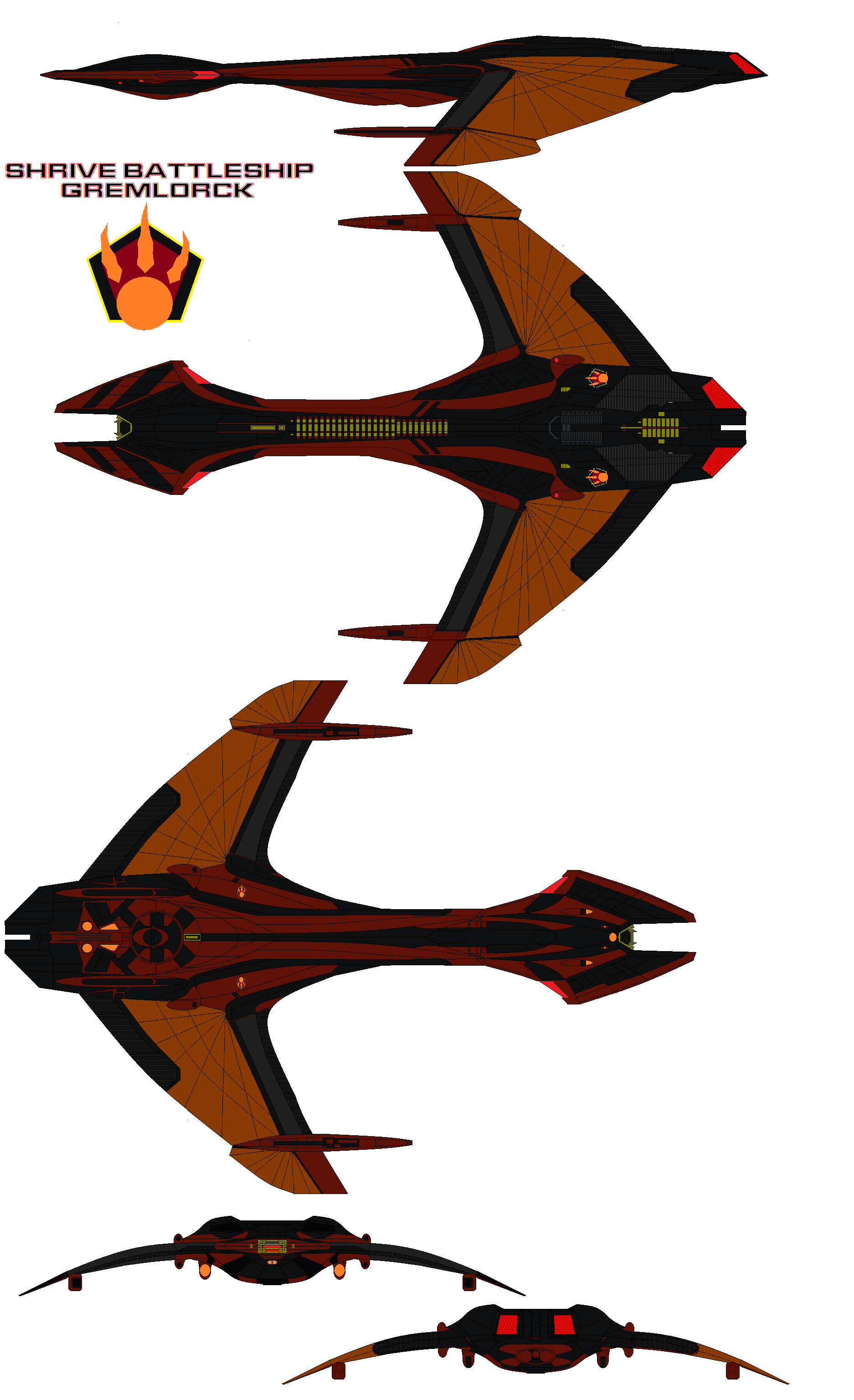
 Martechi — Vorchan-Class Attack Cruiser Refit

#bab5 #babylon5 #centauri #spaceship #vorchan #babylon5fanart #babylon5spaceship #bab5fanart
Published: 2018-09-29 12:52:48 +0000 UTC; Views: 3687; Favourites: 46; Downloads: 74
Redirect to original
Description
In the aftermath of the Last Shadow War and even following the subsequent Drakh occupation, the Centauri Republic came to recognize the Earth Alliance as its primary rival and adversary on the galactic stage for the foreseeable future. Even staunch conservative voices in the Centaurum had to admit the necessity to put an end to the stagnation of the Centauri Fleet.An immediate result of this change in thinking was the mass-refitting of the popular Vorchan-Class Attack Cruiser which served as the main ship-of-the-line up to this point.
The refit was designed specifically with the Earth Alliance as a potential foe in mind. It acknowledged the need for fleet designed to fight an opponent of equal footing, rather than subjugating lesser species.
Keeping with its original design, the Vorchan refit still put an emphasis on mobility, receiving more powerful engines and thrusters, capable to easily out-maneuver the massive battleships commonly deployed by EarthForce. At the same time, additional armor plating and reinforced internal structure increased the survivability of the Vorchan-Class. Finally, the Vorchan Refit was outfitted with a wider range of versatile weaponry. This decreased its raw firepower against capital ships, but made the ship a much more capable escort for larger fleet formations and larger Centauri Vessels in the future.
Babylon 5 fanart. Inspired by Centauri vessels by Mallacore: www.deviantart.com/mallacore/g…
Related content


Comments: 5

I love how this turned out. It is a beautiful mix of the existing design and my own take on future Centauri ships.
👍: 0 ⏩: 1

I'm glad you like it! I find your future Centauri style is a perfect way of adding texture and detail to these canon designs. I especially like the idea of covering the "glamorous" gold and purple in functional, gray elements.
👍: 0 ⏩: 1
I agree. The grey works very well as a break on the eyes and helps bring out the other colors.
👍: 0 ⏩: 0
