HOME | DD
 martinhoulden — ::ALIEN vs HALO .redux::

Published: 2006-09-27 14:06:33 +0000 UTC; Views: 53598; Favourites: 1752; Downloads: 1474
Redirect to original
Description
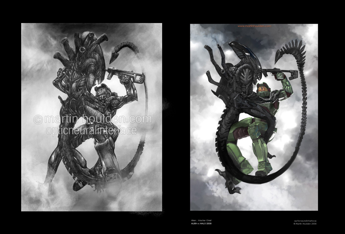
[::: ALIEN vs HALO .redux :::]Hrm. You know, i said i'd never do this. Cos well, i hate it when people latch on to a popular thing and then do NOTHING BUT that until theyre insanely popular. But well, in deviantart's current climate of a screwed up front page, where absolute crap gets faved and becomes more popular than stuff that is actually good, then well, that morale issue is right out the window.
So ... i figured, its been 27 months. Yes ... 27 months, over 2 years, since i last did an my AVH pic. Ive had a rought time of it in the last 2 years ... i dont feel im quite progressing as steeply as i once did ... and i worry im not heading in the right direction. I wanted to (now that im back at uni, in a great place, with my mates, with a crap load of time on my hands) try and establish where i am with my art. And the best way i saw of doing that for me was to try and retackle a picture i had done in the past, and try and see if i was any more able of trying to capture the original vision.
Is it a better picture than the original? pft, i dunno. In some ways i prefer it, in some ways im more proud of it. In other ways i look at it and think, that considering its been 2 years since i did it, it really isnt that much better. The main differences for me are:
Took half the time. 3 hours as opposed to 6.
The detail makes a LOT more sense
The alien looks a lot more like how i originally wanted it to.
Its in colour omg
Its perhaps a little more adventurous.
But then on the downside, i think the original's composition is better. I sat down last night and tried to work out why i still prefer elements of the original. I think it boils down to this:
Craig Mullins does THE most awesome Halo2 pictures. But, the pictures he has done wouldnt make good covers for the game. Theyre specific to a particular moment, and covers of games shouldnt defy specific elements. They should be all round representations of a concept, a main theme. I think the original pic i did is more like a representation of the concept, and the newer one lacks that. Also, the older pic looks much better on CRT monitors with the right contrast, whereas the new ones isnt quite so dependant on that!
But anyway, its not really up to me to decide. The point of the picture was not to replace the original, but rather, for my own purpose, see where i'm at and where im going with my art.
All comments welcome and appreciated. The original is here:
[link]
[::: ALIEN vs HALO .redux © Martin Houlden 2006. Master Chief, Halo © Bungie 2001 - 2006, Alien © 20th Century Fox 1979 :::]
Related content


Comments: 310

ITS A PULSE RIFLE >8o
(rofl just playin. but yes. also im sad that no one picked up that the ammo counter only has one bullet left in the gun ")
👍: 0 ⏩: 1

!...I didn't even ntoice that. I just saw the glowig counter and didn't bother checking what it said. Well, let;s hope he doesn't miss that last shot.
👍: 0 ⏩: 1
 (Smile)")

Haha, yeah, don't you hate it when that happens? I've seen people with over 17k views with Microsoft Paintbrush mouse scribbles. Heck, a guy who did a picture for the sole intention of making it look bad got 4000 hits on that. I'm not joking. It made him die a little inside too.
Anyway, about the pictures. The original looked a lot more gritty, sorta the whole HR Giger thinger. Which fits how my mind percieves the Xenomorph universe. This picture is alot more, how do you say? Lighthearted. Err. Well, it's softer, for one thing. Yet at the same time the colours give a sense of motion and life. I guess you could say the former is a more Alien-ish picture, while the latter is more Halo.
Heh, look at that, I went and rambled. Anyway, keep at it, good sir! With your newfound free time, I look forward to your upcoming pieces.
👍: 0 ⏩: 1
cool, thankyou! yes i think you hit the nail on the head with that comment ... the former is more alien and the latter more halo ... yup! makes sense to me!
Thanks!
👍: 0 ⏩: 1
Glad to be of service.
")
👍: 0 ⏩: 0

Hrm...I agree, I think the first one has better contrast. Got the whole circular thing guiding your eye. Plus the B&W adds a feeling of...Intensity to it, I guess? Maybe that's just me.
In this, they're kind of in an awkward position on the page (I think) and you don't have as much circularity (If that's even a word @_@) guiding your eye. Tho' the color and detail is vivid and adds it's own kind of intensity. You've definitely improved, but I think for this kind of pic, the B+W version miiight have a bit more...Um...Impact, I think.
Either way, both pics are VERY nice, and I can only hope to one day get to be that good XD
👍: 0 ⏩: 1
yeah i agree XD. i mean .. i didnt just want to do the same thing again though ... i could have easily done the same pose or changed it slightly but i thought i'd at least go for something different, even if the pose /composition isnt as strong.
Thanks for the comment and thanks!
👍: 0 ⏩: 1
I agree, it's a good thing trying something different X3 It's just sometimes it works, sometimes it doesn't.
You're welcome ^_^
👍: 0 ⏩: 0
<= Prev |