HOME | DD
 Martyred — The Still Life
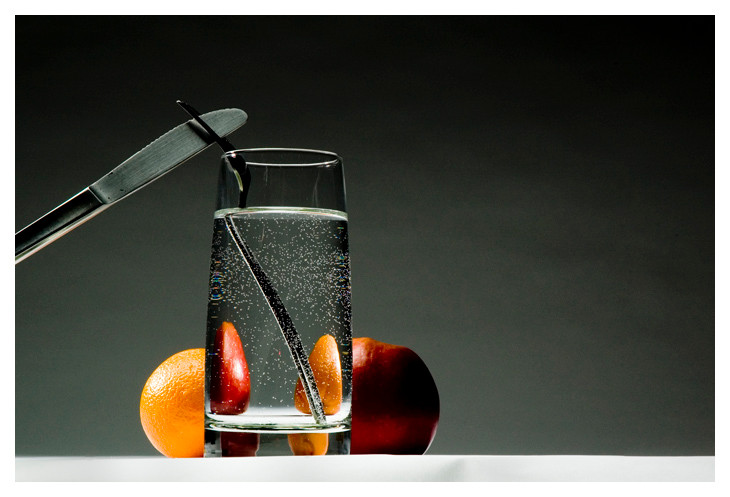
Published: 2006-04-07 20:30:04 +0000 UTC; Views: 743; Favourites: 13; Downloads: 137
Redirect to original
Description
It is like comparing apples and oranges you see.Lighting assignment for class. Clean and crisp. No Edits.
Hope you like
Related content


Comments: 25


it's so clean and crisp. this is so fucking beautiful. favs
👍: 0 ⏩: 1


I really love this and the concept is so cool too!!
👍: 0 ⏩: 1


Just great, I love this composition; and the colours are also great
Keep up the great work

👍: 0 ⏩: 1

SICK! I don't know how long it's been since I last logged onto dA, but this was totally worth it!
")
👍: 0 ⏩: 1
 (Wink)")

first of all, the apple and orange crossover in the water reflection is absolutly amazing. second, the background color blends well with the object. but whatreally drawn me into this picture is the reflection of the two fruits. very good.
👍: 0 ⏩: 1

thank you very much. I appriciate your kindness
👍: 0 ⏩: 0

That is an incredibly interesting image. Are you considering making prints? Or is there already prints available?
👍: 0 ⏩: 1
Umma, there is prints; however, they will not be appearing on dA. If you wish, or any does to have one, please contact me through e-mail or notes
👍: 0 ⏩: 1
Awesome  (Smile)")
👍: 0 ⏩: 0

I like it, the colors work together nicely. I'm glad to see more of your work, I missed it.
👍: 0 ⏩: 1
thank you, and thanks for the support
👍: 0 ⏩: 0