HOME | DD
 maskurade — C - Eislynn Stillwind
by-nc-nd
maskurade — C - Eislynn Stillwind
by-nc-nd
Published: 2012-03-04 19:39:14 +0000 UTC; Views: 1713; Favourites: 18; Downloads: 40
Redirect to original
Description
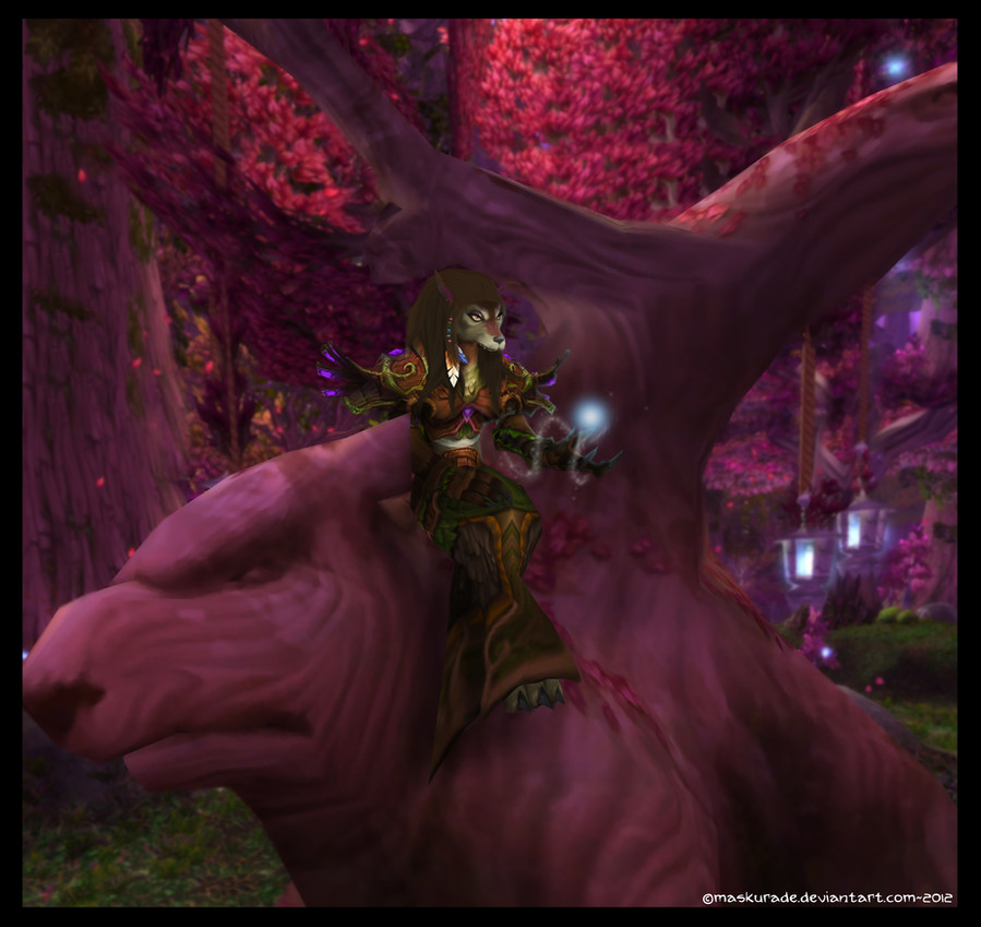
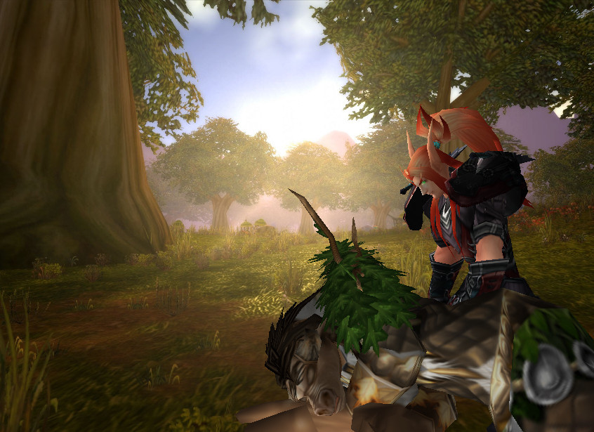
DOWNLOAD FOR FULL VIEW. HUGE PIC IS HUGE.Piece for Eislynn on WRA Alliance.
Picture © Maskurade 2012
World of Warcraft/Character Models/Background © Blizzard Entertainment
- WoW Model Viewer 32-bit
- Adobe Photoshop Elements 8.0
- Brushes from Obsidian Dawn and Falln-Stock
- 12 Hours
Related content


Comments: 6

Overall


Originality
Technique
Impact
Generically, Scale is an issue here.
Anyone how plays Warcraft is well aware of the size of this tree in Darnassus, the fact the model is so huge against it just completely throws the image out of proportional justice.
Secondly, the image seems to lack a great deal of depth, it is very flat and hard to figure out which is meant to be at the forefront of the image and what is intended to be background.
I can see you have put a shadow under the Worgen which tells me that she is sitting on the tree (though I'm not quite sure how as her positioning relative to the structure of the tree is not apparent) But I wonder why you have not used a similar technique with anything else in the image, to point a very simple one out, her hand upon her lap.
Surely this would cast a shadow onto her legs as there is a light source coming from above - The glowing orb in her other hand. The hand on her lap is so incredibly hard to make out as it just melds into the detail and colors of her robe.
Light sources are very important they give shape to the image, Above her is light coming from the sky, it lights up the branches above her, but there is no light below them which concludes the light is blocked from reaching lower parts of the trees due to the branches, however that seems to not reflect at all upon the character who is lighter than the tree.
I think this is definitely something you could address to improve all of your images.
Is we want to move on to detail, as others have mentioned her hair looks incredibly flat, all sorts of different tones and colors are used to show how the hair is shaped, even if our hair is a solid color it always looks different from different angles, there are many shades of brown you could use to express the style and way it lays.
I would also suggest doing something with the bottom of her robe, it is not natural for cloth to 'hang' at such a straight angle.
The blurring technique is a good one, it suits the image, however I feel to really give it the impact that you want to achieve the background needs a little more blur and it then becomes essential to put some very in-focus foreground in, for example a falling petal or so, since it is very evident in the image there is a lot of flora it would fit in well.
👍: 0 ⏩: 1

Thank you for the critique.
But a few things I'd like to clarify. If you are assuming this is the bank tree in actual Darnassus, you're wrong. This is one from outside the city. She is a tad to big on it, but not by much.
There are shadows in all the place you have named, but I tend to keep things soft since I've had in the past people saying it looks to dark. Sorry you think so.
I do agree that her hair looks flat.
But all in all, why should I worry what other think when the person this was for is happy with it?
👍: 0 ⏩: 1
I was just giving a critique if you don't care what others think I don't know why you ask for it in all honesty.
Sorry to have apparently offended you.
👍: 0 ⏩: 0

Overall
Vision
Originality
Technique
Impact
I'm normally not that good at critique drawings and such, but there are a few things I would indeed wish to add about this one.
It looks very well made and put in alot of work into making it! Although it can be worked on even more.
For example, the hair could use a bit more tuneup, it does look a little like a cloth that has been put on her head, so perhaps work a little more on the roots on the hair as well as lighting it up a little. Perhaps lay a little more light coming from the wisp/magic that flies about her hand.
Then the face, it does look a little like her jaw is missing, perhaps look a little into that as to me it looks as if she has lost her lower jaw.
Then lastly, It's perhaps just my opinion, but I can't fully see on what she's sitting on. From the shape of the tree, she would be more or less leaning against the steep side, rather than sitting on it. So perhaps trim up the background a little so it looks like she's sitting on an edge or perhaps move up the character itself.
That's all I can say, it's great work and you're coming a long way! Keep up the good work and I hope this helps rather than me just picking on things.. Because I do know how annoying it can be when people see flaws in ones work.
*hugs* but I like it none the less!
👍: 0 ⏩: 0
