HOME | DD
 Mastershizake — Time Warrior (The Transformers)
#autobots #cybertron #cybertronian #fembot #fembots #thetransformers #transformers #transformersg1 #wristwatch #femaletransformers #kronoform #transformersfanart #sentinelprime #tfg1 #timewarrior #sentinel_prime #fembottf #time_warrior #autobot_female
Published: 2021-04-17 01:34:57 +0000 UTC; Views: 2609; Favourites: 19; Downloads: 0
Redirect to original
Description
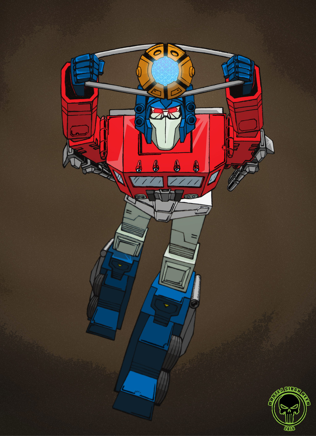
Here is my interpretation of the Autobot Time Warrior watch.If you have already checked out my designs under scraps and my penciled version then you know how I arrived at this design. For those who haven't or actually care here is how I came up with this design. I was lucky enough to get a Transformers Time Warrior watch and a half of another one for my collection before they got out of reach in price. The last one I checked on sold for $500! I based as much as I could on the watch and did the mental gymnastics of trying to have the watch transform into a humanoid shape. I decided why couldn't the Time Warrior be female form since it was never written in the mailaways. There were two main factors I wanted in my version of the Time Warrior watch. First was I wanted her with gears and springs to symbolize her being a clock work being. This also gives the impression she is quite old or even ancient. I guess this could be seen as a rip off of Sentinel Prime, but that wasn't my intention when creating her. Second was having her logo and chest plate to look like an LCD screen. Getting those colors just right was crucial to me. A third, but lesser factor I wanted was to emulate the stippled chrome the actual watch has under the face plates. Then there was the issue of the wrist band. I figured making each side in a sort of dress flap like modern era Wonder Woman has worked just fine. As for her having wings I needed somewhere for the face plates to go and since I was only showing the inside of them I made them into chromed wings on the inside. I thought about making her headpiece a sort of crown to show her being of high standing. Perhaps a Prime?
As far as coloring went there were lots of nooks and crannies to color, shadow and highlight. The stipple effect looked better at a high resolution, but seemed to go flat or lose it's brightness when I reduced the scale and BPP. Lastly if one compares my inked and colored versions of this they will notice that the entire figure is on the screen now compared to my penciled version where I ran out of paper space. This is why the left wing is lacking in symmetry with the lines due to my inability to draw parallel well with my WACOM pad still.