HOME | DD
 Matt-ikus — Colour Comparison 3

Published: 2010-06-09 18:45:20 +0000 UTC; Views: 685; Favourites: 22; Downloads: 0
Redirect to original
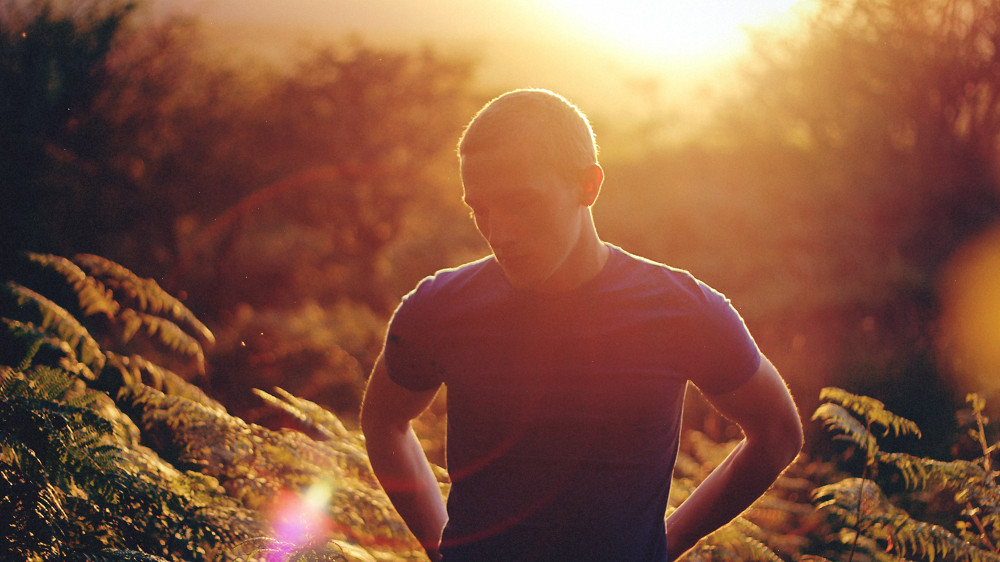
Description
A colour comparison I offered to do for another Deviant so that he could try to grasp what I do to make my photo's look like they do. Not sure whether it will help. But nevermind")
Related content


Comments: 5

You do not know how happy it makes me that you put these up <3 Like I said before, I absolutely love the coloring of your photographs and it's amazing to see any photographer's work pre-edit and post-edit just to compare and learn from them. Keep up the beautiful work@
👍: 0 ⏩: 1

Oh, awesome. I am so glad that you could get something out of them
👍: 0 ⏩: 0

You often take away a little of blue right?  (Smile)")
👍: 0 ⏩: 1
I believe in this particular image, I made the entire scene more yellow, which is why the sky is the colour that it is and also you will see that slight yellow tint in the clouds. Also put a bit of a gradient in the sky for impact and personal taste. I should have used the healing brush to take out a few details in the water, but nevermind.
👍: 0 ⏩: 1