HOME | DD
 matthiasmuth — realitycheck v3
Published: 2010-02-14 17:14:32 +0000 UTC; Views: 10180; Favourites: 59; Downloads: 180
Redirect to original
Description
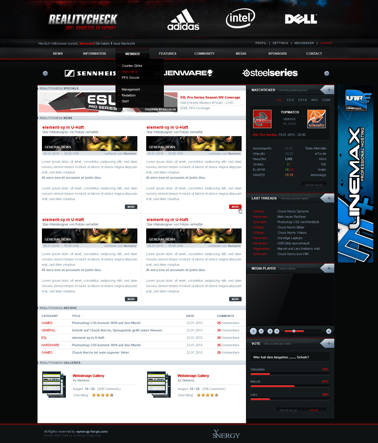
- Collab with overcrock
Related content


Comments: 46


wow wie schlecht oder wow wie gut? ^^
👍: 0 ⏩: 0
 - :D")

das habe ich auch bemerkt..
meinte nur , dass ps nichts mit Games zu tun hat xD
Wirklich ganz nice das Design aber oben im Header gefällt mir die Schrift bei "100 % Add..." nicht
👍: 0 ⏩: 0

Sehr Nice finde den Movie Player sehr gelungen sowie die Polls
👍: 0 ⏩: 0

Richtig gut mal wieder, nur die Navi könnte nen paar mehr details haben um mehr hervorzustechen.
👍: 0 ⏩: 0

Richtig geiles Teil ! Gefällt mir sehr gut
Du bleibst aufjedenfall mein "Design Vorbild"
MFG Zodiak

👍: 0 ⏩: 1
ich meinte "Designer Vorbild"
👍: 0 ⏩: 0

sorry don't like this one man, it doesn't seem to be by you at all imo
looks rushed and sloppy, and boring compared to your usual.
 - :(")
👍: 0 ⏩: 1
of course it is not by me at all, its a collab with *overcrock
👍: 0 ⏩: 1
ahhh I see, I knew this was different for some reason lol, see I know you man 
👍: 0 ⏩: 1

auftraggeber wollte unbedingt in den header auch nochmal sponsoren
👍: 0 ⏩: 1

dann könnt ihr da natürlich auch nichts für.
Zum Design:
Footer gefällt mir nicht
Würde es gerne mit Loginarea sehen, kann mir vorstellen das die da oben sehr gequetscht wirkt und rechts etwas leer ist.
Ansonsten dickes ding ^^
👍: 0 ⏩: 0


mir persönlich ist die schrift im content zu hell, würde da etwas kontrastreicheres nehmen.
Sonst sehr sauber und schön gearbeitet und das Endergebnis gefällt mir auch sehr gut
👍: 0 ⏩: 0


habt ihr das "+"-Symbol in der Sidebar von opera 10 geklaut? ;>
👍: 0 ⏩: 3


Schlicht aber sehr schick! Haste mal wieder schön hinbekommen!
👍: 0 ⏩: 0


Schöne Arbeit.Nur der Footer gefällt mir nicht so richtig.
👍: 0 ⏩: 0

ich finds cool aber irgendwie fehlt mir was aber ich komm ned drauf xD  (Smile) - :)")
👍: 0 ⏩: 0


Mehr Details besonderst bei Navi, Footer und Logo. Ansonsten ziemlich geil und sauber!
👍: 0 ⏩: 0

der stil beider designer ist ersichtlich, ich finds schick, der footer gefällt mir persönlich nicht.
👍: 0 ⏩: 1
danke, ich denke an den footer werden wir uns nochmal setzen
👍: 0 ⏩: 0

habt ihr ja noch ordentlich dran gearbeitet, kB auch nen kommi bei marcel zu machen, also gute arbeit ihr 2  (Wink) - ;)")
👍: 0 ⏩: 1
meine comments sind eh geblockt damit hier kommentiert wird
👍: 0 ⏩: 1
Ah ok hab ich gar nicht nachgeschaut
👍: 0 ⏩: 0