HOME | DD
 mattu84 — Strummin Home 6
Published: 2007-06-13 17:34:40 +0000 UTC; Views: 606; Favourites: 3; Downloads: 0
Redirect to original
Description
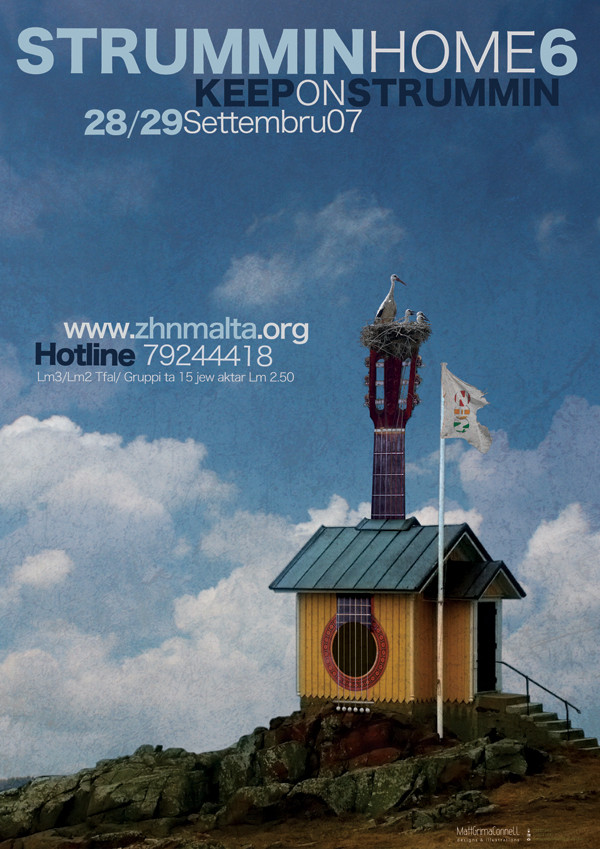
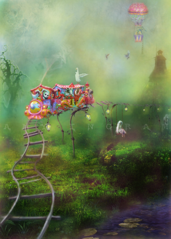
Poster for an activity to be held later on this year...As the name might suggest, this will involve a couple of dozens guitar players who will play with a band for philantropic reasons. As the activity is called Strummin Home I wanted to create an object representing the name itself in an obvious yet weird way to make the poster appealing...
Still in doubt about the fonts I have used... erm..or rather the combiation of fonts...
Would greatly appreciate constructive criticism... txs!
Related content


Comments: 36

niiiice work love the font..i'm gonna be in the concert so that's even cooler to see strummin home on devart!
👍: 0 ⏩: 1

 (Smile)")
👍: 0 ⏩: 0

this is the best strummin home poster ive seen yet! prosit xbin
👍: 0 ⏩: 1

Txs loads Sasa! Glad u liked it
👍: 0 ⏩: 0

hehe weird!!... but lovely... the storks are a nice touch... really really well composed overall istra!!
not sure about the fonts imma... I have a general rule for myself not to mix font types (unless they are very similar). but instead use 1 font throughout and change weight, kerning, size etc... apart form the obvious difference bejn "strumming home" and "keep on strummin"... i'm finding more strange the "28/29 September" part... is that yet another font? why not keep it like "strumming..."? that font is quite clear and legible...
imma the house, guitar, rocks and light are awesome!
maybe the sky+clouds are a bit too bright for the bckgrnd? even brighter than the foreground. (qed inkin pittma issa aw!) hehe!
caw!
👍: 0 ⏩: 1
Txs for the positive comments Matt!
Considered your criticism as well! Txs for that as well...
- I have used variations of the same font
- I made the details bolder
- changed the background...
Hope I managed to satisfy your eye!
👍: 0 ⏩: 1
prefer this version much much more!... and nice touch with that texture!
hope you get chosen issa mela!
👍: 0 ⏩: 1

It's a bit difficult for me to review this without ending up in an ethical dilemma (I think I'll be part of the committee/sub-committee/whatever that will get to choose the "winning" poster), but I'll do my best to remain as objective as possible  (Wink)")
I shall also say that I have no experience whatsoever in an ad agency, but what I'll say is mostly based on what I remember from the material I studied two weeks ago for my consumer behaviour exam at uni (where a great deal of the topics covered advertising, perception, and so on)...
So, the montage is superb. There's not much to say more about it, except that it is truly superb.
And unfortunately that's the problem for this poster (all other things remaining unchanged), because viewers will probably recall and/or recognise the montage later, but they will not associate it with Strummin' Home.
I feel that the title and the lower part of the poster are not "balanced", with the title buried in the grandness of the imagery. The title's font (although it looks good on its own) does not do a good job at balancing the bright white clouds on the horizon. Maybe you can try choosing a larger chunky (what word is that?) font which has a thicker concentrated area of solid white, to draw attention also to the title.
I'm also not sure about the size of the details (date, ticket details, hotline).
I feel that, given the current text/montage combination, this would have worked out great as an album cover but it does not quite pull it as a poster. Imagine the poster affixed amidst dozens of posters for parties and so on (the most likely scenario), can an uninterested walker-by 1) be attracted to 2) get as much details as possible on the event without stopping to read the small text closely?
I think you should start from there. And whatever the outcome of the selection process, make bloody sure you do something with that montage, cos it's fab.
👍: 0 ⏩: 1
First of all txs for the constructive criticism...
Secondly... I tried to improve the design to make it more attractive, with more conspicuous details and a less bright background... I also reintroduced light textures to give it a bit of a dirty look... yet the opacity of these textures is not as high as in my first submission...
As for the ticket details... I decided to keep a small font size as otherwise it would appear rather bulky...and apparently prices are in 'most' cases (from what I have managed to 'study'
Anyways... txs for spending time to stop by and leave such a 'huge' comment ")
...may the best poster will be selected. Amen!
👍: 0 ⏩: 1
Of course I could elaborate so much because I wasn't doing the dirty work myself. You know, it's so much easier pointing out stuff and criticising
...may all posters be at least half as good as this one, and that democracy elects the one that is truly the best. (I will personally mutilate anyone voting for posters with Comic Sans.)
👍: 0 ⏩: 1
Ah, I didn't notice you've edited it. Still not sure about some of the font weights (I should probably shut up għax jien jien pittma nobis), but I think this is much much better, especially the ticket details/hotline area.
Now I can't decide between textured vs non-textured, but I think I better spare you that debate again because we'll drive you crazy at this rate
👍: 0 ⏩: 1
Thanks for the interest you have shown and for the nice comments once again...
Np regards criticism and being pittma... I greatly enjoy people who point out features they don't like in a constructive way as u do...
I LOVE textures and I wanted to give the poster a bit of my touch... and apart from this I think that optical roughness and noise matches really well with the rock-genre music featured in the past editions of Strummin Home... Ma nafx x'ha ddoqqu this year ...but 'knowing' some of the ppl who usually take part in this concert (tipo Malcom u Izzy... i guess it will feature mostly rock rather than pop
Txs K!
👍: 0 ⏩: 1
In fact I'm happy that you ended up choosing the textured look. It's after all your piece, not ours.
Good luck!
👍: 0 ⏩: 1

..........my dream house.. but it will be a bass instead of a guitar
proset tax xol man vera cool
")
👍: 0 ⏩: 1

lovely work matt. maybe the clouds are abit too bright and somewhat distracting
👍: 0 ⏩: 1
Aw Tonin!
👍: 0 ⏩: 0

Insomma, halli f'idejn mattu u jaghmillek xoghol ta veru hux.
👍: 0 ⏩: 1

I love the fonts you used. It is so hard to find a place to use a unique font, but I think you nailed it. The image is very strong as well. This really caught my eye while I was browsing. Nice job!
👍: 0 ⏩: 1
Hey! Txs... nice to hear it caught your attention!
👍: 0 ⏩: 0

i would like to see it without the texture on everything just to see if it looks better. the font are ok but i would align everything to the left as there is a lot of sky space. enlarge just a bit the title, make some flying birds going to the nest and use the same font of keep on strummin for the details...
Everything else amazing matt... amazing montage! and also if i could say there is too much going on in your logo area
Constructive?
👍: 0 ⏩: 1
Wow really good crit. txs... as u can see I considered your suggestions... and yes it does look better
Txs Jamine!
👍: 0 ⏩: 1

I like the idea of the guitar home
👍: 0 ⏩: 1
Aw drin... txs xbin! sewwa ...ara issa hux xi ftit ahjar... naqqas in-noise tas sema... txs tal-kritika
👍: 0 ⏩: 1
...welcome np! Iva tider ahjar. L'ahhar haga jekk mhux se indejqek imma pruvajt tghamel a black shadow wara it-text biex jinqala aktar? ma nafx kief tigi tider imma nahseb li tinqara ahjar peres li hemm l'ishab abjad.
👍: 0 ⏩: 1
ara drin... shadow m'ghamiltx, imma biddilt it-tipa...
x'tahseb issa?
👍: 0 ⏩: 1
I like it too! Jinqara ahjar hekk. Keep it up men
👍: 0 ⏩: 1

