HOME | DD
 mauroh —
Thinking Around I
mauroh —
Thinking Around I

Published: 2009-01-19 01:38:35 +0000 UTC; Views: 39531; Favourites: 972; Downloads: 0
Redirect to original
Description
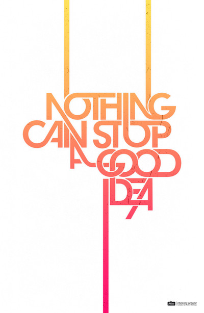
Nothing Can Stop A Good IdeaThinking Around / A project of creative thinking
Illustraror CS4, Photoshop CS4
Base Font: Avant Garde Gothic
___________________
(eng)
"Nothing Can Stop A Good Idea" is the first typographic poster of the series "Thinking Around", a project of creative thinking, I just wanna explore the words in wich creativity is protagonist.
(esp)
El Cartel tipográfico "Nothing Can Stop A Good Idea" (Nada puede para una buena idea) es el primero de la serie de "Thinking Around", un proyecto del pensamiento creativo en el que, quiero explorar las palabras que influyen en el proceso creativo.
Related content


Comments: 253


i could see that hanging in my room (with different colors perhaps ^^)
very nice
👍: 0 ⏩: 0


I found this gem on weheartit.com and had to track it down. It's fantastic!
👍: 0 ⏩: 0


wooooooooow
i love your work
evry thing u did it ..
i am from iraq
i will see all your art
love it so much
👍: 0 ⏩: 0

Really nice eye catching but simple, I like the way you have stretched the font but it is still easily read, very good idea, I might try and so a spin off this  (Smile)")
👍: 0 ⏩: 0


This artwork does prove that nothing can really stop a good idea such as this. Interesting font play, I really like Avant garde but what you did to it makes it look like a new font altogether.
colours are nicely changing from posotive to more positive. It will make a great poster, I had extra cash I would've bought it.
It's inspiring too, I havent gone that far with my design, so artworks like this can really help me learn and discover new horizons.
Thank you for putting it up
👍: 0 ⏩: 0


nice work
i love the colours and the typo

👍: 0 ⏩: 0

 (Wink)")

I like your work especially the intersecting letter forms
👍: 0 ⏩: 0


muy wen juego tipografico, es una avantgarde no?
👍: 0 ⏩: 1

eh muchas gracias, y si señor es la Avant Garde Gothic, muy buen ojo
👍: 0 ⏩: 1
con el tiempo se te quedan las tipos en la mente, debo tener una buena coleccion grabada en la cabeza
👍: 0 ⏩: 1

te pasaste man lo encontre genial ojala subai mas trabajos tan buenos
👍: 0 ⏩: 1
Jey muchas gracias men, que bacano que lo aprecies
👍: 0 ⏩: 0


this is great
only problem is "A" looks werid
pero es muy genial
👍: 0 ⏩: 1


Base Font: Avant Garde Gothic, lo escribi en los comments, la fabulosa avant, gracias por el fave mi amigo
👍: 0 ⏩: 1


One of the BEST TYPOgraph ever created in DA...
👍: 0 ⏩: 1

That's really awesome! I love how you've nested and conjoined different letters; it reminds me of celtic knotwork or macrame or something, only very avant garde/post-Helvetica and whatnot. The verticals from the top and bottom really pull the whole thing together (and do trippy things with the negative space; I started seeing letters when I squinted at it for too long!) Plus the subtle splatter texture adds just the right amount of organic quality to the whole thing...
*hugs poster* me love poster!! ")
(*taking a typography class at university at the mo', so pardon the rambling gush!*)
👍: 0 ⏩: 1
| Next =>