HOME | DD
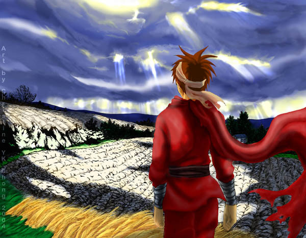
 mayshing — In the Fields -color
Published: 2004-01-15 22:19:21 +0000 UTC; Views: 1894; Favourites: 15; Downloads: 319
Redirect to original
Description
Time: 4-6 hours prox.Medium: ink, adobe photoshop 7
No photoshop tutorial on this one...because the techniques are laying in the basics of layers, blend mode and coloring.
Comment: I didn't reach my expectation completely for this piece.... it's unfinished in a way... but it's finish enough with my current ability... I feel that I am lacking something... but I am not sure what.
My next practice will be taking a photo and copy it as close as I can.
Category: Not sure what this should go into, I will put it as misc for now.
Related content


Comments: 54

I love this, the sky looks awesome. I love how you made patches of light where the sun broke through the clouds and shone down on the ground.
👍: 0 ⏩: 0

wow this is soo cool. i like the coloring a lot. the sky looks so nicely done and the light on the ground is great. good job!

👍: 0 ⏩: 0

I think the thing that you feel about unsatisfied it is something beyond this picture.......it is something quite hard for me to explain, because it is something only you know how to resolve, but i guess that you headed into a more realistic point of view??, the coloring is very soft and it looks like watercolor or oil painting, the effect of light that wraps all the environment is simply warm, natural, yes, that is the correct word ^_^ , i feel that something is missing, but im so tired right now that even commenting in this wonderful picture migh lack any sense due to my tired brain, i gues that Randy is waiting for something? or just he enjoys watching the entire environment that stands in his eyes?..........i`ll try to comment better on this later.........
👍: 0 ⏩: 1

You are VERY right. I have admired you for your spiritual/mental awareness, you have great understanding toward my intention in my works and my struggles. It's a precious thing to have you watch and comment on my work.
I feel I NEED a break through, a break through in my coloring that will take me to another level, what I am lacking is "BOLDNESS" and "WILDNESS." It's a state of mind, I found out i am lacking that just recently during the break. (so taking a break is good! ")
Thank u for being a wonderful commenter and supporter, it means much to me.
👍: 0 ⏩: 0

Looking at the art makes me feel inspirational... like there's a story behind the picture. I love the shadows created by the clouds, and how there's a sense of wind. Vewy pwetty! Looks like a great place to spend a day.
👍: 0 ⏩: 0

beautiful coloring, that's all i can say about the clouds. did you use photo reference at all for them? it's got a real nice painted feel to it... you hid some of the lineart!!! ")
")
beautiful, simply amazing. i need to get off my butt and overcome my fear of color one day... so that i can hope to make some thing of this quality of color in the next 5-10 years ")
👍: 0 ⏩: 1
My greatest problem is how to make ink and color work together like a charm.
I did use photographic refrence, photographs taken by me... and yes sky is the part i am most proud of in this one, and the ground is the most baren in this one, however it's a difficult decision to make about what to do with the high contrast problem. I wanted the high bleaching contrast, and yet I have problem deciding what to do with it.... =_=b
I will come back to it another time.
👍: 0 ⏩: 0

I like how the light falls through the clouds. I personally love it when I see similar scene happening with the clouds in real life and I think you captured it really well in this picture.
👍: 0 ⏩: 0

I'd say that if you could make this one piece the way you would like it, you'd have taken yourself to the next level, y'know...
Judging your other works, that I've been lucky enough to see, it wouldn't be that far a step.
If you ask me, I'd say the figure looks a little amorphous in the red clothes 
..asking...me, that is
Looks good so far, though, yo!


👍: 0 ⏩: 0

i absolutely LOVE the lighting effects and patches you created on the fields. wooooooow. O_O
👍: 0 ⏩: 0

wow that is amazing mayshing ^_^ the colours are perfect!!!
👍: 0 ⏩: 0

I was waiting for this one to get completed shortly after you revealed it on the oekaki board! ^^ I think your shadows are really good, and as I said, I liked Randy's scarf. The sky is beautiful, and the inked in fields look very realistic and lush.
Don't you hate it when you know somehow you're lacking that 'oomph' with a picture? Drives me mad at times when I'm doing my art...

👍: 0 ⏩: 1

Wow, that sky is awesome! You really did a great job coloring this. Although the background could be a little too distracting. Perhaps if you add a bit of fog in the distance to make the focus be more up front?
You could work on the details in the grass and wheat to bring them out more. Perhaps add more colors in the gass other than green?
One thing I noticed is all the colors are really bright and saturated. You could tone them down a bit and leave the areas you want the viewer to focus on more brighter. Just a suggestion though  (Smile)")
👍: 0 ⏩: 1
Interesting suggestions, i will think about it. I think i have to work back into the background... and well the WHOLE thing... 
👍: 0 ⏩: 1

it looks really good. i love the contrast in the light and dark areas....maybe the missing/lacking part is somewhere in the left hand aprt of the pic...i don't know, i'm attempting to help. but it sounds rubbish....i only said that cause my eyes look at the right hand side straight away, but the whole pic is really well done, and i wish i had the paitience to sit down and do something like this. it looks great. especially the clouds and the flowing fabrics, they look amazing.
👍: 0 ⏩: 0

colours are extra lovely and effects very splendid
👍: 0 ⏩: 0

You have done the cloude really, they look realistic and the shades on them look's natural. and the corn feld that is on the left hand side also have a real sence of realisem to it.
What dose looks a little strange is the dirt\earth feld. even though there is light comeing on them from the sky you should have put some earth\dirt tone colors on them and not have it so white in MO.
the coloring on the person looks good. I like the shading and and the light on him.

👍: 0 ⏩: 0

hmm i think its lacking your textural rendering, seems a little bit flat in his clothes. hell that wheat is done really nicley and i'd find that hard to render coz there so many thing to consider with stuff like that, grain, straws etc, and just below his scarf blowing, is it a dying feild? coz it looks like there are weeping plants which is a interesting detail with the white highlights. can't get over that wheat!
👍: 0 ⏩: 1
Good point, I aggree with you, texture is one thing i need.
👍: 0 ⏩: 0


I think it turned out darn tuttin good! oO Har har (nobody talks liek that anymore but me) Anyways, I love the way you did the lighting; it's very good and at the right spots! Though, I'm not surprised. And I like how you made it so taht we could see what the boy is seeing...oO Er, well I think i see what he sees. Magnificent job as usual. 
👍: 0 ⏩: 0


hmm..not sure..but i almost like the black and white version better. but this is very nice.
👍: 0 ⏩: 0

omg! the sky is soo amazing! it reminds me of some impresionnist painting! ^^ beautiful
👍: 0 ⏩: 0

*gasp*
0.0
I love how you did the clouds and the sunlight pouring through!!!! IT IS BEAUTIFUL!!!!!!
My mom goes nuts for these kind of pictures.
The scenery is just awsome.
:fav:
👍: 0 ⏩: 0

I think what its lacking is its "fuzzy" Perhaps you should have colored the line around the character darker, it looks like there is nothing "holding in" his coloring. And when I say "make the line darker" I don't mean black, I mean reflecting on the colors around it, only.. darker
I LOVE the light on the ground, but that looks "unfinished" as well, perhaps some light shadows in the clumps of dirt? Some hint of brown so it doesn't look like you just left an uncolored patch?
Otherwise, it looks WONDERFUL. I love the use of color, and the sky is the best part. It's GORGEOUS

👍: 0 ⏩: 1
I thought about ur suggestion and saw where you might taken this piece if it were you. But that would be too far from my imagination. Neverthless thanks for the input. ^^
👍: 0 ⏩: 1
Lol, well no one ever said advice HAD to be taken .  (Wink)")
👍: 0 ⏩: 1
^^ i know ur intention, thanks for the reassurance.
👍: 0 ⏩: 0

This is wonderful!! However, i also feel like something is missing in this piece...
I think the man in the foreground is the problem. The coloring on him is not as realistic as the coloring of the wheat and clouds. Also, he seems too " in focus" - I think if you made him more blurry as if he was out of focus it would add to the realistic feel of the image.
What I really like in this is the beatiful coloring of the wheat and the shadows cast by the clouds on the field. absolutely stunning!
👍: 0 ⏩: 0

Very nice. It reminds me of this Mickey movie I once saw. Where he climbed the bean stock to see the giant. The backround reminds me of that!
👍: 0 ⏩: 0

Wow. That's really awesome. I especially like the clouds. They look so... turbulent, it's really neat to see. It seems almost like he's standing in the eye of hurricane or something. I also like how the light is so brillant on the fields it's almost looks like it's bleached the color from them.
👍: 0 ⏩: 0

I love that picture soo much! ^^ I like the field; its so cool! Makes me wanna go out into a field myself! ^^ *faves*
👍: 0 ⏩: 0

ooo, beautiful background and use of the colors.
i know what you mean about that one lacking thing >< i get that alot myself
👍: 0 ⏩: 0

Didin't expexct this outcome when I saw the B/W image, good idea but there is something I can't quite grasp either...
👍: 0 ⏩: 0

Oh, my dear lawd. This just takes my breath right away. its absolutely gorgeous Mayshing! :worhship:
👍: 0 ⏩: 0

breath-taking! this piece of art gets a fav :fav+:
👍: 0 ⏩: 0

wow that is beautiful...I love the sky with the sunlight poking though the clouds....
👍: 0 ⏩: 0


Ooo this picture is so lively!! I love it! And I love how you colored the sky, its just beautiful. And on what you think may be missing, I think you should add a lil' more lightness on his hair, like Seibaru said^^ But either way your artwork is beautiful and amazing.
If ya want, I think it'll look really cool if ya added some birds or animals in the picture^^ Mweee~
👍: 0 ⏩: 0

Beautiful Christine! Simply beautiful. As for what you feel is lacking, in my point of view it is the lighting on Randy's hair. It seems a little light from the back of his head. But that's just me.^^ I always loved your art. Being a fellow artist, I have those feelings sometimes as well.
Keep up the awesome work, and I welcome you back from your internet fast. ^^
👍: 0 ⏩: 1
thanks... perhaps i will work more on that too.
👍: 0 ⏩: 0


looks like its brought to life! i love the usage of light.
👍: 0 ⏩: 0

It is still beautiful.
And my comp thinks Times New Roman and Verdana are the same font.. greaaaat.......
👍: 0 ⏩: 0

I yes, i remember this one when it was just in pencil, looks awesome in color
👍: 0 ⏩: 0
| Next =>