HOME | DD
 mayshing — An Eagle without wings
Published: 2003-08-25 15:46:01 +0000 UTC; Views: 7220; Favourites: 122; Downloads: 1671
Redirect to original
Description
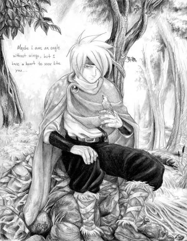
") My 300th deviantions! This is my favorite pencil piece so far~~ I love it. X3
My 300th deviantions! This is my favorite pencil piece so far~~ I love it. X3 This is also the first piece of mine approved by my teacher of its quality, my stones finally look more like stones now...

Anyway, this piece is done when I was extremly annoyed, but this piece actually calmed me. I am so happy. ^_^
Medium: Pencils. (HB, 2B, 6B)
Related content


Comments: 98

its the same character, main hero in my original title 2masters: [link]
👍: 0 ⏩: 1

I didn't see the other drawing until after this one, and I started reading both series! Looks awesome so far! =^_^=XD
👍: 0 ⏩: 0

awww ... I fell in love with your character ! O///O
👍: 0 ⏩: 1

thats so amazing! i wish my pencil art was that good!!
wow!
👍: 0 ⏩: 0

OMG OMG OMG OMG! This is absolutely amazing! You really did an awesome job. I love that you did it in pencil! The landscape is... WoW! I love the message...
" Maybe I am an eagle without wings, but I have a heart to soar like you..."
' god thats deep.
👍: 0 ⏩: 0

Es dibujo está muy bueno, pero el pelo (quizá su cabeza en sí (Wink)")
👍: 0 ⏩: 0

thank you for your graceful comment, this is actually a plot in 2Masters that will be shown... probably... by next year if I go by monthly update. OTL (Its in chapter 3.)
👍: 0 ⏩: 1


That' is one of the most best pencil sketches I've ever seen. O_O
👍: 0 ⏩: 0


Nice detail work and such. Too bad it's not coloured.
👍: 0 ⏩: 0

I'm so impressed I can't think of what to say! Your shading skills are far superior to mine, so I'll keep on practicing to get better! This piece is very calming and pretty... I definitely have to agree with you!
👍: 0 ⏩: 0


👍: 0 ⏩: 0

The shading is exquisite. I like how the light from between the leaves falls on the character.
👍: 0 ⏩: 0

you only used HB, 2B, and 6B?!?!? You have amazing pencil-pressure-applying-type abilities
👍: 0 ⏩: 0

Amazing simply Amazing there is just nothing else i can say
👍: 0 ⏩: 0

")
👍: 0 ⏩: 0

Wonderful drawing...especially love the details!
is now one of my fav's!
👍: 0 ⏩: 0

When you put the effort in a piece of art, it shows. This is a good example, so well done.
First of all, the drawing demonstrates good understand of composition, use of the media, and good proportions. What is lacking however is lighting.
At first glance it was hard to understand the direction of the light, and I had to study carefully around the picture to confirm the light's coming from the eat direction (our right). While the shading itself does create reasonable amount of depth in the piece, I couldn't help but feel it could have and should have been a lot stronger. It feels like you're avoiding heavy toning, and thus there isn't a very strong sense of light and darkness in the piece, that in turn meant the atmosphere isn't as strong as it would have been.
The touch of sunbeam light casted onto the cloak was a nice touch, however since the overall feeling of light and darkness isn't particularly strong, the feeling of a hero sitting in a dense forrest is gone.
Texture is something that bugs me in this piece as well. While it's obvious the subject of the picture is the man, the amount of details and texture on him isn't at all strong in contrast to the background trees. It is as though you've given the background more effort than you did with him. I understand it's a problem anime presents, and while you might have noticed beautiful backdrops in many animes, you might want to take into consideration of the textures used when characters are present. In a scene which the purpose is to show off the location, a vivid image of the landscape of cityscape would be used. However when anime characters are present, you might notice the use of backdrop are often different, with a softer feel to them to compensate the anime styled characters. Also moving pictures has the advantage of keeping focal points of the subjects in question. Still images have to deal with the problem differently.
There are, in my view, three types of trees present in this picture. From the closest one with the detailed leaf to leaf version, to the dense and loosely detailed tree behind the character, to the almost painting like soft description to the distant right. I feel strongly that the second tree should have better details just to make the transition stronger. At the moment the tree to the left really stands out too strong in contrast to the other two. The tone used on the other hand seems too light on the distant trees. It's understandable if the atmosphere you're after is a misty morning in the woods, but then the sunbeam on the cloak seems to contradict that. Perhaps the overall tone of the trees should be more consistent. Afterall, we're talking about woods, not landscape. There are much more layers to deal with then the simple 3 to 4 - step progression in most landscapes.
I know I went overboard with this comment, my explanation is I see a lot of potential from this drawing, lot more than what's presented to me. I don't think I'll be able to produce this kinda of drawing without some much needed time with the tool of trade again, plus I'm not a big anime fan. I guess I want to push you further towards your limit, so hope it wasn't too harsh or confusing.
Overall, great drawing, great toning and texture though arguably at the wrong places, lack of light definition : 7.5/10
👍: 0 ⏩: 1
Thats the LONGEST comment I ever have gotten, a pretty helpful one too. ^_^ I will be watching my lighting directions and transition more on shading and toning from now on. Thanks for the thoughts and the time for comment. *ur probably the first one who looked at that pic long enough to pick out the problems. ^^*
👍: 0 ⏩: 1
I do look at pictures for enjoyment, but the point of my thread was to give constructive criticism, thus the time and thoughts. Critising other people's work is another way to learn, since you can study other people's work much quicker than you can produce and study your own results.
👍: 0 ⏩: 1
I agree 
However it still takes time to think and post all those comments, I appreciate it. ^^
👍: 0 ⏩: 0


Very realistic! Those hands are phenomenal, but I think I like the cloak the most. Theres just something about cloaks....
👍: 0 ⏩: 0


Wow! Can't say anymore than has already been said, but you got a fav.
👍: 0 ⏩: 0

line work is awesome, the shading clean and easy to read...the subject is very well done...great job!
👍: 0 ⏩: 0


👍: 0 ⏩: 0

Oohhh... This is very nice.. I just love the shading and background. It's very nicely done... My hand would fall off if I even TRIED doing that... @_@
👍: 0 ⏩: 0

Wow...this piece really sent shivers down my spine...
It's really inspiring. His expression seems...defiant? Determined maybe...very nice. =o
👍: 0 ⏩: 0

Now this is one of my favorites sketches ive seen u do. Its just flat out great.
I especially like the cape *steels it for his own and scuries off into the wild*
👍: 0 ⏩: 0

Lovely, i love just everything in this image, the envirionment, shadows - light, the expression, my first fav :$
Keep the awesome work!
Regards gREk
👍: 0 ⏩: 0

Woa, this is soooooooooooo... *pauses*...... sooooooo GooooooooooooD!!!!! I love pencil peices, this is so great, i love the pencil work, the rocks look awesome!!! AHHHHHHHHHHHHHH +fav
👍: 0 ⏩: 0

300 deviations! Dang!! I wish I was as prolific as you xD; Awesome!
Well, you've got every right to be proud of this 
 (Smile)")

👍: 0 ⏩: 1
Thanks for the long comment, and fav.
Yeah, its definately uplifting when I heard my teacher's comment, he is a cool teacher but he has high standerd.

👍: 0 ⏩: 0

oh wow. that looks like it took ages....it looks beautiful thoguh, and there's so many little details in there....i love those boots though...they look like they're really warm...but can i ask a question.....don't those rocks hurt his bum??
laters
Tailschao
👍: 0 ⏩: 1
don't those rocks hurt his bum??
I don't think so...
👍: 0 ⏩: 0

Wow! Dat's sooo pertyful! I love the way this looks! It's just so soft and easy on da eyes. Not a lot of extensive details! Great piccy!
👍: 0 ⏩: 0

*gasp*You did it again MAY!!!*dies but is revived*>
👍: 0 ⏩: 0

So much texture
The picture and the quote is really touching
👍: 0 ⏩: 0
| Next =>