HOME | DD

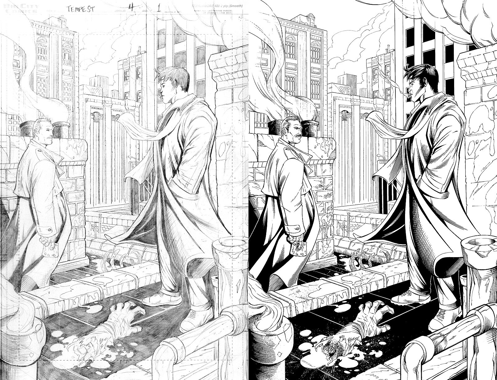
mechangel2002 — Tempest issue 4 pg 1 INKS

Published: 2008-03-07 23:00:16 +0000 UTC; Views: 4925; Favourites: 62; Downloads: 103
Redirect to original
Description PENCILS BY ROB DORIA
INKS BY DIANA GREENHALGH


A page of inks from issue #4 of the vampire series Tempest from Big City Comics. The issue came out in February 2008 but I've been busy and forgot to post this one


Materials:
- bristol board
- brush
- crowquill
- Rapidograph pen
- toothbrush (for spatter)
- ink


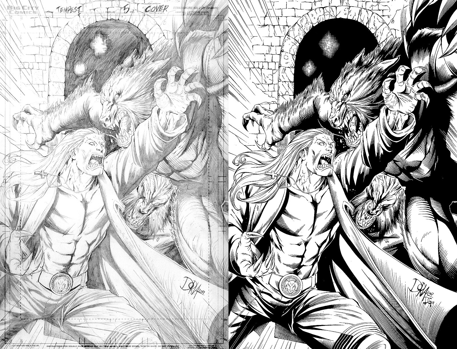
Tempest is copyright Big City Comics .
Related content
Comments: 59

mechangel2002 In reply to ??? [2010-10-21 08:29:12 +0000 UTC]

Thanks I used a brush for the smoke then another brush with white ink to dash in a small strokes (to help break it up a bit). The buildings in the background are all done with Rapidograph pens (this was before I got a better handle on my crow quill).

👍: 0 ⏩: 1

undead-medic In reply to mechangel2002 [2010-10-21 08:47:44 +0000 UTC]

Nice

👍: 0 ⏩: 0

AngeloftheInfernal [2009-03-09 21:53:06 +0000 UTC]

Great pencils. You really set the scene here. I get a slight feeling of 'another day at the office' for these guys.

👍: 0 ⏩: 1

mechangel2002 In reply to AngeloftheInfernal [2009-03-10 00:10:52 +0000 UTC]

Thanks but I'm the inker

👍: 0 ⏩: 0

MonkeyTheArtist [2008-09-16 02:46:35 +0000 UTC]

>.< Look at all those details!!! I adore you

👍: 0 ⏩: 1

mechangel2002 In reply to MonkeyTheArtist [2008-09-16 02:46:52 +0000 UTC]

Thanks

👍: 0 ⏩: 0

AenTheArtist [2008-07-08 21:42:52 +0000 UTC]

Beautiful inks and structuring: great work by the both of you!

👍: 0 ⏩: 1

mechangel2002 In reply to AenTheArtist [2008-07-08 22:05:19 +0000 UTC]

Thank you very much ^_^

👍: 0 ⏩: 0

RodTsumura [2008-06-14 07:52:53 +0000 UTC]

You did a great work over the MR.Doria pencils Diana-chan,simply awesome !

👍: 0 ⏩: 1

mechangel2002 In reply to RodTsumura [2008-06-14 09:24:19 +0000 UTC]

Thanks

👍: 0 ⏩: 1

RodTsumura In reply to mechangel2002 [2008-06-14 10:06:19 +0000 UTC]

Np hun !

👍: 0 ⏩: 0

sendmn23 [2008-06-04 17:05:36 +0000 UTC]

Wow! Your stuff has really tightened up since the last time I saw it. Its really clean. Good work D!

👍: 0 ⏩: 1

mechangel2002 In reply to sendmn23 [2008-06-04 17:58:03 +0000 UTC]

Damn right It's been a while!

👍: 0 ⏩: 0

FabianCobos [2008-05-23 12:05:39 +0000 UTC]

nice inking work, I like the blood efect..

👍: 0 ⏩: 1

mechangel2002 In reply to FabianCobos [2008-05-24 17:24:33 +0000 UTC]

Thanks I used a toothbrush for the spatter and a dry watercolor brush for the gore on the end of the arm

👍: 0 ⏩: 0

OPTIMUSEDD [2008-05-13 08:22:22 +0000 UTC]

I must say you line are exlemplary and have improoved a good deal since I first met you .

👍: 0 ⏩: 1

mechangel2002 In reply to OPTIMUSEDD [2008-05-13 08:46:16 +0000 UTC]

Awww thanks Hard to believe its been almost 2 years hey? Practice does an inker good

👍: 0 ⏩: 1

OPTIMUSEDD In reply to mechangel2002 [2008-05-13 21:07:31 +0000 UTC]

Well I'm aware of how muck ink you've been putting in, And it sure does.

👍: 0 ⏩: 0

Sebbythefreak [2008-04-18 02:30:43 +0000 UTC]

Awesome! I love the spatter and gore too!
Do you do the little dots with white ink?

It's not perfect, like the right guy's pocket looks disembodied (looks more like part of the sleeve) but I blame the source art, not your inking = P

👍: 0 ⏩: 1

mechangel2002 In reply to Sebbythefreak [2008-04-18 04:50:13 +0000 UTC]

Thanks

The white spatter on the black, and the black spatter along the metal vent thing that's sticking up on the ground was all done with toothbrush. The gore on the severed arm was drybrush.

Yeah I should've put in a few lines to show the hand bulging in the pocket lol.

👍: 0 ⏩: 0

NickSchley [2008-04-16 06:38:31 +0000 UTC]

this is a great page!

👍: 0 ⏩: 1

mechangel2002 In reply to NickSchley [2008-04-17 07:26:21 +0000 UTC]

Thanks Nick

👍: 0 ⏩: 0

omgCAM [2008-04-08 05:01:21 +0000 UTC]

I'm struggling my way through learning how to ink (I lose a lot of the original pencils in the process), but it's inking like this that gives me references I can use to build my technique.

Clean, crisp, and gorgeous lines. I also like how you do not feel the need to resort to uber-thick outlines to make your work stand out.

👍: 0 ⏩: 1

mechangel2002 In reply to omgCAM [2008-04-08 06:06:34 +0000 UTC]

Hmmm technically you're supposed to ink over the pencils anyways If you're afraid of ruining original pencils, you could buy separate art boards and print the pencils on them in a shade of blue called Non Photo Blue. Whatever leftover blue there is when the inks are done is easily removed in Photoshop (just scan in greyscale then adjust to get rid of the grey).

Thanks yeah only a few penciler's styles call for uber thick lines to pop the foreground out, but a good inker always knows when less is more

👍: 0 ⏩: 0

hodengai [2008-04-07 02:53:31 +0000 UTC]

I like the job you did on the inks it really enhances the scene. Spectacular job!

👍: 0 ⏩: 1

mechangel2002 In reply to hodengai [2008-04-07 03:59:48 +0000 UTC]

Thanks

👍: 0 ⏩: 0

MrGranger [2008-04-04 14:30:07 +0000 UTC]

Wow...that's great stuff.

👍: 0 ⏩: 1

mechangel2002 In reply to MrGranger [2008-04-06 07:27:39 +0000 UTC]

Thanks Shawn

👍: 0 ⏩: 0

gambitgirl [2008-03-20 04:46:20 +0000 UTC]

i love what you did with the 'open' end of that arm on the ground...

👍: 0 ⏩: 1

mechangel2002 In reply to gambitgirl [2008-03-20 05:38:02 +0000 UTC]

Thanks yeah it totally needed some gore!

👍: 0 ⏩: 1

gambitgirl In reply to mechangel2002 [2008-03-20 16:24:28 +0000 UTC]

of course.

👍: 0 ⏩: 0

TatsujinEdge [2008-03-19 10:44:50 +0000 UTC]

Wow great work on this one. I especially like the touch up ya did on the blood splatter makes it alot more dramatic

👍: 0 ⏩: 1

mechangel2002 In reply to TatsujinEdge [2008-03-20 07:30:25 +0000 UTC]

Thanks

👍: 0 ⏩: 0

g0st [2008-03-15 19:35:06 +0000 UTC]

great work, as usual! I like how you're balancing your blacks on this page, gradually getting heavier on either side as you move towards the major area of focus. You also clarified a few details, such as the smoke from the guy's cigarette, a few background elements, and the smog coming from the chimneys. I appreciate attention to detail, and not just robotic reproduction of someone else's linework. To me, that's where the art comes in: Conveying what you want to say, being clear about where you want the focus to be without losing any of the original information. Anyway, that's enough babble for now. Keep up the good work!

👍: 0 ⏩: 1

mechangel2002 In reply to g0st [2008-03-23 20:02:40 +0000 UTC]

Thanks Yeah with the background and everything I put a lot of work into keeping the depths of field separated. I also fixed the 5 different kinds of windows in the building on the left side of the background And added spatter and gore to the dismembered limbs XD

👍: 0 ⏩: 0

JoshTempleton [2008-03-14 13:09:41 +0000 UTC]

Great work!

👍: 0 ⏩: 1

mechangel2002 In reply to JoshTempleton [2008-03-21 16:22:59 +0000 UTC]

Thanks Josh

👍: 0 ⏩: 0

allynevp [2008-03-13 13:53:31 +0000 UTC]

Nice lines! OH MAH GOD, A HAND! @.@
BLEH BLEH hehehe XD

👍: 0 ⏩: 0

Robo-Bug [2008-03-11 12:43:37 +0000 UTC]

Very cool, Diana.

👍: 0 ⏩: 0

The1Blur [2008-03-09 16:48:04 +0000 UTC]

Sometimes i look at this stuff and i think.. How does she do it... its so crisp!

👍: 0 ⏩: 0

Speedslide [2008-03-08 10:15:34 +0000 UTC]

That's one awesome way to use a toothbrush... XD

👍: 0 ⏩: 0

SpiderGuile [2008-03-08 08:21:43 +0000 UTC]

Great inks!!!! I'm impressed!

👍: 0 ⏩: 0

ashigaru [2008-03-08 05:00:43 +0000 UTC]

sweet inks, love!

👍: 0 ⏩: 0

NuclearConvoy [2008-03-08 02:45:06 +0000 UTC]

The difference on this one is outstanding. Your inks are killer.

👍: 0 ⏩: 0

Wytherwing [2008-03-08 02:44:26 +0000 UTC]

very cool work!

looks like they're trying to figure out who's turn it is to clean up the mess...

👍: 0 ⏩: 0

Lomeloke [2008-03-08 02:02:50 +0000 UTC]

oh sweeet!

👍: 0 ⏩: 0

pixeltease [2008-03-08 01:40:08 +0000 UTC]

Beautiful inks! The details you add are awesome!

👍: 0 ⏩: 0

geezone [2008-03-08 01:38:58 +0000 UTC]

I really like how the pipe on the lower left came out, but the characters' faces seem different from pencil to inks. Not sure how I feel about that. Also like the fog transparency and how you tightened up a the pencils. Digging those shoes.

Odd, but I couldn't find Tempest at my local comic shop, but the Ronin Studios Hope Graphic novel was there, finally, today. Gonna pick that up when I get the chance.

👍: 0 ⏩: 0

Stigmartyr762 [2008-03-08 01:34:54 +0000 UTC]

Beautiful work, that certainly looks like juicy crime scene there!

👍: 0 ⏩: 0

chiachrome [2008-03-08 01:28:31 +0000 UTC]

you are so damned good at this. ^_^

👍: 0 ⏩: 0


| Next =>