HOME | DD
 mercurybird — Respectable Gents March tasks p1

Published: 2013-03-27 06:21:15 +0000 UTC; Views: 1562; Favourites: 27; Downloads: 5
Redirect to original
Description
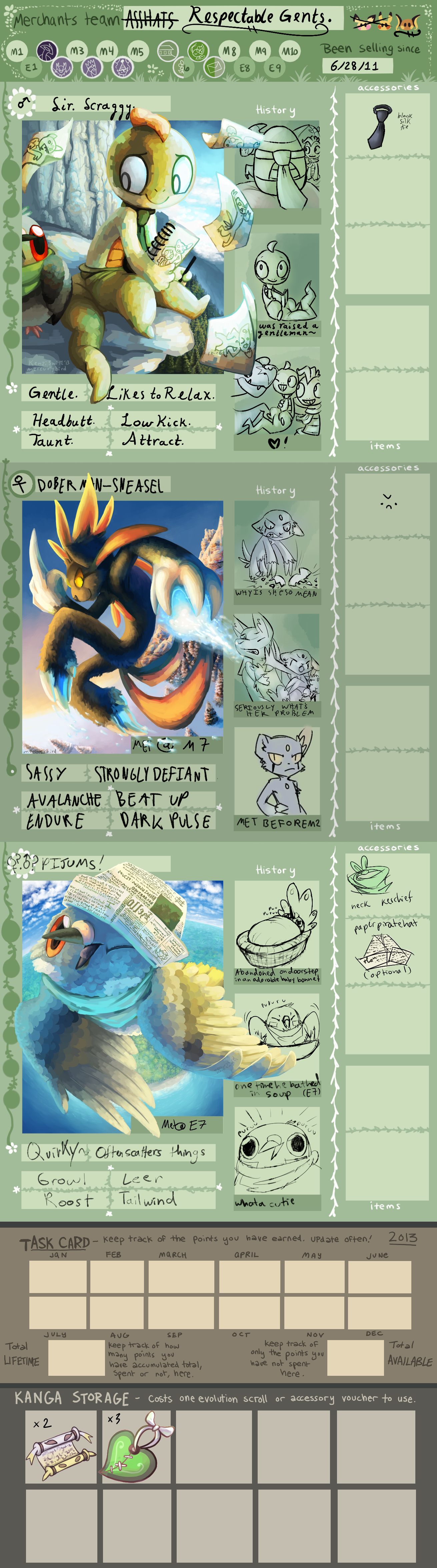
next >>Respectable Gents Team App
Team Tumblr ~ open for questions yo
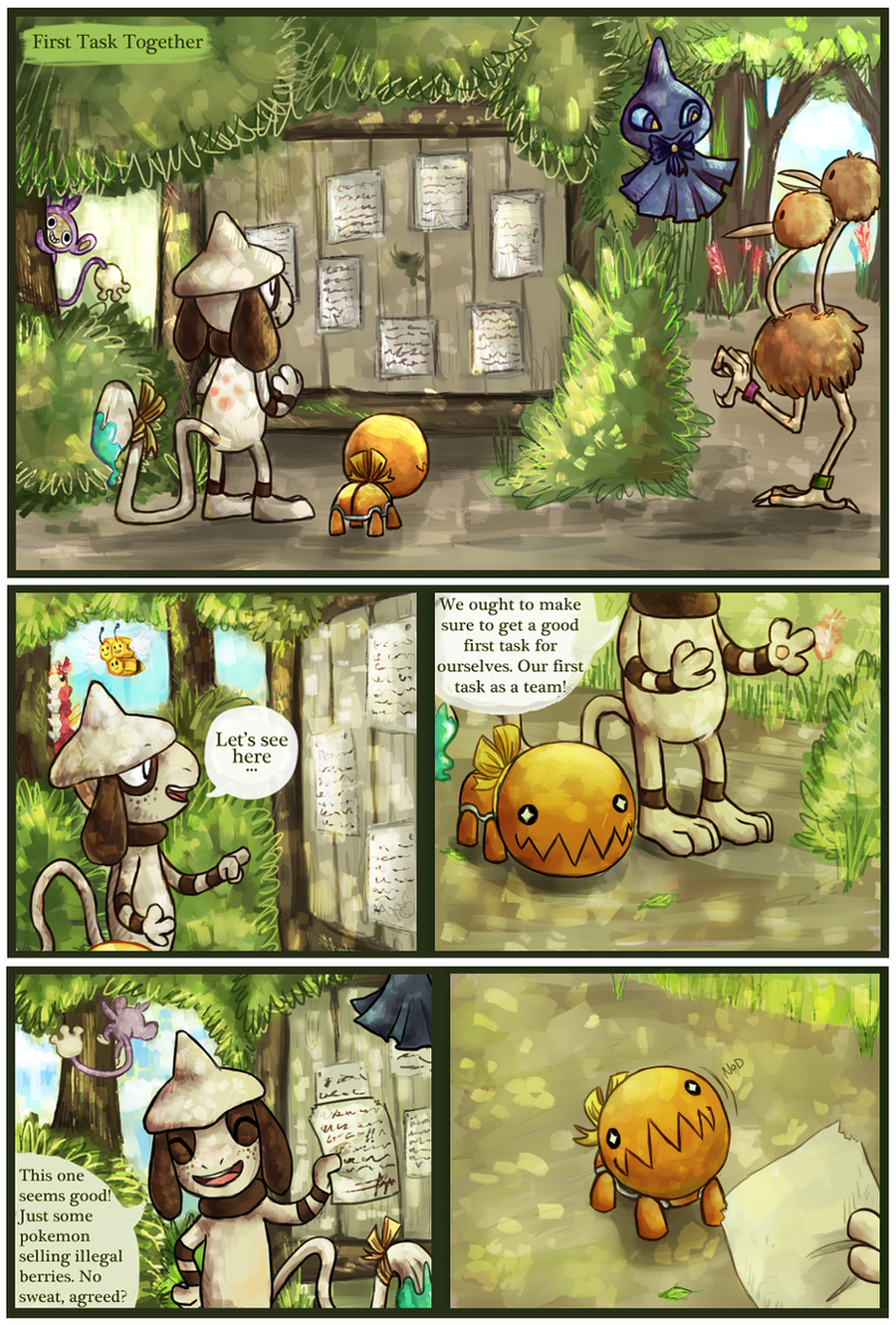
task: go pose for Bud so he can trim a hedge to look like you
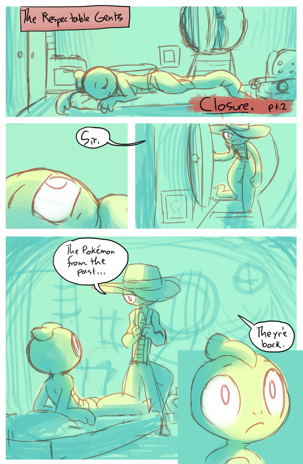
yaaaay
tried a new thing
downside: not enough color variety/contrast, hard to distinguish different shapes
upside: gjdfgjfdkgf omfg prettier than any comic I've ever made
thoughts????
edit; quickly decided to make a few little changes to make it clearer. thanks to Spike and Uruboros for the input. *u* to see the original version if you're curious, click here: [link]
another edit: added sir and pijums into one panel; wasn't sure if the sequence of events was clear so.
also I know I switched the colors of the roselia's flowers in one panel. too lazy to fix tbh
Related content


Comments: 12

It looks sunny and fun, like a brisk spring morning.
👍: 0 ⏩: 1

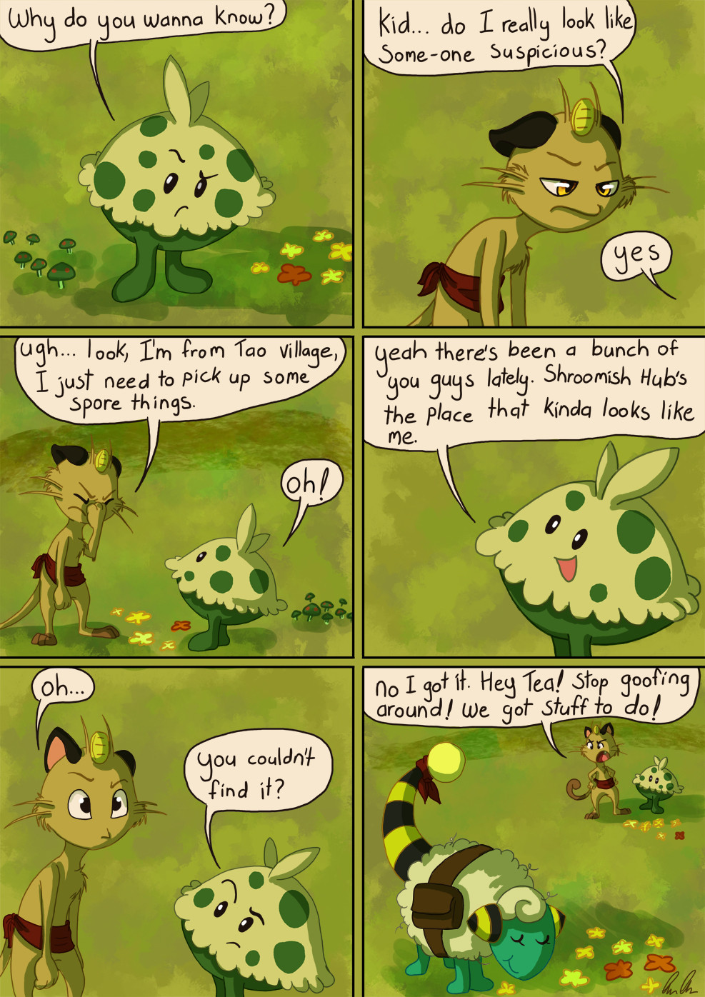
perfect contrast for the upcoming mission 8 past weheheheheh
👍: 0 ⏩: 0

dsgkdfkjgdfkgf this style. Is very cute and eeeee <333 Great job Mercury uvu
👍: 0 ⏩: 0

It will be the most respectable gentlemen hedge in the entire garden :3
👍: 0 ⏩: 1
if only things had gone quite according to plan. vwv welp now I guess it ended up just being the cutest hedge in the garden? good 'nough
👍: 0 ⏩: 1
Mmmm yep :3 I'd say that's just fine
👍: 0 ⏩: 0

It looks great but I guess what needs work is on refining the colors to better define things and give them more contrast and depth.
👍: 0 ⏩: 1
I think using more layers would've helped :] allow me to separate out colors a bit more. thanks for the input!
👍: 0 ⏩: 0

it is hard to tell whats going on, and the softness makes the paneling suffer a but, but yeah, you're right this DOES look gorgeous!
👍: 0 ⏩: 1
I think I'll have to slow down and lay out flat colors a little better so the end colors come out more distinct xP good learning experience tho!
👍: 0 ⏩: 1
maybe being a bit bolder with your shadows would help too. I notice that your darkest values are only in small places in most of these. But what do I know? haha
👍: 0 ⏩: 1
oooh that's a good point, almost everything is pretty medium-valued hmmMMMMmmm
👍: 0 ⏩: 0