HOME | DD
 MetaKnuckles — Doomsday v2
Published: 2014-04-22 00:40:11 +0000 UTC; Views: 1157; Favourites: 80; Downloads: 5
Redirect to original
Description
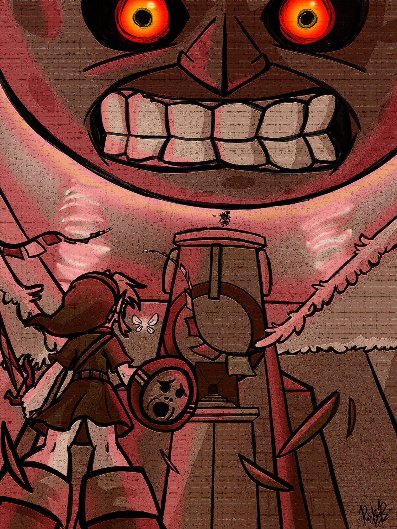
I was tryin' to redraw this piece from 2012, and I think I improved upon it a little! What do you think?Related content


Comments: 10

The scratch marks around the moon and the sprials leading up to it are completely unnecessary & just look sloppy. More variation in the lineart would be nice as well to maybe help differentiate what is close or far in this awesome perspective.
The colors are an incredible improvement however compared to the old version & the cleaner, tighter look does add to the quality of this piece.
👍: 0 ⏩: 0

You've made that moon creepier.
It reminds me of that "Game Theory" episode where it was pointed out that everyone would already be dead way before the moon even got this close.
I'm glad I didn't view this at night.
👍: 0 ⏩: 0

It's definitely an improvement on the technical side of things, but I'm not sure that I like it better.
I guess they're both good for different reasons. This one is great because it does have a sense of urgency and the linework and colours are really great and it almost looks like official art. Like, if Young Link were announced for the new Smash game, this would be his big poster thing on the website.
On the other hand, the previous version has more of a surreal and foreboding feeling to it that I really like. Everything is just fuzzy grey shapes, but they're still clear enough to make out and it feels like the buildings are being crushed under the moon's gravity. I also feel like Link has more presence in the older version than in the newer one because he's this black silhouette in the foreground of an otherwise grey landscape. Here, he's just another part of the scenery. Although the angle does make it seem like he's confronting the moon, which is cool, I still prefer the other one.
Either way, it's really good!
 (Smile)")
👍: 0 ⏩: 1

I think you raise some good points! There is some stuff that I lost in the transition, but I just wanted to try something a little different. But I think you're right that it paid off in some areas and not so much in others.
And thanks!
👍: 0 ⏩: 0


I'm split both ways. I like the overall coloring/line art/etc on this one, but I liked the stark black/white/gray of the original, given how creepy and dark Termina is. The moon looks much closer in this one, which fits if it's truly the Final Day, and it's face is alot better than the original.
Also, just wondering if it's a curious coincidence, but those swirly winds -- was that inspired from when Meteor is about to crash into Midgar? Because holy wow, I thought of that instantly when I saw them.
All in all, I definitely approve!
👍: 0 ⏩: 1
That was the inspiration for the little tornado dealies, yes! Good eye!
And thanks for the feedback! I do kind of miss the black and white, but, I wanted to try something a little more... I dunno, at first, I wanted it to be entirely in black and white EXCEPT for the moon's eyes? But I ended up just kind of casting everything in this sort of reddish glow - I think I just really wanted to push the "doomsday" idea.
Thanks again man!
👍: 0 ⏩: 0

Noticeable improvements, aye! More confident lines, great colors.
👍: 0 ⏩: 1
