HOME | DD
 Metroversal — Windows 10 - Ribbon

#metro #awesome #concept #explorer #microsoft #mockup #ribbon #windows10 #metroversal
Published: 2015-02-23 02:06:11 +0000 UTC; Views: 48666; Favourites: 152; Downloads: 2293
Redirect to original
Description
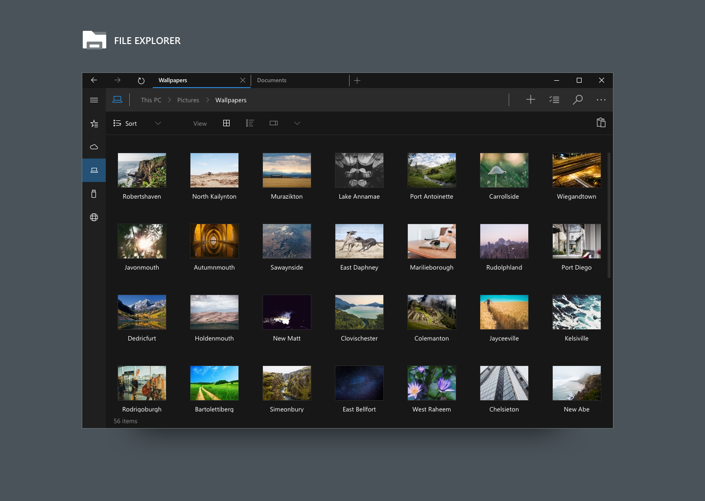
Since Microsoft is listening to feedbacks I decided to try to contribute with some mockups. I hope that it will come to their attentionWhat's new:
- Universal app (check phone version here: fav.me/d8l17id )
- Transparency (optional - customizable opacity level)
- New icons (Office 2013 flat style)
- File Explorer Overhaul
- File Explorer Tabs support
- File Explorer Split View (not in this mockup)
- Ribbon UI
If you want to see this in Windows 10 please add 3 votes on UserVoice:
windows.uservoice.com/forums/2…
Related content


Comments: 60


Okay, so what now? Is there no way to make a program that would allow for this theme? I've read on the dark themed version that there are people willing to do this for free. Why does this have to go through M$?
If there's not much hope, is there something akin to this that is available? The dark-themed version is EXACTLY what I want. :/ ")
Is there nothing we can do?

👍: 0 ⏩: 0

At the right corner you must even keep the details panel
👍: 0 ⏩: 0

That looks really cool, though access was denied when I tried to follow your link.
👍: 0 ⏩: 0

as an optional UWP app it's not bad, but as a total replacement for Explorer (i.e. removing the Win32 explorer in the process) it's dangerous. The UI is "UWP-sized", with massive titlebar/addressbar and ribbon buttons, yet the ribbon is just a single Mail-style menubar with only a few options. The back/forward/dropdown/up controls don't belong in the navbar; that's bad design choice as their horizontal layout makes them appear to be controls which affect the navbar rather than the content panel. Likewise, if you make the window narrower and don't force them to shift out of the navbar (creating a UI inconsistency) then you'll lose access to them behind the navbar menu. The standard navbar isn't resizeable either; you can only open and close it.
Microsoft cannot replace Explorer until they've implemented input device adaptability, so that we don't lose screen real-estate or functionality for the sake of touch-friendliness on touchscreens we don't have.
👍: 0 ⏩: 1

Really interesting feedback, thank you!
Please note taht this mockup is 1+ year old, the new one is totally different, hope to share it sometime after this year //Build/ event
 (Smile)")
")
👍: 0 ⏩: 0

How to download this theme? Link which you write dont exist.
👍: 0 ⏩: 0

looks very elegant and beautiful
I would love to see this on windows
👍: 0 ⏩: 0


I would love to see this in Windows 10. It's about time they changed the file explorer. Give it a fresh look
👍: 0 ⏩: 0

Here you go: fav.me/d8jpy75
👍: 0 ⏩: 0

How do you makes these things? Photoshop? It looks very nice.
👍: 0 ⏩: 1
Yes, made with Photoshop! Thank you so much
👍: 0 ⏩: 0

This is what would be great in Windows 10. Hopefully Microsoft listen to what people wan´t in this version. Get rid of the old 90´s and bring in the new
👍: 0 ⏩: 1

Yea, the Windows 10 Explorer looks horrible right now!
Your design concept looks really awesome!
Also I think your concept dovetails nicely with Windows 10 design language.
Your concept is the future of Windows 10. I genuinely hope that Microsoft choose your design.
Great Job!
👍: 0 ⏩: 1
Danke my friend!
Well I hope so, I think Microsoft should do the exact same thing as with Project Spartan. I mean, they keep the old Internet Explorer but Project Spartan will be the default browser.
The same thing should be for File Explorer, it's ok to keep the old one but they should try to set a "modern" version as default.
👍: 0 ⏩: 1
I can only agree with that!
👍: 0 ⏩: 0

Thanks! Glad you like it
👍: 0 ⏩: 0


It´s absolutely brilliant. Incredible the quality of your work.
👍: 0 ⏩: 0


I've given you 3 votes on UserVoice because your concept is the one that is the closest to my ideal concept...
👍: 0 ⏩: 1

Wow! I like this one. Only thing I would change, as a concession to "power" users, is there needs to be a full path string to the directory that you can edit, cut and paste from. Perhaps an option to switch from iconographic path to a regular text string. Up arrow always allows you to return to the parent directory and down is easily chosen from within the directory.
👍: 0 ⏩: 1
Absolutely! The ability to edit the path string is vital.
Of course I didn't show how to do that... but it's something I've already thought about
")
👍: 0 ⏩: 1
I'd just turn that section white and put the path string in there with a (blinking) cursor, maybe some hilighted text to show it can be done. I gave you some votes over on uservoice. I'm a Windows 10 preview user and I regularly complain about their file exploder. ^_^
👍: 0 ⏩: 0
Hum it's a similar idea to mine... Except that my design is much weirder.
👍: 0 ⏩: 0


Microsoft must see this Project, incredible. I have given 3 votes but perfectly could give them all if I could. Awesome.
👍: 0 ⏩: 0

needs a bit more color on the icons to the left tree, and would look nicer than any other concept. i hate going backwards to black and grays, this is not the 70s we have full hd monitors and 4k resolution for COLORS.
Microsoft should stop copying the ugly gray design ideas of iOS.-
👍: 0 ⏩: 0

These look awesome... Let's hope that Microsoft actually sees them
👍: 0 ⏩: 0

I think these are great, they look really sleek and ultra modern, micro$oft should take a leaf from your book. I saw your comment on the verge earlier today, about that horrible new recycle bin icon, what a coincidence I found you here too! I gave you 3 votes on uservoice if that helps
👍: 0 ⏩: 1
Yeah, current Windows 10 icons are quite disappointing I must say. I really hope they change their minds!
Thank you so much for the 3 votes!

👍: 0 ⏩: 1
Your welcome! if the final thing actually looked like this it would be great  (Wink)")
👍: 0 ⏩: 0

Tt needs to have lot of votes on UserVoice before they even take it into consideration.
Users from all over the world have been incredible so far!

👍: 0 ⏩: 0

it's a slightly edited version of this one: sushibooy.deviantart.com/art/P…
👍: 0 ⏩: 1
| Next =>