HOME | DD
 MichaelFaber — Abstract Forces
Published: 2006-09-27 02:25:11 +0000 UTC; Views: 994; Favourites: 26; Downloads: 7
Redirect to original
Description
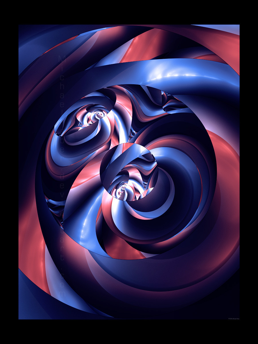
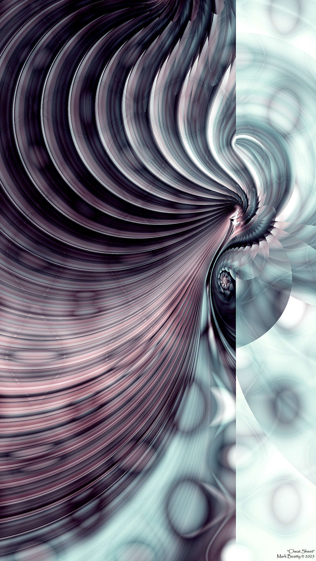
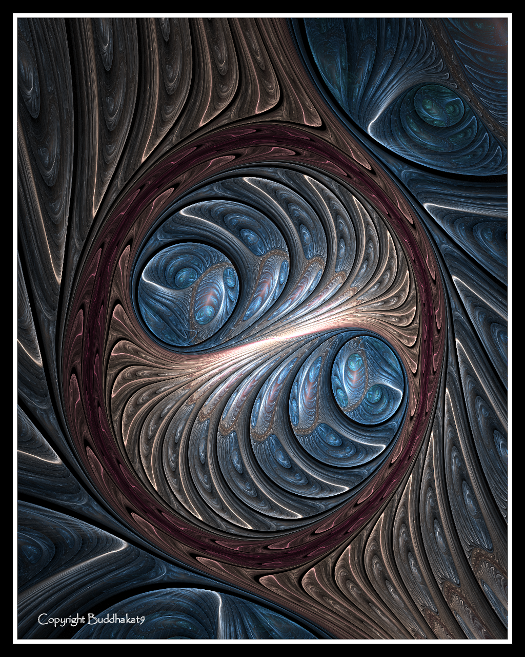
Apophysis 2.05RC1 and PSCS2A little more abstract than i usually do. Let me know what you think.
Related content


Comments: 32

This is so SMOOTH omg gorgeous and i always love your use of color hun stunning
👍: 0 ⏩: 0

that's pretty cool. it is different form your style, but it's still really cool. i love the smoothness of the colours
👍: 0 ⏩: 1

")

The surrealist aspect of this is quite, well...surreal.
Great work on the design it really looks amazing.
The colors are hit or miss, honestly. I think that maybe more brighter colors would be more widely appreciated or accepted, but since i'm weird and like dark colors, I have to say I like it as-is.

👍: 0 ⏩: 0


anothet trick from the master.
awesome
another 
👍: 0 ⏩: 0

Your production looks more and more like it was done with UltraFractal  (Smile)")

👍: 0 ⏩: 0

Very cool abstract. I like the design and colors, but don't like the black frame. The image have enough dark shadows.
👍: 0 ⏩: 1

Thanks for the input Pakar! The next one's got no boarder
👍: 0 ⏩: 0


I don't really like it. The colors almost clash, and it does hurt my eyes. I think this same effect with complementary colors would be just the ticket.
👍: 0 ⏩: 1
You're welcome. Sorry I couldn't say "Wow it's amazing love it" and the whole deal.
👍: 0 ⏩: 0

I think the colours work excellently together to make this abstract fractal look like a 3D masterpiece 
👍: 0 ⏩: 0

The overlapped circles and the way the design changes in them makes for a great deal of interest in this. I like the incredibly solid look and the variations in the light. Visually satisfying and very different image.
👍: 0 ⏩: 1
Thanks for the comment again Kat!
👍: 0 ⏩: 1


i really like this one. it seems different to me than your other ones. good job
👍: 0 ⏩: 1
yup, trying some other variations
👍: 0 ⏩: 0

I don't like it.
No, I'm kidding, it's awesome. I just wanted to post that on one of your works for a change.
👍: 0 ⏩: 1
i guess i deserve that once in a while.
I'm glad you do like it
Go ahead and hate the final transform though. there isn't one.
👍: 0 ⏩: 1
One of these days you'll post something that's just awful.
Cool! I thought it looked like rings2 final transform.

👍: 0 ⏩: 0

i liked the 3d effect it has and the "plastic" texture gives a nice effect too ^^ very nice

👍: 0 ⏩: 0
