HOME | DD
 MichaelHoweArts — Red and Blue

Published: 2012-12-23 03:16:44 +0000 UTC; Views: 512; Favourites: 10; Downloads: 9
Redirect to original
Description
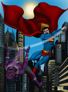
Superman and Spider-Man fan art done as a Christmas present for a pair of friends - she likes Spider-Man and he likes Superman.For Superman I tried to combine the cool slightly-more-alien parts of his New 52 costume with the power and dignity Alex Ross gives him.
Related content
Comments: 12

I can! Though i actually have to charge for them.
👍: 0 ⏩: 1

Heres the link to my journal with some prices. Message me your thoughts on what you want.
👍: 0 ⏩: 1

Can you do a amalgam? Like a combo of a Marvel/DC character. Superman/Spider-Man vs a combined Doomsday/Venom. Also could the "Super Spider" costume look like this design?batdude727.deviantart.com/art/…
👍: 0 ⏩: 1

Thats possible. Check with that artist that he'd be fine with that.
👍: 0 ⏩: 1

I tried. I think he's inactive.
👍: 0 ⏩: 1

Yeah. I tried MULTILPLE times. Ever a year apart from the last one.
👍: 0 ⏩: 1

Bit too stiff on the characters, Spidey's not bad but that Superman looks like a waxwork. Watch yourself relax in a mirror, note the lines and the way you're not stiff and 'hard' when you are doing so.
👍: 0 ⏩: 0

looking good! you may how ever want to work on your back ground and perspective. the building to the left look a little funny because the top line should be parallel just like the one behind you characters. This is not criticizer the piece but a way to help you grow and become a better artist. You may want to try and play with the placement of you focal point so that the viewers eye keeps moving threw out the piece and make it a complete in a sense story. example: [link]
here you see the two charters in front but your eye goes to the back the wall and you get a little bit of an in site to the charters so you go back to the charters in front and back and forth hence keeping the viewer on your page longer.
Love Ya!
👍: 0 ⏩: 0


