HOME | DD
 michaelspitz — Blink Chocolate
Published: 2009-08-19 04:47:09 +0000 UTC; Views: 1689; Favourites: 21; Downloads: 36
Redirect to original
Description
-Related content


Comments: 5

'Blink' looks awesome indeed, i agre with ~fishmellons about the 'chocolate'.
👍: 0 ⏩: 1

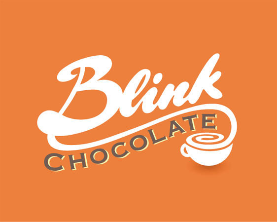
I really like this one the smooth typeface for blink. The only thing that I don't think looks quite right is "chocolate" while typing this i followed the link and i think it has summed up what I think it is on the colour version you have the brown letters with the white "backing" I like the one that is all black so maybe a all white one? just a idea. I also like the colour is a bright but yet also soft to the eye I can't describe.
Good job!
 (Smile) - :)")
👍: 0 ⏩: 1

Thanks a lot for the breakdown! For the 'Blink' piece, the type is fully hand-drawn > As for the 'chocolate' line, it's modified Copperplate. Getting the two styles to match has honestly been a struggle from the get go, and I've worked with multiple versions. (Including the all white like you mentioned, but I guess I don't have any comps floating around?) At this point I think I'm fairly settled on it, but I always have that sneaky feeling that one day a better solution might present itself...  (Wink) - ;)")
👍: 0 ⏩: 0