HOME | DD
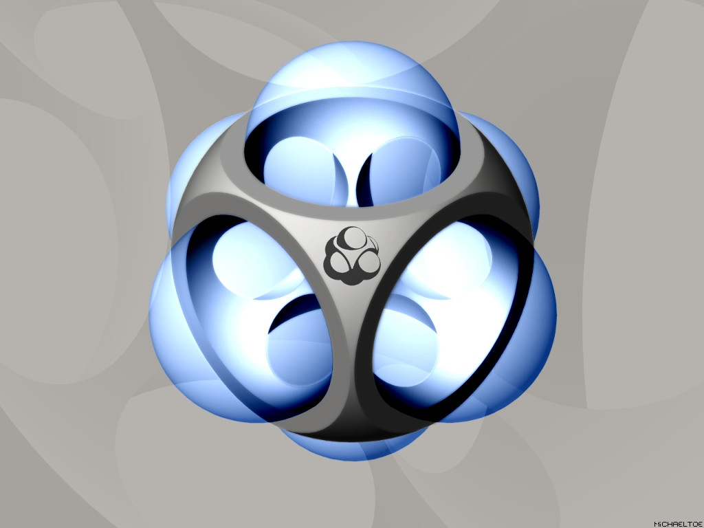
 michaeltoe — The Market

Published: 2002-08-02 10:41:06 +0000 UTC; Views: 834; Favourites: 1; Downloads: 74
Redirect to original
Description
If you don't like this wallpaper, there's something wrong with you.I'm very serious about that.
I am.
Related content


Comments: 20


sweet. this means snake eyes every roll.
very clean. I like it. but my current computer layout revolves around a darkish blue/dark teal color.
👍: 0 ⏩: 0

ok my comment got fucked up everyone i tried to do a frowny and it chopped my comment in to
the long and short of it is:
Great job, i like your work, its just my taste
👍: 0 ⏩: 0

Speaking on the behalf of the (currently 161) other people who looked at it and didn't comment...
I don't like it, maybe if the gradients were done better, and not so obviously dithered, it would be better. But as it stands, it's bland - sorry.
(I'll leave my vote null, so I don't tank your average.)
👍: 0 ⏩: 0

what's the point of a die with the same sides... at least put light on the statement you want to make...
besides... it was done very well. i like the simplicity. and red is one of my two favorite colors.
👍: 0 ⏩: 0


I agree with crypticbebop, this would be really neat if it was dice sided with more than just 1 symbol per side. Good wallpaper though/
👍: 0 ⏩: 0


reminds me of target i wonder why
nice job. i dig it's minimalism
👍: 0 ⏩: 0

What's not to like? Smooth and deadly, my man.
and is supposed to be The Marker?
👍: 0 ⏩: 0

i dont get the title, it doesnt match the wallpaper at all.
its hypnotizing....
good job...
👍: 0 ⏩: 0


Sooo... When're these prints going to come out? I'm certain they'd look good at work... wait, never mind, I'm not spending money on the place I work, wtf am I, a moron? Pthhhbt, it's still nice and smooth, but I was hoping for target symboled dice sides, like 4 symbols, and ect.
👍: 0 ⏩: 0


hey's that is pretty fucking cool.. i might use it. great job.. TARGET!
👍: 0 ⏩: 0
