HOME | DD
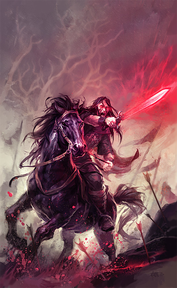
 michalivan — The Sword of Radhost
Published: 2010-07-03 10:19:44 +0000 UTC; Views: 60214; Favourites: 2160; Downloads: 1956
Redirect to original
Description
Hi Guys !This is a cover I just finished. It's for a re-edition of fantasy novels I did covers for about six years ago (my first ones). So this is actually new version of this cover: [link]
This is one of the first images I've been doing after Berlin Made Symposium where I had my portfolio reviewed by Marko Djurdjevic, Coro and Esad Ribic. They gave me a lot of useful critique. So I'm trying to develop my illustrating abilities. I'm trying to use less effects and concentrate more on the painting, composition and anatomy. Hopefully in some time I'll get better and faster. Looking forward on this road, but it'll be a hard one
 (Smile)")
Hope you’ll like the image. I may change something after some time (it’s too fresh now to see all the mistakes). If there is something you don’t like please tell me.
Thanks!
edit: I edited the picture a liitle, corrected proportions of the rider, gave it a little different crop etc. thanks, for the comments and crits!
Related content


Comments: 111

i don't like those half trees on the background and i think that if you want more movement then you should of blurred some small parts
overall it's better then the v1 of it and it's very nice.
👍: 0 ⏩: 0

")


I really like your style, "dirty lines" that give an awesome result. That drawing in particular, kick ass. Has a special place in my faves
👍: 0 ⏩: 0


cool picture.
the newer one has definitely more action in it. while the older gives us the bigger picture..
like old and new cinematography - an old film has a more steady cam, while a new one has these fast cuts - always close range.
as a picture this is cool, as a motion picture it can easily be too much.
👍: 0 ⏩: 0


The horse looks more pissed off than the rider, this is so awesome.
👍: 0 ⏩: 1

XD
exacly the words i've serched for!
👍: 0 ⏩: 0

The expression on the horse's face is great! But, i'm wondering where all the blood came from? I'd like to see some corpses!
👍: 0 ⏩: 0

for sure, that's one of your best pieces so far Michal ! But you were already doing excellent art before anyway
 (Wink)")
👍: 0 ⏩: 1

Thanks a lot J.S.! I really appreciate you like it. And thank you for participating on MADE. It was a great inspiration, gave me new fresh energy to work.
Keep the great work you are doing, I'm still looking forward on new stuff
👍: 0 ⏩: 0

I think it's excellent. The horse is very wonderful!
👍: 0 ⏩: 0


Horse form this one is definitely better - looks more dynamic. But I like better this older worlock - he looks more natural.
👍: 0 ⏩: 0

Very nice as usual, I love the tones of colors you used.
👍: 0 ⏩: 0


Fuha
Paradne si sa vyhral s farbami...
A nepamatam sa kedy naposledy sa mi dakde pacila ruzova... ale teraz sa mi tu naozaj paci
👍: 0 ⏩: 0


Wow, this is incredible! I'm not even sure where to begin. Well, the composition is fantastic. I seriously need to learn how to do stuff like this. I love the colors and your style of painting as well.
I think if there's one thing that could be a bit better, it would be the eyes. Cover up the mouth, and there's not a whole lot of emotion left in the face. So maybe, I dunno...make the eyes wider and the eyebrows more slanted or something. But anyway, completely awesome work!
👍: 0 ⏩: 0

Úžasný... Ale v noci bych Rogana teda potkat nechtěla...
👍: 0 ⏩: 0


Hey man, your stuff always blows me away, it is very particular. So they say with art that you never reach "the top"; but you can get pretty far ahead.
👍: 0 ⏩: 0


As always, so beautiful colors and perfect dynamic for an fascinating scene taking place in the sword and sorcery tradition...
👍: 0 ⏩: 0


Astounding on a whole, I think the blood spray is the most impressive aspect of the piece. I suspect the two red arrows near the front may wind up being edited later on.
👍: 0 ⏩: 0


Omg dude this is awesome !!!!
the face the sword the horse its all so great .
Amazing job .
👍: 0 ⏩: 0
Omg dude this is awesome !!!!
the face the sword the horse its all so great .
Amazing job .
👍: 0 ⏩: 0

Wow, I can already see the improvements! They're great!
👍: 0 ⏩: 0

omg, the composition is so amazing, and the brushstrokes are so simple, really awesome.
horses are not the easiest thing to do, and you've done it very well
👍: 0 ⏩: 0


my god that looks awesome man 
👍: 0 ⏩: 0


wow, first version was good, but this has so much more punch!
👍: 0 ⏩: 0


new version really kicks ass!!
if you have some adivce for me pleas visit my gallery
cheers !!
👍: 0 ⏩: 0
| Next =>