HOME | DD
 michalivan — demon sanctuary

Published: 2010-07-28 15:53:12 +0000 UTC; Views: 45769; Favourites: 1091; Downloads: 1309
Redirect to original
Description
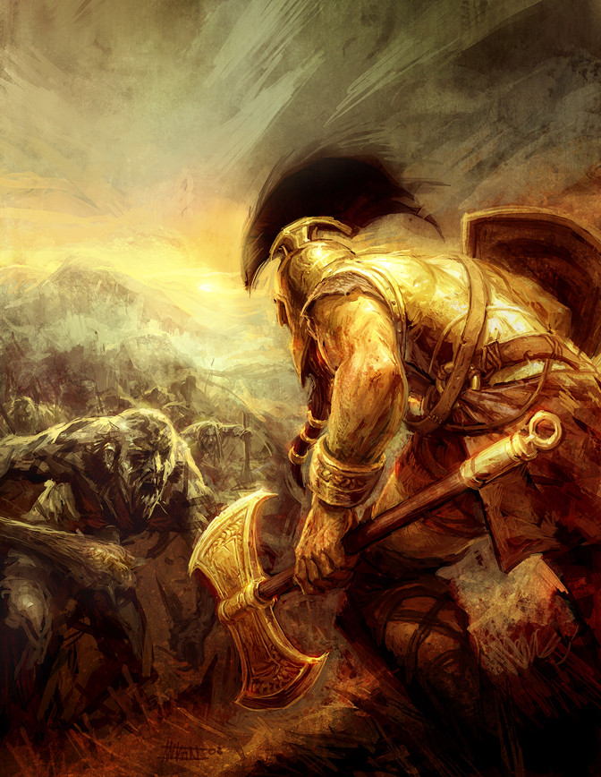
This is a cover for a local book about Conan I just finished.Done in Photoshop
(I posted it earlier, but after short time and after feedbackI deleted it, to correct it, this version is much better-sorry for that)
edit: I changed conans face a little after useful crit. from Merlkir- thanks a lot!
Related content


Comments: 58


Nice, the female-character is looking sharp aswell  (Smile)")
👍: 0 ⏩: 0


Wow, nice work!
If you're interested, Radical Publishing is running an art contest right now; the winner's art will be published in an upcoming Radical trade. There's more information on our dA page or at this [link]
👍: 0 ⏩: 0


Anything that reminds me of Frank Frazetta makes me smile. The reason this reminds me of his oils is the spot on anatomy, the pose, the composition and the textures. Great job.
👍: 1 ⏩: 0
 (Wink)")


Excellent work! Reminded me a bit more of Kull then Conan. Should do great for the book.
👍: 0 ⏩: 0


whoa it look im looking at my fav pc game Ice windale ")
👍: 0 ⏩: 0


*starts singing the conan cartoons song*
i like the way the blood pops out of his axe
👍: 0 ⏩: 0


I love this! It has to many layers, it almost looks cinematic. <3
👍: 0 ⏩: 0

This is amazing work - I would have liked a bigger axe - but thats's me
👍: 0 ⏩: 0


the contrast on conans upper half really brings it out a lot. good stuff ")
👍: 0 ⏩: 1


Looks geat especially the shine effects on the axe .
Weird question but how do you make your blood look so ........liquidy ???
👍: 0 ⏩: 0

I am a huge Conan fanatic. I was hooked on that cartoon Conan The Adventurer. I read all the books. I have to read this one.
👍: 0 ⏩: 0


If you will not hear me...
THEN TO HELL WITH YOU GROM!
👍: 0 ⏩: 0

I just love the axe...it's design is impressive!
👍: 0 ⏩: 0

Rozhodne ovela ovela lepsie ako tie priserne Conan I-III obalky od Dubnickeho...
👍: 0 ⏩: 0


Thanks a lot man! appreciate it
👍: 0 ⏩: 0

Líbí se mi, že co přidáš novou ilustraci, vždycky je lepší než ta předtím a je v ní mnohem víc příběhu a kvalitní kompozice. Hodně se mi tu líbí ta žena, zjednodušení a zkratky v anatomii fungují výborně a póza jasně ukazuje její úmysl a náladu.
Jestli můžu trošku kritiku - Conanův obličej by mohl být lepší. Je v něm hodně ostrých a špičatých tvarů a i když má působit zuřivě, vypadá trochu žensky. Možná je to i tím, že je hodně jiný než jak ho maluje většina lidí kopírujících Frazettu - tzn. široká tupá brada, ostré rty, malý nos a rovná ofina. Tenhle má ty obličejové proporce mnohem normálnější. Není to špatné, ale ne úplně Conanovské (pro mě).
Ještě maličkost - to svítící rameno pěkně vede pozornost od blyštící se sekery ke slečně v pozadí, ale Conanův obličej tím trochu zaniká. Na druhou stranu to dost dobře vyvažují tmavé vlasy a dělají i dost kontrast s obličejem, takže je to ok.
👍: 0 ⏩: 1
diky som rad ze sa ti zdaju lepsie. snazim sa teraz co najviac skillovat.
a diky moc aj za kritiku,upravil som trochu ten face, dufam ze je to lepsie.
Inak mas super veci. Videl som ilustracie k DD2 a je to fakt kvalita, dobra praca. Ked budem mat viac casu pozriem si podrobnejsie tvoju galeriu aj necham comenty
👍: 0 ⏩: 1
Oo, bomba, díky!
Obličej vypadá mnohem líp.

👍: 0 ⏩: 0

| Next =>