HOME | DD
 michalivan — falling_down_on_me

Published: 2008-02-02 21:00:11 +0000 UTC; Views: 20392; Favourites: 561; Downloads: 715
Redirect to original
Description
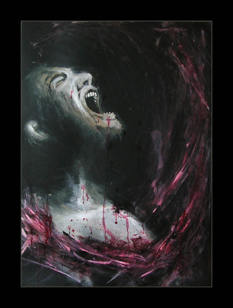
This is a CD cover for Slovak punk'n'roll band I just finished. Tey wanted something similar like my shards picture ([link] ) but with rocks, this is what came out. I just finished the picture so later I might change something.It's Photoshop over pencil drawing
Thanks for watching!
Edit: I did some minor changes on the guys back and toned down the stomach a little, thanks for the crit. rose-walker and ThaHellion
Related content


Comments: 47

This is pretty goddamn cool. Have you thought of putting the pencil drawing up?
👍: 0 ⏩: 0


Очень интересный эффект, хорошая композиция и цвет .
👍: 0 ⏩: 0


")


in the news --> 'AWAY FROM THE FLOCK' --> [link]
HOPE YOU LIKE IT (:


👍: 0 ⏩: 0


Very nice work and it reflects exactly the way I feel right now!!!!
👍: 0 ⏩: 1

thanks, it's not good to feel that way but it happens, but good times are comming
👍: 0 ⏩: 0

This is SO great.
Seems like you illustrated my life!
Wish I could buy a print.
👍: 0 ⏩: 0


your beautiful work has been featured in my journal: [link]

👍: 0 ⏩: 1


great energy and texture. I love the line work you've incorporated as well.
👍: 0 ⏩: 0

Ouch, that'll definitely hurt !!! Very emotional piece
👍: 0 ⏩: 0

Hi
I have featured this deviation in my journal as a thumbnail because I like it and want my watchers to see it.
If you object to your work being displayed in this manor - I have every respect for you and will remove it as soon as I receive a note from you asking me to remove it.
Keep up the really great work.
Andy
👍: 0 ⏩: 0


Hah!! Yes!!! The rocks will crush his body like old cheez!! Bwa-ha-ha-ha-ha-ha!!!!!!!!!!!! Very nice by the way.
👍: 0 ⏩: 0

Absolutely amazing.
The textures, and everything are flawless.
Good work.
👍: 0 ⏩: 0


great stuff, bristling with the vibration of each falling rock
👍: 0 ⏩: 0


great style, like you could feel the energy in your lines.
and the way those stone, make him go for cover, very strong image.
+fav
👍: 0 ⏩: 0


I really like this new style. Don't take my not adding this to favorites as a sign that I don't like it, I merely find the body to be at a very awkward position.
I think that the color selection was phenomenal. I also think that they outlines you did on some of the rocks make them pop. The contrast makes it seem truly artistic without losing value due to outlines. I also believe that if you had made the stomach slightly darker or duller that you could have made it look much more pleasing. The change in darkness in the background also gives it a certain feel, I just can't quite describe it. Good example is how it gets dark near the legs and then there is like a lighter circle around the legs.
👍: 0 ⏩: 1
Thanks for the crit. You were right with the stomach , I edited the picture and made the stomach a bit duller. I think it looks better, thanks!
👍: 0 ⏩: 1
No problem man. Thanks for listening and taking the crit.
👍: 0 ⏩: 0


very nice! powerfull indeed!
only thing bother me a teeny bit - the lines on the guy's back and hands seem to be a bit too much.. i mean - it loses the grungy feel, and just slides a bit into looking too... unfinished, imho....
maybe it's just me - but i think that a bit cleaner look would keep the attention on the guy, and not the contour lines...

👍: 0 ⏩: 1
thanks very much for the crit. I know what you mean, I wanted to keep it sketchy, although the are on the back and hands might be too much. Right now I did some minor changes there, I think I'll keep it like it is for now. Next time I do picture with this technique I'll keep in mind not to do it too sketchy  (Smile)")
👍: 0 ⏩: 1


")

Wow! great colors.
These days, winter days, i can totaly feel this guy.
👍: 0 ⏩: 0