HOME | DD
 michalivan — horns
Published: 2008-12-21 22:10:34 +0000 UTC; Views: 17974; Favourites: 389; Downloads: 644
Redirect to original
Description
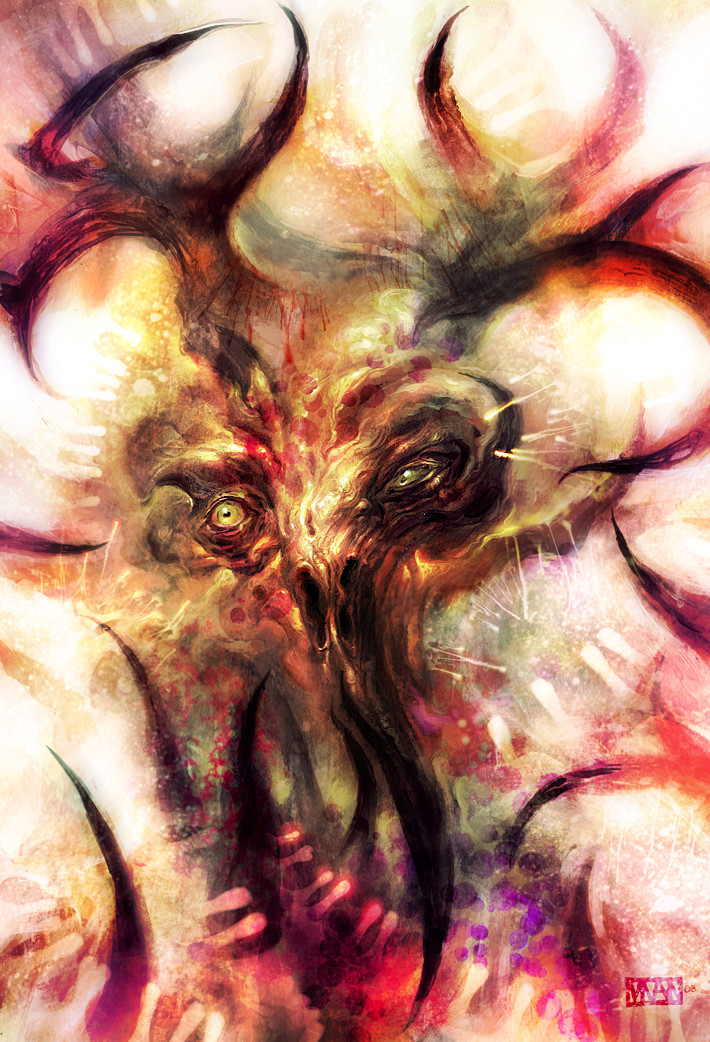
Ok, now something different. This is a personal work I've done recently. I first painted it in acrylics on paper than scanned it and had some fun in photoshop. The colors are completly new and on most parts it's overpainted digitally.Let me know what you think, thanks for watching
Related content


Comments: 44


Did you start with an idea in mind or did they get brought together by the eyes? This miasma of colors and shapes do work because of the previously stated remnant of a face. Personally I think its one of you best works. This envelopes the whole of the page instead of jagged areas, and yet has the jags to tie it to your other work. For something I would not want to meet on a dark night it has beautiful colors and they work together. It does remind me somewhat of your horned lord, but not in color or design. I had to look at your other work to see it. Sort of a up close and personal.
👍: 0 ⏩: 0


 (Wink)")

breathtaking
It's rather rare to find a work like this that is abstract, twisted and still clearly definabel at the same time

")
👍: 0 ⏩: 0

REAL NICE PIECE. PRETTY CREEPY, BUT NOT THAT MUCH SO.
GOOD JOB. LOVE THE COLORS
👍: 0 ⏩: 0

Somewhere along the line it reminds me of H.P.Lovecraft and his stories
👍: 0 ⏩: 0

Wild! I love the palette, and the expressive details around the eyes.
👍: 0 ⏩: 1

Its like someone else put my imagination on paper! well on a screen. Shit dude you scare me. : /
I'm stunned..
👍: 0 ⏩: 0

I feel overwhelm!
[link] this is my gallery link...some advises?
👍: 0 ⏩: 1

thanks!
nice drawings. maybe start drawing from life to improve (i see you're quite good at anatomy, but it always can be better), start to do images with background and thinks like that. Basically you can do whatever you want with it as soon as you still see the mistakes in it, look at the world around you and draw, draw, draw. you will be getting better
👍: 0 ⏩: 1
Thanks for advises! I thought you wouldn't never reply to me.
👍: 0 ⏩: 0


holy fuckin´shit, man! I would like to see the original underpainting. Its awesome, as is expected from you  (Smile)")
If Albin Brunovsky would still live and had a Wacom, he would do a piece like this. I dig this more then the comic-book covers of yours, this piece has gotten more of your love for art and more dedication and fun creating.
👍: 0 ⏩: 0

very nice-i like the detail to abstract feel to it.
though its really bright, it has an eerieness to it.
same concept of the vampire bunny.
")
👍: 0 ⏩: 0

hmm, I can't say anything constructive
but I'm just curious about the title - why 'horns'?

👍: 0 ⏩: 0


I love the intense colors, it looks as though it's about to explode. The contrast between the detailed middle and more gestural outside is pretty cool, especially since the middle isn't a complete face.
👍: 0 ⏩: 1


this painting actually reminds me of a metal sculpture i recently saw at the local fine art museum (at least thats what i think it's called).. it looked a lot like a creature but had been stylized to an abstract shape with rusted irons n other rusted metals.
👍: 0 ⏩: 1
spiky irons n other rusted metals.
👍: 0 ⏩: 0


")


That's so intense! I can't see what's traditional and what's digital, so props for that.
I think all the red around the outside is pushing forward more than the detailed middle, so that's making all the white values appear less like a void of space/action and more like a 2d representation of white framing the center.
I think I'd like the design element slightly more if you avoided tangents on the top of the frame with those antler-y things.
In closing, I'm downloading this because I like it so much. I'll keep this in mind next time I mix digital and traditional.
👍: 0 ⏩: 2
really glad you like it !! yeah the mixing is fun
👍: 0 ⏩: 0
Actually, looking at the texture around the face helps that balance better. I felt like critiquing the colours would be best left to the thumbnail, but I've seen otherwise. Sorry 'bout that.
👍: 0 ⏩: 0

really cool work
great flows and colours and a touch of evil
Nice!
👍: 0 ⏩: 1