HOME | DD
 michalivan — suffer mechanics

Published: 2007-01-27 11:03:35 +0000 UTC; Views: 31720; Favourites: 649; Downloads: 1161
Redirect to original
Description
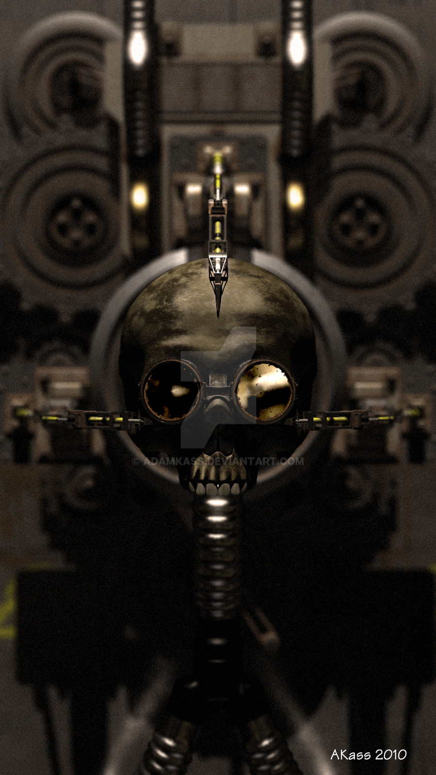
Cover for a norvegian metal band Mirror of Madness ([link] ). The album will be called Chaos Industry. I liked painting the mechanical part, after all the fantasy pictures, I think I will do something sci-fi also in the future. Later I'll mabe post more artwork for this cover. I just finished it (so mabe I'll change some details later)Done in Photoshop. c&c very welcome.
Related content


Comments: 65


metal lovers will love that pic dude ...
you did it well, dark, macabre ..
👍: 0 ⏩: 0


 (Smile)")


reminds me a lot of H.R Gigers stuff! especialy is biomechanics!
very nice all the same as I like Gigers stuff XD
great detail !
👍: 0 ⏩: 0

When I first noticed the flesh jaw..
"Feed me..."
Ah, I loved that movie. Silly cannibal plant.
👍: 0 ⏩: 0

Great image. I like how you've given the mechanical parts a corroded look- really adds to the hoorror of the piece.
Just wondering though as most album titles are at the top of the cd cover, whether turning the image upside down might work better, so that the type can be in the space at the top and not obscure the mechanical detail.
👍: 0 ⏩: 0


The symmetrical composition lends itself well with the shape of the cd case, I mean, assumming it is some sort of square. Your skill with digital color seems flawless to me, since my skill level is lower than yours. The only thing that I think my eyes want to see and don't is movement. It seems as though it is somewhat static, even when the jaw and the wires at the bottom should seem dynamic...that's just me, though. It is a quite awesome piece. A favorite for sure. Now I want to check out this band...
👍: 0 ⏩: 0

<= Prev |