HOME | DD
 Midday-Mew — Animation Comparison
Published: 2011-10-23 01:01:21 +0000 UTC; Views: 2506; Favourites: 32; Downloads: 0
Redirect to original
Description
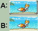
Will upload to scraps later.Okay, I need to know which looks better, Animation A (which is the animation on top), or Animation B (the one on the bottom)? I'm trying to figure out whether the "3D button shading" looks good or if it's better without the shading.
Your thoughts?
I'm making a poll in a bit so people can vote on which one they like more! I'll edit this deviation with the link to the poll when I'm done, okay?
EDIT: Done! Here is the link to the poll: midday-mew.deviantart.com/jour…
Also, feedback on how I can improve the animations shown above would be much appreciated!
EDIT 2: Some people were confused regarding the difference, so I'll explain this further.
The only difference is that Animation A has a button effect added, while Animation B does not have the button effect. Other than that, there's no real difference, as they are the same animation.
I'm trying to figure out whether the button effect makes it look better or worse. D: If you can't see what's causing the button effect, look at the borders of Animation A. You should see that some shading was added to the inside of the perimeter of Animation A to make it look more like a button.
So, which is better, do you think? Feedback would be much appreciated, so if you want to nitpick at the animations, by all means do so. I want to improve my art, writing, and animations, so I need the criticism! Oh, and if you see anything wrong with either animation or both of them, please do not hesitate to tell me! I'm open to criticism, and would love to know what's wrong with my art/writing/animations so that I can fix these issues in the future and improve my skills.
Also, if you have any suggestions regarding these animations, I'm willing to listen, so don't be afraid to ask! I won't bite, I promise! ^^
Edit 3: Hoooo $&#@. I can't believe that I forgot to state who the credits belong to! D:
Tails, Emerald Coast, and Neo Green Hill Zone belongs to Sega.
Sonic Advance 2 Tails sprites ripped by Kevin Huff of TheSpritersResource.
Neo Green Hill Zone sprites came from a sprite sheet assembled from the following website: The BG HQ. Credit to Shadowbot for assembling/ripping the sprites.
The border of the animation was edited from the deviantArt default Group icon and therefore the border belongs to deviantArt.
Animated by me, Midday-Mew, and button effect created by me from scratch.
Edit 4: Sorry, poll's closed, folks. I no longer need help with deciding which animation to choose.
For those who were wondering, Option B won the poll.
Related content


Comments: 27


Thanks.
Also, sorry, poll's closed. *points to Edit #4 in the Artist's Comment of this deviation*
👍: 0 ⏩: 0

How do you submit GIFS without making preview images?
👍: 0 ⏩: 1
The size. They have to be small enough. If they're too big in dimensions (or possibly even filesize, but that's never happened to me...yet), they have to have a preview image. Flash animations, on the other hand, always require a preview image. But small gif animations like this one don't require preview images. ;)
👍: 0 ⏩: 1
Uh...poll's closed. This is an old deviation. ^^;
I no longer need help with deciding. Maybe I should put that into the Artist's Comment...
👍: 0 ⏩: 0

Did you even read the Artist's Comment?
I said that the top one has shading to have a button effect. The bottom one doesn't have the button effect at all. Look at the borders of the top one, and compare it to the borders of the bottom one.
Also, the poll is over, and voting's been closed for several months now.
👍: 0 ⏩: 0

Dude. Old poll is old. I'm no longer accepting votes. I know you voted Animation B, but really, I've already decided which one to keep (which is Animation B)
👍: 0 ⏩: 0

I like the bottom one better personally. Just my opinion though. Because I don't really think it needs the button effect.
👍: 0 ⏩: 1
Well, most of the people who voted in the poll chose "Animation B" (the bottom one) as the better one.
I sort of agree. I'm thinking about making the bottom one be the final choice and throwing the button effect out the window. ^^
*throws a white button with "fx" written on it in black permanent marker out the window*
Also, considering your most recent journal, I'll feel bad every time you comment, unless you go with Hedgefox's suggestion in that journal (she's the first commenter in that journal entry if I remember right). D:
You should take a break from dA, really. D: Tell your watchers that you plan on returning eventually and that you need a hiatus to heal your wounds. D: My oldest sister (who's like 40-something and the oldest of my siblings) says that tendonitis is caused by overworking of the muscles. I believe that would mean you shouldn't do anything that involves using your hands.
Maybe you should try watching TV or something or perhaps have a family member help you read a book. D:
👍: 0 ⏩: 1
I voted B too ")
Haha XD
I start getting overwhelmed when the pics build up. So now that I've gotten through a lot I hope to just have to answer a few and do so when I get to use my topical numbing stuff.
yeah tendonitis is. I t's weird really cuz I've been doing way less than normal. I have a splint that prevents m from moving anything but my fingers thatI've had on for two weeks.
👍: 0 ⏩: 1
You don't have to reply to EVERYTHING...I don't reply to everything unless I can think of something to say right off the bat. Usually I look at the deviations and read the deviation descriptions (each one also known as an "Artist's Comment") and move on. If I have something I want to say, I post it, otherwise I don't bother.
Commenting on everything is a pain, especially when watching groups. I usually ignore certain group's deviations that I'm a member of, more specifically I tend to ignore those that update with too many submissions at a time in the stacks.
But really, I usually don't even reply to friends' deviations if I can't think of something to say more than just "awesome" or "cool". I tend to favorite and run too, but I don't favorite everything my friends post, I only favorite what I truly like. And I'm picky.
Oh, and no need to reply to my other new deviation. D:
👍: 0 ⏩: 1
It's my policy. Doing to others as I would have them do to me. I typically only comment on people's pics who comment on my styff.
I ignore groups though lol. Cuz I'm mean.
I'm incredibly picky when it comes to faving........................especially since I forget half the time even when I do mean to fav
👍: 0 ⏩: 0

The A animation looks worse actually. I think that the problem is that the animation part is just against the 3D shading. I think that with a flat border just between the animation and the shadding whould looks better, though I'm not sure. Don't ask why I said that because I don't really know myself.
I'm not good for critiques, but I hope this would help.
👍: 0 ⏩: 0

I have to admit, I'm not fond of the button effect. I prefer just the straight animation.
👍: 0 ⏩: 1
Hm, interesting. Did you vote in the poll? The poll is what I'm using to judge which animation (A or B) that has more people that like it. Then I'm going with the winning option, unless it's too close to a 50%-50%. I'm going to need more than a two-thirds majority on either animation choice in order for it to "win".
Otherwise, I may go with the straight animation, considering that you can see more of the animation that way. Or I might modify the button choice to be a little muted, like looking through gray glass. If I go with muting the button-styled animation with solid gray, I'll probably redo the poll to compare it to all three animation choices (but I might not redo the poll, we'll have to see).
👍: 0 ⏩: 1
I did vote. But I'm afraid I ended up tying it in a 50-50. My apologies...
Also, that sounds like an interesting idea. Though, it IS up to you ultimately as the artist, am I correct?
👍: 0 ⏩: 1
Not to worry, it was already too close to call as it was anyways. A mere two-vote difference will just NOT do. D: So you didn't do anything wrong, it looked as if it was going to be 50-50 or something close to that. Some people love the button effect, other people hate it.
Personally, I sort of like them both, but the button effect could use some adjustments to make it look better. I can't decide whether I like or dislike the button effect. If I stare at it long enough, it looks fine, but just glancing at it it looks not as good. So tough to decide. D:
I think I'll try muting the center part with gray now to see if it looks any better. It shouldn't change the animation any, I think. I didn't really use that many colors, plus the transparent gray on top of it would still change any and all colors underneath by the same amount, so it shouldn't make any difference.
👍: 0 ⏩: 0

They both look the same. Only A looks like it is put on a button, while B looks like it is a animation that is not on a button.
👍: 0 ⏩: 1
That IS the difference. And I need to know if the button effect makes it look better or worse. D:
👍: 0 ⏩: 1
Did you vote in the poll? That's what I'm using to judge which animation (A or B) that more people like.
👍: 0 ⏩: 1
