HOME | DD
 mikey-madness — Vic Rattlehead Megadeth II

Published: 2006-02-01 18:39:43 +0000 UTC; Views: 7984; Favourites: 26; Downloads: 125
Redirect to original
Description
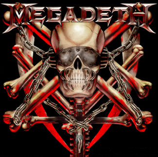
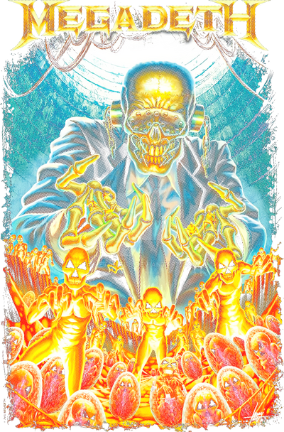
Here is my second attempt at the contest. The first can be seen here [link] I am not sure which one I like better. They are completely different style. This one is done again with color pencils. But I modified it and added the Megadeth Logo in Photoshop. I also soften the exterior background and deepened the shadowing. Let me know what you think.... If I should just drop the logo or what. Let me know ok.Related content


Comments: 42

this one is my favorite of the three, more original than the ones that won the contest too
 (Smile)")
👍: 0 ⏩: 1

Thank you, that is quite kind of you. I think that could be the flaw of my work. it is too original.
👍: 0 ⏩: 1

LOL you have been gone for a while girl.
👍: 0 ⏩: 0


Hmm, its great. For some strange reson, it really reminds me of the dog-type-things in hellraiser!
👍: 0 ⏩: 1
LOL yah i thought it had a sort of hellraiser quality to it after I made it. Thanks for the look OVER!
👍: 0 ⏩: 0

wow. that's so cool! I love weird things like this. it's so cool! *faves*
👍: 0 ⏩: 1
Well thank you I am humbled. Thanks for the 
👍: 0 ⏩: 1
You're welcome. ^^
👍: 0 ⏩: 0

Lol you are second to say that. i guess it kind of does in a way.
👍: 0 ⏩: 0

LOL never noticed that, but it does have a simpson type quality
👍: 0 ⏩: 0

I think the logo looks fantastic there i would leave it if it was me
THis is fantastic you such a wicked artist !
👍: 0 ⏩: 1
Thank you very much for your kind and encouraging words
👍: 0 ⏩: 0

i like this one a whole lot better. the skin (is it skin) stretched over the skull with the blind fold is great, and giving it background makes it better. and i think its fine with the logo. nice job
👍: 0 ⏩: 1
Skin, skull virtually stretched.....not sure. i just thought it looked cool. thanks for the look and the remarks.
👍: 0 ⏩: 0

kool design... kinda reminds me of a sublime album cover
👍: 0 ⏩: 1

This one is really good.. but I think I like the first one better. ")
👍: 0 ⏩: 1
I am not sure which one I like... totally two different designs.
👍: 0 ⏩: 1
what about trying to combine the 2?
👍: 0 ⏩: 1
I don't know.. I can't draw stick people...let alone anything that complex.
👍: 0 ⏩: 1
Hay get yourself a Bob ross video and go to town... You never know what you can be if you don't try
👍: 0 ⏩: 1
lol... my sister is the visual artist.. I have very shakey hands for some reason. Makes it hard to get a straight line in.
👍: 0 ⏩: 1
Could have an interesting effect though. I have draw with my left hand to get a new effect. Very shaky. It is also why I sometimes masturbate with my left ")
👍: 0 ⏩: 1
lol.. my sister keeps telling me how shaky my hand is doesn't matter... but I dunno.. maybe I'm just not inclined to visual arts.
👍: 0 ⏩: 1
I am sure you are creative visually too, how about crafts, scrapbooking, etc. You have an eye for photography
👍: 0 ⏩: 1
well.. floral arrangements.. painting ceramics.. it's all in my scraps you know.
👍: 0 ⏩: 1
")
👍: 0 ⏩: 0

i much prefer this one. i mean i know this crit doesnt mean much cos you cant exactly change it, but i would say do four staples on vic's mouth, or three actually! but this is much more... megadeth ish. the other one doesnt look... painful enough i guess! i cant make out whats going on as well as this one, this one has stark obvious features y'know, particularly like the... tarpaulin (spelling?) effect, this is prob the best comp entry ive seen!
👍: 0 ⏩: 1
Thats for the feedback, I am thinking of trying a third too. Thanks I appreciate it!!
👍: 0 ⏩: 0

Thanks man I appreciate that
👍: 0 ⏩: 0

they are both wicked.. i prefere the 1st one personally but ur amazing.. let me no wot u think of my poetry
👍: 0 ⏩: 1
Thanks man, and I did. You are not a half bad writer. Keep it up.
👍: 0 ⏩: 0