HOME | DD
 Miracat — Fly

#creature #fly #lion #lioness #lying #pegasus #wing #wings #wingedanimal #fantasyanimal
Published: 2016-03-28 19:45:03 +0000 UTC; Views: 442; Favourites: 14; Downloads: 0
Redirect to original
Description
Cause... I felt like it


 Hope you like it. Comments much appreciated


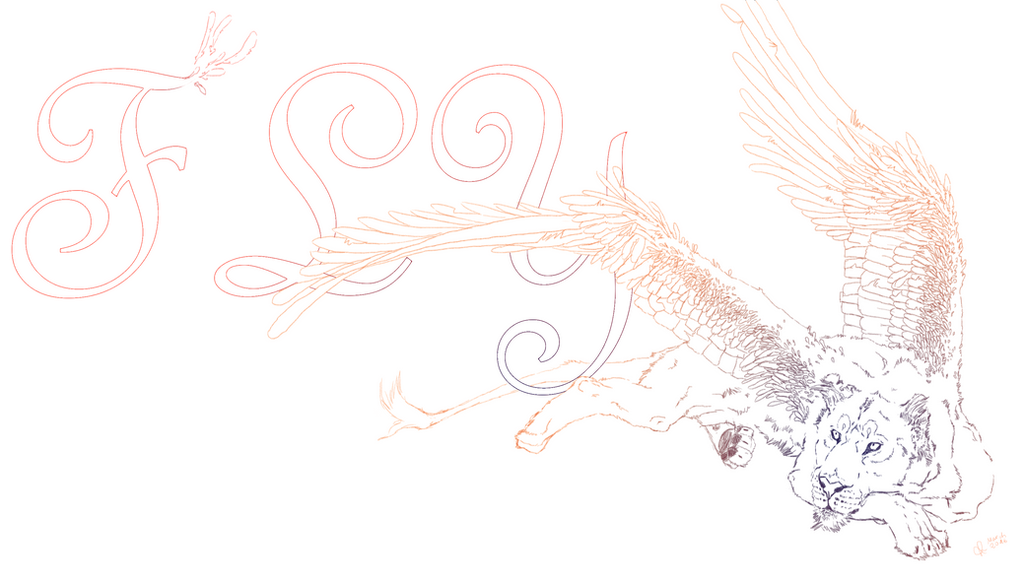
Please someone remind me: next time I do lineart: tell me not to. These wings took like FOREVER!!
No need to ask if you want to download it, use it as desktop bg etc. Just if you want to use it in anything you want to publish


Related content
Comments: 17

This seems like it could be a logo or a design for an advertisement of some sort. I like the pose of the lion, and how she seems so relaxed looking up towards “FLY”. It definitely shows that you spent a lot of time on this, the details are gorgeous! I think the feathers look beautiful and I love how you made the fur and feathers distinct from one another while still flowing into each other. The simple gradient gives a nice, airy feel to the piece.
I like that you have varied linework throughout this image, and I like how you’ve evoked texture by doing so. The lion does look a bit separate from the letters though, simply because they are outlined in thicker, smooth lines while she has broken, thinner lines. I really like the feathery explosion off of the end of the ‘F’, and I think including some more of that small detail into the letters and perhaps giving the lion one or two stronger, solid areas (perhaps making the spine or tail have a thicker, smoother outline to show part of the line of action) could help connect the two together a bit more.
I like your lettering, it’s pretty and embellished without being difficult to read. I feel like the ‘F’ looks a little too far away from the ‘L’, it doesn’t look like it’s the same distance between them compared to the ‘L’ and ‘Y’. I’m thinking that’s simply because of the curly q’s of the ‘L’ and’Y’ going towards each other, but it still does create a distance that I think could be corrected so that all of the letters look equidistant.
Overall I really like the detail that you’ve put into this and how you’ve portrayed the character of the lion. She looks rather disinterested in the prospect of flying, or perhaps she’s waiting to be shown why it would be interesting for her (waiting until the birds start flying!). Your lines are quite clean and wonderful to look at and the soft colours help set a light and cheerful mood. Keep up the good work!
👍: 0 ⏩: 1

Thanks again 
👍: 0 ⏩: 0

Hello I'm commenting on behalf of
I'd love to start my comment off by stating what it is about your drawing that I like. With "Fly" here I just really like your line work. The detail is extraordinary. I can see why you don't want to do a line art again. The wings must have driven you crazy. The detail is so minute. I like the realism to them. How the smaller parts of the wings work themselves larger and larger just like a bird. The lion herself looks great. You've maintained the integrity of the lions shape even though you've added wings. This is a wonderfully rendered work of imagination.
The only drawback to the drawing is the word "FLY". I'm sorry but your drawing is so special all on it's own. The "Fly" takes away and draws the viewers eye away from the drawing. Had you placed the lion in the center and put the "FLY" in the back of her maybe it would give a completely different impression. Another option would have been to make the "FLY" about a third of the size that it is and stick it in a corner with the lion still in the center.
Other than that I think you show some serious skill here and are very impressed with your drawing abilities. Keep up the great work. I don't know if anyone has asked before but have you considered coloring this?
Have a great day.
👍: 0 ⏩: 1

Sorry for the late reply... just... thank you! I wanted to add some kind of a meaning to it by adding the word "FLY" but you´re right, I could have legt it on it´s own...
Yeah... the wings took their time XD
👍: 0 ⏩: 0

It's so majestic! I love the colors and how you made this. Awesome job on this 
👍: 0 ⏩: 1

Thank you! Glad you like it... I love colours 
👍: 0 ⏩: 1

Omg die flügel *___________*
Und der Löwe ><
Und alles XD
👍: 0 ⏩: 1

jaaaaa... hab noch nie so komplizierte Flügel gemacht... Aber ich mag Flügel 
👍: 0 ⏩: 1

Ich mag flügel auch XD
Aber deine sind sehr viel besser oWo
👍: 0 ⏩: 0

Der Schriftzug ist mega nice, und ich mag diese Pose *^*
👍: 0 ⏩: 1

Danke... jap, die Pose hat auch ein bisschen gedauert... und vor allem DIE FLÜGEL!!!!
👍: 0 ⏩: 1

Bitte c: Jaah, das kann ich mir vorstellen xD
👍: 0 ⏩: 1

Ich hab noch nie versucht Flügel in so einer kmplizierten Position zu zeichnen... ich finde.... so für den ersten Versuch....
👍: 0 ⏩: 1

Ich finde, die sind mega nice geworden
👍: 0 ⏩: 0


