HOME | DD
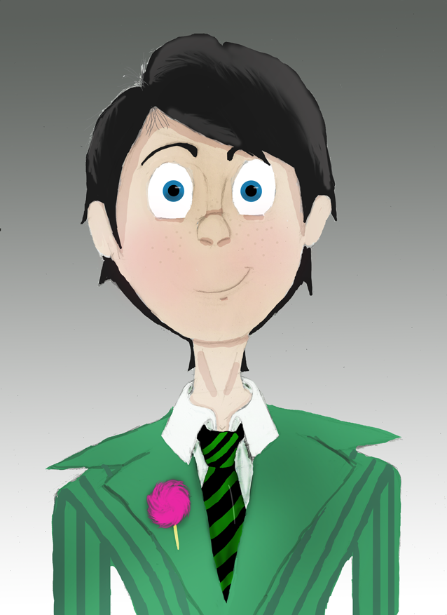
 MissTooni — Go Green
Published: 2012-04-15 02:57:22 +0000 UTC; Views: 1045; Favourites: 19; Downloads: 28
Redirect to original
Description
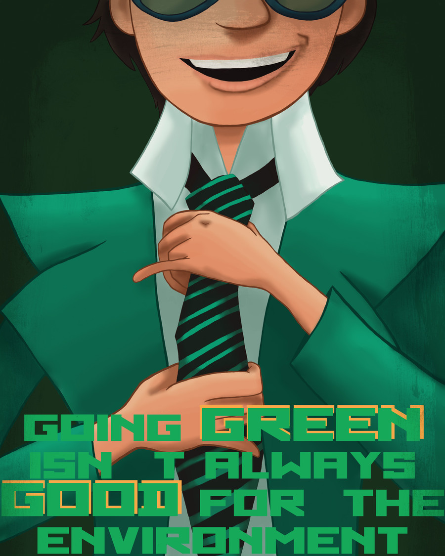
But please, do everything you can do "go green" in the environmental sense of the word!After seeing Dr. Seuss's The Lorax for the second time, I started throwing this idea around in my head. The Once-ler's wardrobe shifts to green when he begins destroying nature - even when he cuts down the first Truffula Tree, his gloves are green - which is ironic considering that the phrase "go green" is so prevalently used in our society to mean lessening environmental impact.
I realize that green is also associated with greed and that is probably the meaning the film was going for, but living in Portland, Oregon where going green and helping the environment is very commonplace, I couldn't help but immediately think of that meaning.
I LOVE The Lorax so much. I love the characters, I love the songs, I love the animation, I love how fabulous Dr. Seuss is and how true to his style the movie seemed to try to stay. Most importantly, though, I love the message.
I spent a lot of time on this, I attempted speedpainting for the first time (by the way, I don't know why it's called speedpainting when it takes FOREVER to do), and while I primarily did it because I thought the line was clever and wanted an excuse to draw the Once-ler, I really hope this inspires people and makes a statement for the sake of going green.
And now, relevent Once-ler quotes:
Unless someone like you cares a whole awful lot, nothing is going to get better. It's not. - The Once-ler
It's not about what it is, it's about what it can become. - The Once-ler
The Lorax belongs to Dr. Seuss, this rendition of The Once-ler belongs to Illumination Entertainment and Universal Studios
Used [link] by ~aqueous-sun-textures as an overlay texture
Thank you *Sarky-Sparky for the lovely speedpainting tutorial!!
Related content


Comments: 19


As I've already said in person I freakin love this! Very well done X3
👍: 0 ⏩: 1

I think it looks better biggerer, don't you?
👍: 0 ⏩: 1

This looks really good, reminds me of a movie poster ")
👍: 0 ⏩: 1
Haha that's part of what I was going for! That or a propoganda poster, I still remember one of the projects we had to do for... one of the first photoshop classes I took at AI... And you do! I can't believe you haven't seen it yet, it's fantastic!!
👍: 0 ⏩: 0

Very nice work, Minty.
I have no real complaints except parts of the word 'environment' are a bit lost amongst the darker shades of green. That being said, it is impressive how you used predominantly one colour as a scheme without it coming across as boring or hard to differentiate parts of the picture.
I really love the text and the use of close-up- it gives the picture a kind of propaganda feel which is very fitting with all the complex political undertones of the movie.
As I'm sure Maigis has let you know, we're big Lorax fans and big fans of yours so this is wonderful all round~
👍: 0 ⏩: 1
Yeah, I had to tweak the text color to get it to not blend in as much as it would have normally... That made sense, right? I may go back in and brighten it again. I could've made the text a different color, I guess, but... green was the theme, so... green! xD
Yeah, my initial idea was... well, I got that line in my head and thought "Let's use Cyrrilic-type font and make a propoganda-ish poster!" even though the text is sort of juxtaposed with any idea of Dictator!Once-ler xD
And yes, If your sister's tumblr account wasn't an indication. xD I've been reading your reblogs and posts there, so I knew~ I love it to death right now <3
👍: 0 ⏩: 1
It's really conflicting because the darker gradient on the bottom of the picture adds to the whole towering perspective thing but drowns out the text. I have a lot of respect for you artist types and the kind of decisions you have to make.
I'm not going to lie, the text is really clever. Although like you pointed out- they were probably going for a green = greed motif. I actually got really excited when I figured out the Once-ler's original pants have the same pattern as the Truffula trunks. Subtle symbolism, whooo~
And yes, Mai and I are extremely subtle in expressing what we enjoy. Hahaha.
👍: 0 ⏩: 1
Ahaha yeah ^^" At the same time I didn't want a font that was so loud it covered everything else up... It's always about trying to find a happy medium...
Haha yeah... I really started thinking about it this week even more because it's Earth Week (with today being Earth Day!) and subsequently everything is about going green! I should've waited until today and posted it for a more poignant reason... Oh well. And yeah! I love that about the original pants design, too! I love character design elements like that, I could have so many discussions about theme and symbolism in that movie, makes me feel like I'm in English class again!
Haha it's cool~ I'm extremely picky about what I reblog on tumblr XDD
👍: 0 ⏩: 0

It's so exciting watching people try new styles and techniques! Particularly you, as you seem to have command over several media and line styles and programs but painting is like the undiscovered. And you've talked about trying painting for ages now, so it's really cool to see you actually getting stuck in XD And for a first shot, this is great! Of course, being you, the main thing about it that stands out is the smart layout. I LOVE this kind of poster. It's quirky, fun and attention-grabbing. The only thing I'm not sure on is the overlay thing being on his face but that's probably a taste thing.
Although I can't remember the story/character for the life of me, the personality spills out of this, so that's a pretty strong statement in itself. The pose choice is just brilliant - it's so smart and witty and the kind that makes you smile because you can read the character immediately. I adore the expression and the simple, cartoony style of the mouth that ties in beautifully with the film's art style. The only problem really is with two parts of the anatomy. The higher hand and the arm attached to the other one (I say higher or lower because I never know if I should say camera left, or character left etc). The lower one is pretty much spot on but the higher one has some issues with the finger positioning; I don't think the middle finger would extend that far over the ring finger at the bottom from that angle. Maybe a google search for men adjusting ties and reference a few of those photos if dA isn't helpful. The same goes for the arms in that one of them looks great, the other one seems a tad off. The one attached to the higher hand looks absolutely fine to me, but the other one seems to start a lot lower (unless you missed a block of colouring at the suit collar at the top?) and with the arm from elbow to wrist being bent at that angle, the upper arm might need to be closer to the body... I'm sitting here doing chicken wings right now to check XD
Colours! First of all, I'm impressed that you can make a picture so predominantly one colour without it looking dull or monotonous. The range of shades are fabulous and keep the theme without being boring. I love the variety in there, and the yellow in the font that really is striking. You've done a great job of blending too! And I love how you have both hard and soft shadows in the relevant places. So many people seem to only do the soft ones and forget the hard ones in places like the fingers and under the chin. Your shadows definitely need to be stronger, particularly on the shirt, but you're probably already aware of that. The shading on the hands is my favourite part; that's definitely where it's strongest. I also love that there seems to be a soft gradient on the suit. Towards the very bottom, the text is a little flat against the white, so maybe a slightly darker gradient over the clothes (maybe a grey multiply layer?) just to make the text pop that little bit more? And the font is fun too XD I didn't even notice the missing apostrophe until the person in the comments pointed it out XD
So yes, this is wonderful! I really enjoyed seeing this! Brilliant job! ^^
👍: 0 ⏩: 1
Thanks! And yeah, I actually feel that way about the overlay on his face, too... I might mess around with this even more in terms of the effects/text and stuff...
Yeah, I knew on the higher hand the pinky at least was too small, but I appreciate you pointing out the other fingers, too. I think it's probably because the sketch of the hand underneath the painting was so rough... In the future I think for parts like that I'll probably try to refine the sketch a little more before I paint over it. I did have two references, but I admit I didn't use them as much as I should have. One was a stock image and another was a shot from the movie (because this scene is in the movie, but at a different angle. I really only used the movie shot for color reference and that's how I decided to have his pinky out) Haha yeah, I was kind of thinking it was off when I was working on it, but y'know how at some point when you've been working on it for so long you just kinda say to yourself "Screw it, I don't care enough to fix it"? xD I'm no by any means upset that you brought it up, though. I think knowing it's not just me will help me to remember to pay more attention next time. ^^
With the font, I was like "I want to make the words 'green' and 'good' pop", but just making the font size bigger didn't seem to be enough, so I figured I'd put a shadow behind them. I chose the yellow-orange color because that's another color that seems predominantly used in the movie and I knew it'd pop against the blue-ish green. ^^ Yeah, I know I was a little more conservative with my shadows than I should have been, but I'm glad to hear I'm on the right track in terms of having the darker shadows where they need to be! Yeah, I think you're right about the suit bottom part. I had to change the font color twice because it was almost invisible at first, and yeah, I think I definitely need to work it more xD I'm glad you didn't notice the apostrophe, that's what I was going for. I used the cyrillic-ish font to make the letters big and bold and I was hoping the punctuation would be secondary in that case. ^u^
Thanks for commenting! I appreciate all the criticism! I know I have a lot to improve on, but I'm glad to hear about the things you think I'm doing well! I'll definitely take your input to heart when I'm working on my next painting. This is really fun and has really rewarding results, even if it takes a long time! I really appreciated having your tutorial to help get me started on the right track, too, so thanks~!
👍: 0 ⏩: 0

This is looking really good, hon! The only thing that catches my eye is his pinky looks really tiny compared to the rest of his hand. But other than that this is looking great for your first speed paint.
I would suggest, if you feel a speed paint is taking too long, putting a time limit on yourself in the future and stopping once the time is up.
It will probably be hard at first but the point of speed painting is to get faster at painting. And with practice you will!
")
👍: 0 ⏩: 1
I know, I think so, too, but I'd already spent so much time that I didn't want to go back and fix it...
Thanks for the suggestion! I'll have to try it... I'd like to practice more, definitely, but for now I think I need a break... xD
👍: 0 ⏩: 0

Your font selection is missing the apostrophe in isn't. Just a heads up.
👍: 0 ⏩: 1
Oh, I know, it was deliberate. ^^" But thank you for pointing it out!
👍: 0 ⏩: 1
What was your reasoning for leaving it out?
👍: 0 ⏩: 1
Well at FIRST I didn't notice that the font didn't have an apostrophe, but when I did I debated on changing the font, but in the end I decided not to. There's not really a valid reason, I admit, so much as I looked at it and thought it was unnecessary, even if incorrectly punctuated. I didn't put a period at the end, either... ^^"
👍: 0 ⏩: 0