HOME | DD
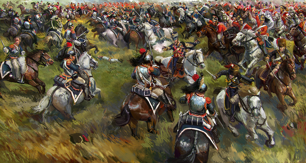
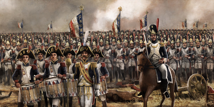
 Mitchellnolte — Scourge of War: Ligny

#1815 #battlefield #french #infantry #ligny #napoleon #waterloo #fleurus #mill #sowwl
Published: 2017-08-18 03:18:53 +0000 UTC; Views: 17140; Favourites: 363; Downloads: 0
Redirect to original
Description
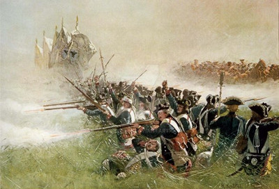
One of the art pieces i made for Norbsoft's Scourge of War: Ligny expansion. Napoleon surveys the battlefield from the Mill near Fleurus.Related content


Comments: 14

👍: 1 ⏩: 0

👍: 0 ⏩: 0


"They fear me, like a force of nature. A dealer in thunder and death. I say, I am Napoleon. I am Emperor"
-Napoleon Total War
(This is actually really epic. I like the way the background is foggy and all the soldiers have dark expressions. It really feels like they are marching tow war)
👍: 0 ⏩: 0

Nice, foreboding feel, of the kind one finds in a morning before a great battle.
👍: 0 ⏩: 0


Not bad, but I do have to say that certain areas in this painting (like the guy on a horse in the middle (or his upper body and head/hat)) look kind of out of place. I mean, the entire picture is somewhat blurry, so random detailed zones draw excessive attention and also look weird (not that detail can't be used to draw focus, but, even then, I don't think the gap between amd ratio etc. of blurriness to clearness should be this big). It's like having the resolution of a picture change throughout the picture. Not to mention that it makes the piece look kind of unfinished. Like you were working on the details and then just gave up. Besides that... I guess I'm honestly not sure what you're trying to draw the focus to. The first thing that catches my eye is the horseback-guy I mentioned earlier, but considering his positioning in the painting I doubt that's intentional. Maybe you meant to make the people on the windmill the focal element, as I imagine one of them is Napoleon, but they just don't draw that much attention.
👍: 0 ⏩: 2

Honestly, you post this kind of comment with a hidden gallery and journal and nothing posted.
👍: 0 ⏩: 1
There's a lot of people on this page that compliment pieces while having a gallery stuffed with horribly drawn fetish art, so I personally can't bring myself to see why what I- a person who has at least not shown any negative tendencies towards art- wrote would be a problem here. All I did was offer a short critique about this particular painting (I usually barely comment on anything on this site) based on things any normal person would notice as well as my own knowledge about art and with that rules/tips I've heard a million times from various different sources (books included). Wether the artist that made this picture will take my comment seriously or not is up to them and -seeing as they definitely have experience- I'm sure they'll make the right decision about it. If they don't feel like trusting someone with an empty profile and what I said doesn't sound plausible/familiar/right to them, they'll probably just ignore me and be right in doing so. (I apologise for my English, it's not my first language.)
👍: 0 ⏩: 0

thanks for your feedback - i didnt make the work with any specific focal point in mind, rather i was just thinking kind panoramically - also yes it has parts that need refining for sure. Overall i like the piece but yes i would like to have spent more time up close with it - that is a mistake i often make - i want to do the big scenes, but also realise with digital art as opposed to traditional art doing big scenes somewhat impressionistically/roughly clashes with the quality that digital art i think demands. I apologise, i am working to fix this - subsequently i have alot of other big scenes, which i am spending a long time on -battles of Borodino, Leipzig, Rivoli, Friedrich the Greats battles of Leuthen, Zorndorf
👍: 0 ⏩: 0

