HOME | DD
 mjponso — CE: Above the Influence

Published: 2010-06-14 03:33:36 +0000 UTC; Views: 3133; Favourites: 21; Downloads: 221
Redirect to original
Description
This is a contest entry for DeviantART's "Above the Influence" contest. To be honest, I'm not even really hoping to win...I just did this for the free T-shirt.
But anyway, I feel I owe an explanation for everything I put in the given template. The picture can be broken down into five parts, starting from the top left: music, education, faith, artwork, and numismatics. These are the five primary categories I fill my life with, instead of drugs, alcohol, or any other kind of debauched behavior.
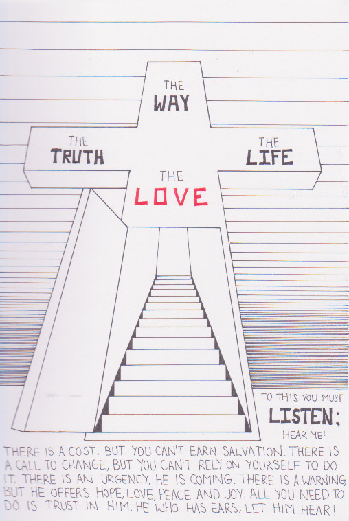
The middle category, faith, is the one I take most pride in, both in my actual life and in this image, for unlike the other categories, which are largely a collage of various images I found, this region was all custom-made. The cross was generated with a fibers generation, tinting, and beveling, and the inscription on it started with a built-in custom shape, colored and text added. The text in the background of that section comes from the King James version of Proverbs 2, for those wondering.
The music section contains pictures of the instruments I know how to play. The "Element" logo you see is the logo for a contemporary worship service at my church, in which I play bass in the worship band.
The education section has a background of a diploma (my name is pictured but it's not actually my diploma), with different engineering-related imagery, which pertains to my bachelor's degree in mechanical engineering.
The artwork section is self-explanatory; it contains several of the digital artwork I've created and posted to DeviantART.
The numismatics (coin and banknote collecting) section is also self-explanatory, with different images of collectible banknotes. I tried going for multiple varieties of note types as an example to the uninitiated.
The whole setup has an indigo-tinted background. The reason for the color is that indigo (and magenta secondary) are the colors I've come to associate with myself.
Related content


Comments: 21


I primarily did this just for the free DA T-shirt that was being given to all participants, but yeah, I like the way it turned out.
👍: 0 ⏩: 0

this is just too good for words
one of those perfect arts on deviant art that shows a part of the artist
👍: 0 ⏩: 1
This was done as part of a contest several years ago. Didn't win or even receive an honorable mention, but I suppose that's no surprise. My only reason for entering the contest was so I could get a free DA T-shirt. X3
I do thank you for your kind words, though.  (Smile)")
👍: 0 ⏩: 1
You are a wonderful artist! ^^
Sorry you didnt win i would have picked you right away
👍: 0 ⏩: 0
Thanks.
👍: 0 ⏩: 1

Bummer. well at least you got the t-shirt.
👍: 0 ⏩: 1
I knew going in that I wouldn't have a chance of winning, because tens of thousands of people would enter, many of which would be real professionals. If not for the T-shirt I probably wouldn't have entered.
👍: 0 ⏩: 1
Wow! That's a lot of contestants.
👍: 0 ⏩: 0

")


ohhh shit!! again that what is that ??
i don´t know why but, i hate jesus whit or whitout cheese.
👍: 0 ⏩: 0

I just did it for the free T-shirt, personally...which still has yet to come in.
And wow, I hadn't expected you to comment on any of my works. I really appreciate it.

👍: 0 ⏩: 1

that looks a lot better than my idea! i like it alot! i couldent enter because u have to be living in america but i live in australia
")
👍: 0 ⏩: 0

Wow, that's a whole lot of "you" in one big image. Very cool.
I find myself to be similar in a lot of the regards here. I might not know how to play instruments and I may not be a religious person, but I have my own passions and interests that I focus on rather than going to things like drugs.
Of course, I also have my own reasons as well. Because of drugs, I lost my brother. And loss like that really turns me off to any of the crap that was involved. I don't want to hurt my family like how that loss hurt them.
But anyway, it's a very gripping image. It really pops out at you. The background helps make it have more of an impact, and the amount of things that surround the cross seems somewhat overwhelming at first, but when you break it down and look at everything there, you see so many pieces of yourself there that are both fulfilling and have nothing to do with drugs.
It's a nice message.
👍: 0 ⏩: 1
For your information, for the background, I originally had a cloud pattern that (coincidentally) took a severe swirl in the middle of the ring, which I thought looked cool and attracted attention to the arrow in the middle, but in trying to layer fibers over it, I couldn't make the two blend together well. I came to the conclusion that the fibers layer, with a zooming radial blur, would still attract attention and yet provide a surreal feel.
👍: 0 ⏩: 0