HOME | DD
 mmpratt99 — The Collector2
by-nc-nd
mmpratt99 — The Collector2
by-nc-nd
Published: 2010-12-25 07:39:43 +0000 UTC; Views: 1047; Favourites: 28; Downloads: 25
Redirect to original
Description
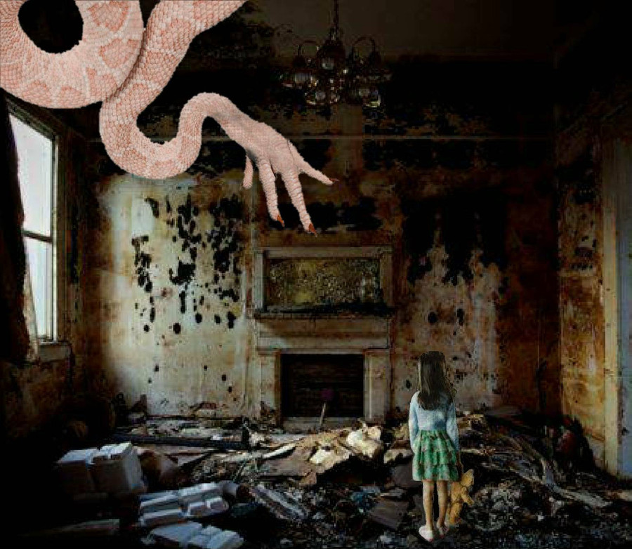
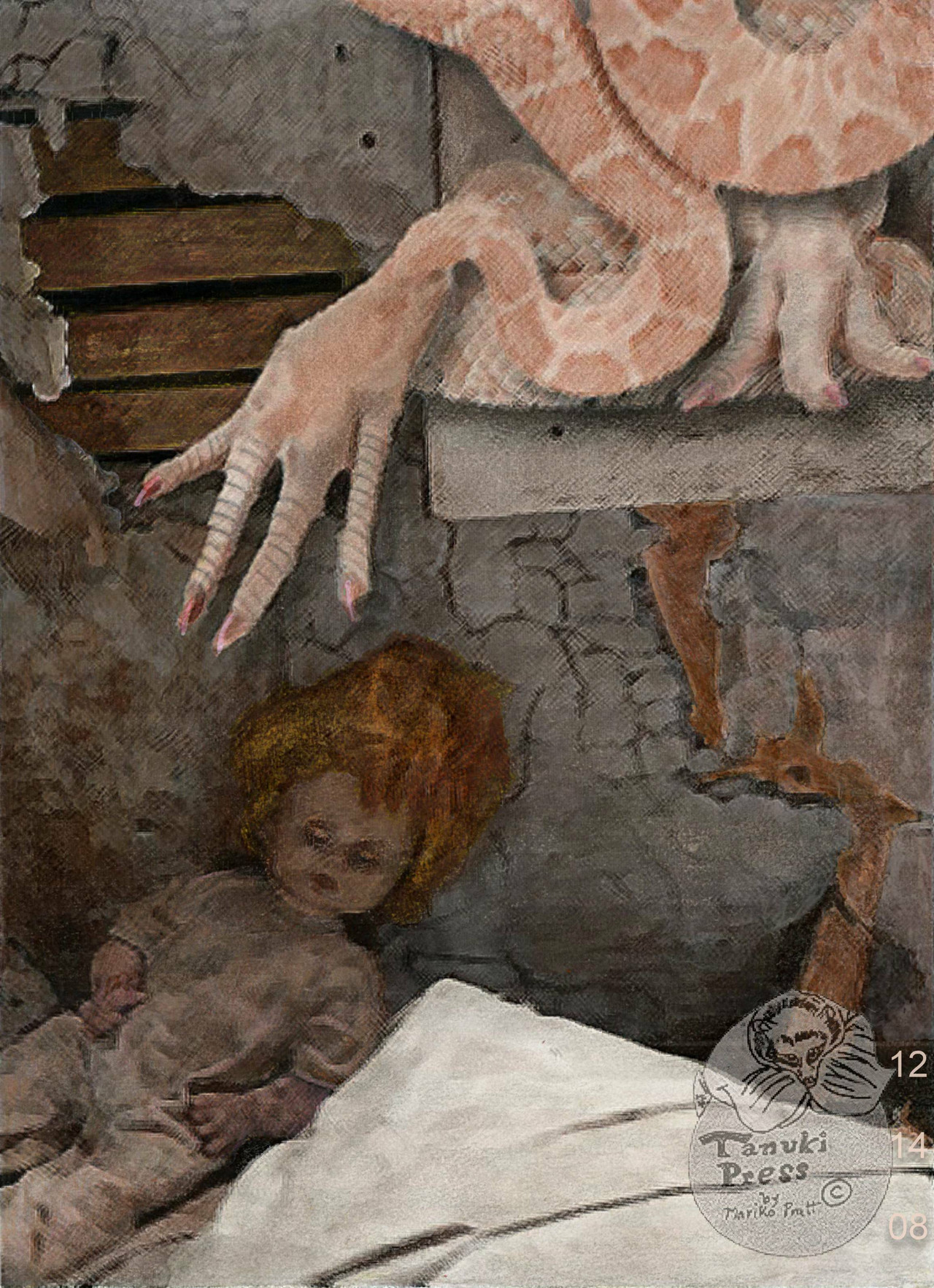
What I can say about him is that he likes to collect things--sometimes live things. Also he was inspired by the works by H. P. Lovecraft and a Jan. 2oo8 article I read about the abandoned towns and homesteads of North Dakota. Merry Christmas!Ruined interior of house>
[link]
Girl with teddy bear>
[link]
Monster>My Design
[link]
[link]
(C) Copyrighted to mmpratt99. Dec. 24 2010
Related content


Comments: 19

Overall


Technique
Impact
To begin, I would like to point out that the imagination behind this image is very well portrayed. The monster is very creepy and is pulls together recognizable elements to create a surreal mood. The image of the snake body and chicken-like claw meld together smoothly to create a very original creature.
The setting is very well selected, as it looks like a place where the creature would be able to make a home and live away from the threats of normal world. It gives the feeling of a previously inhabited area which has taken on the qualities of a dank creature den.
The rubble around the room looks as though it could have been collected by the creature. The girl amongst the rubble adds interest and I instantly wondered if she had wandered into this place or if she had somehow been collected by the creature.
All of the above elements come together to make up the high vision and originality ratings.
While the potential for a masterpiece is most definitely there, a few things related to technique cause the overall impact of the image to suffer.
The first is the fact that it is easy to recognize the different starting images used in creating the final one. The one thing that causes this to be most apparent is the lighting on the figures of the creature and the girl. The creature is very light and contrasts starkly with the dark shadowy background. The deep shadows of the environment do not match the flat lighting of the creature, so the illusion of space suffers. This could be improved by adding shadow to the areas of the creature that face away from the window.
The shadows on the girl are not quite as noticeably out of place, but they can still be improved. The light from the wind would naturally come from the girl's front-left. The bright parts of the girl are on the left, but due to the positioning of the window, her back would lay mostly in shadow.
Two other things with the girl detract from the technique of the piece. The first is the scale of the girl. She is a young person and very small, but it seems that she is too small in this image. This is most likely caused by the fact that the source image for the girl has her standing on a lower plane than the image used for the background. In other words, the horizon line for the two images do not line up properly. The horizon line for the girl is her shoulders while the horizon line for the background is about half way up the image.
The one last detail that might be able to be improved upon is the resolution of the background. The image is quite beautiful when it is small, but the resolution is much lower for the background than the girl and the creature.
I hope my critique has been helpful. Keep doing your art, as you have great vision and an eye for interesting situations.
Thanks for reading!
👍: 0 ⏩: 2
Oh no problem. I like to help people improve because it gives me perspective on improving my own work as well.  (Smile)")
👍: 0 ⏩: 0

Thank you so much for the very detailed critique. I really appreciate the helpful information on what parts of this works that still needs to be improved on.
👍: 0 ⏩: 0

Cool picture. Love how dilapidated the room looks.
👍: 0 ⏩: 1


Really nice work! I agree with Okinization about the shading though- a few multiply and screen layers in photoshop could help bring all the different light sources together, and take your piece from really really good to spectacular.
👍: 0 ⏩: 1
Thank you so much for the helpful hints. I still need practice with the photoshop program I'm using.
👍: 0 ⏩: 0

The concept is nice. Hmm...what a sad scene. Poor girl....
")
👍: 0 ⏩: 1


Thank you. Still working on what the rest of this guy will look like.
👍: 0 ⏩: 0
I read that article about the adandoned towns and homesteads in North Dakota. I also know from www.ghosttowns.com there is a lot of places like that here in Alberta. Even when I ride my bike outside Calgary city limits I see a lot of abandoned structures
👍: 0 ⏩: 1
Often times I wonder who or what might be hiding in one those abandoned buildings. Maybe something like The Slender Man.
👍: 0 ⏩: 0


Thank you!

👍: 0 ⏩: 0