HOME | DD
 mnoo — Equipoise
Published: 2005-02-04 16:54:50 +0000 UTC; Views: 4506; Favourites: 95; Downloads: 1398
Redirect to original
Description
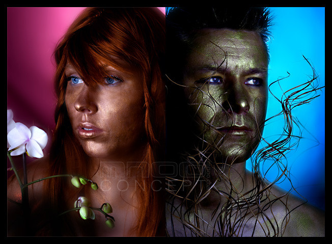
e·qui·poise1. Equality in distribution, as of weight, relationship, or emotional forces; equilibrium.
2. A counterpoise; a counterbalance.
3. Symmetry.
Pretty much the same lighting set up in both. A softbox on one side, gold reflector on other. Two flashes behind the head, one pointing at background, one towards the camera. Yup.
Models: Päivi and Miikka
Note: Detail: [link]
Related content


Comments: 120

Amazing texture on the detail link.
I love the metallic look of it.
And thanks for the description, I learned a new word today
")
👍: 0 ⏩: 1

Metallic make-up is really working for you right now!
I love the effects in colour and B+W from your previous images... this one is great. The blue eyes are very appealing

👍: 0 ⏩: 1


oh my
the colours are amazing
the lighting is perfect
the paint is fantastic
their eyes are stunning
the list goes on
this is amazing sweety

👍: 0 ⏩: 1

Aww so glad you like it dearie.
👍: 0 ⏩: 0

Great work marianne, very professional. Love the colors and details
...im really impressed.
👍: 0 ⏩: 0

wow, nice combo
the girls blue eyesand her red /bronze colour really brings out the colours even more.
hehe for some reason.... the female is middle earth (flowers, trees, beauty and such ) while hte male are the roots. haha
anywys, ncie work~~
👍: 0 ⏩: 1


thats very beautiful 
")
👍: 0 ⏩: 1

i am so insanely in love with this minus one thing - i'd make the eyes a TAD less blue. b/c the eyes look "too blue" as in obviously processed or whatever (even if not) and the whole image is SO FABULOUS in every way and the effort, the make up, the concept, the presentation, the color, the light 
but yeah - this is BAD ASS and you are jumping creative wise!!

👍: 0 ⏩: 1
I know on him in this size the eyes look freaky. It's a combination of the eyeliner and the compression. Did you look at the detail pic? they're lot less piercing in a proper size. I tried to kill the whiteness of the whites (just for you) but now I think the eyes look even more blurry sort of. Oh well.
Glad you like it anyways.
👍: 0 ⏩: 1
i like it better in the detail for sure
go you - tons of effort and its so artistic. proud of you!!!

👍: 0 ⏩: 0

Your work just always... ALWAYS amazing.
I am really wanting to try this style of work moe
studio... good lighting. Reflector... what does it look like? What does it do (other then the obvious).
And I have a white umbrella... would putting that over a basic lamp give it the same effect as a soft box?
Thank you. Absolutely amazing work!!
👍: 0 ⏩: 1
Thank you dear.
A studio would indeed be nice. *sigh* A tiny living room isn't exactly the same.
Yes an umbrella would definitely diffuse and spread the light out a bit. Soft box has a few layers and is a lot bigger - and a flash is more powerful obviously. Reflector can be pretty much anything that reflects light. They're not awfully expensive, mine is a white circle (which folds quite small when it's not in use) on which you can put a silver, gold or black covering. And yeah it is pretty obvious what it does, when you want to fill in the shadows from the darker side you can use a reflector to bounce the light back from the main light source.
I remember years back when I shot a lot of B&W portraits, I 'built' a softbox out of a en empty large (but shallow) box by taping white fabric over the open side and cut a hole on the back/bottom to fit over the light I was using. I had a big slab of polystyrene as a reflector.
👍: 0 ⏩: 1
Thank you hun
I will try this out for myself soon enough!
👍: 0 ⏩: 0

He's so gay
Oh.. and i didn't mean that the pic sucks. It's just so NOT Miikka.
*openminded*

👍: 0 ⏩: 1


I wish I could see the details on this . . . the link you have is great. The makeup is fabulous!! And it is still a colorful style, I feel. It's very you.
👍: 0 ⏩: 1

I get a whole "opposites" thing from this - yin/yang, comedy/tragedy, summer/winter, etc.
👍: 0 ⏩: 1

It's all so very rich in color and lighting...excellent!
Were the eyes of the model at right manipulated in any way? Because they look -very- blue...
👍: 0 ⏩: 1
The blue isn't manipulated at all, I did take some blue out of the white bits though, which made them a bit brighter... it looks a lot more subtle in real size, shrinking pictures down always seems to accentuate the contrast.
👍: 0 ⏩: 1
Ah *nods* Yes, the contrast looks a bit strong in the blue range. I wasn't aware resizing to a certain extent could do that, though...
👍: 0 ⏩: 2
Wow...I hadn't even noticed the line of jewels along the line of the eye before this. Well, perhaps you could always make the size of the overall image somewhat larger. 652x480 is rather small, especially on a monitor resolution of 1280x1024...
👍: 0 ⏩: 1
To be perfectly honest... I'm not that worried if it doesn't appear 'perfect' on DA, all I really care about is the print - the actual photograph. And no, I wouldn't really dare post much larger...
👍: 0 ⏩: 1
*nods* Understood, just something that might help out in the future, if needed.
👍: 0 ⏩: 0
Resizing always loses some of the more delicate details and then everything looks a bit more contrasty.... at least imo. The eyeliner (which the girl lacks) makes his eyes look a bit freaky in this as well.
👍: 0 ⏩: 1
Thinking about it, whenever I have to resize an image by %, I try to use interals of 10% or 25%. The resize has to interpolate the information, and pixels can't be divided into fractions. Perhaps trying to use whole numbers will preserve the finer, smaller details.
Aside from that, you could always add a layer effect (I forget the official term, the black/white circle icon) on the top layer and reduce the overall contrast.
👍: 0 ⏩: 0

great colors.....
the blue eyes.....wow.....what an contrasct...

👍: 0 ⏩: 1
Thanks.  (Smile)")
👍: 0 ⏩: 1

congratulations, i think this is your strongest piece to date! it's beautiful and intriguing and has that lovely touch of magical whimsy.
👍: 0 ⏩: 1


No ei todella. 
👍: 0 ⏩: 1

Ah, tossa kuvassa se on juuri sen värinen tukka ku mä haluun.
Kuvat muute toimii aika hienosti yhessä.
👍: 0 ⏩: 1
No siniset ne piti olla tuon meikin kaa.
👍: 0 ⏩: 0

Very Unique shot... I would have liked to see a little clearer skin on the girl because it looks like you tried to dirty it up a little. I think it would have contrasted a bit even more if you'd made her skin nice and smooth while having the guy's rough with the foliage there. Still good shot none the less..
👍: 0 ⏩: 1
I know what you mean about the skin. The makeup was very difficult to see in daylight/roomlight, it only sort of lights up from the flash. Hence it was impossible to get it even... so I went with an intentional rough look. I am gonna look for some metallic stuff with different sort of texture that would be easier to apply.
👍: 0 ⏩: 1
Thats a good idea, or maybe even put some makeup on as though she had a tribal tattoo or something... that would let you show some contrast and still not worry about it being blotchy. Just a thought
👍: 0 ⏩: 0

when did you get so many lights,
im very impressed, this is some of the best work ive seen from you.
very wonderful.
xoxo
ryan
👍: 0 ⏩: 1
Umm yes good question... they kinda sneaked in and on to my overdraft. First I got this fairly cheap kit with a basic flash and a tiny wide-angle flash, which was nice as it came with a reflector and umbrella and all sort of 'starter' stuff. Then just after christmas I got an alienbee 800 and an octabox as they were fairly cheap to order from the states... So now that's my main flash and I use the two small ones as background/hairlight. although I'm hankering after another alienbee at some point maybe.
")
Anyways, so glad you like. Means a helluva lot.
👍: 0 ⏩: 0
| Next =>