HOME | DD
 mocha-san — Found Receipt Font demo

Published: 2008-10-27 06:11:58 +0000 UTC; Views: 16780; Favourites: 89; Downloads: 2992
Redirect to original
Description
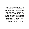
Inspired by the idea of found paper objects, this font resembles receipts and is strongly focused on the idea of a grid.This free demo includes all uppercase and lowercase characters except for R, S, T, L, N, E
To Purchase FULL version: [link]
My Typography Website: [link]
Edit 11/13/08: Change the kerning, added curly brackets, altered lowercase i and l.
Related content


Comments: 11


am i the only one that notices the letters not included (r s t l n e) are the ones given on wheel of fortune for the final word/puzzle?
👍: 0 ⏩: 1

It is because they are the most used letters, haha.
👍: 0 ⏩: 0


 (Wink)")

nice!!! i was searchin 4 someone like this lol thnx!
👍: 0 ⏩: 1
You're welcome n_n Hope it is useful!
👍: 0 ⏩: 0

