HOME | DD
 ModalMechanica — More Armor Concepts
by-nc-sa
ModalMechanica — More Armor Concepts
by-nc-sa

Published: 2011-10-21 08:02:23 +0000 UTC; Views: 12121; Favourites: 303; Downloads: 310
Redirect to original
Description
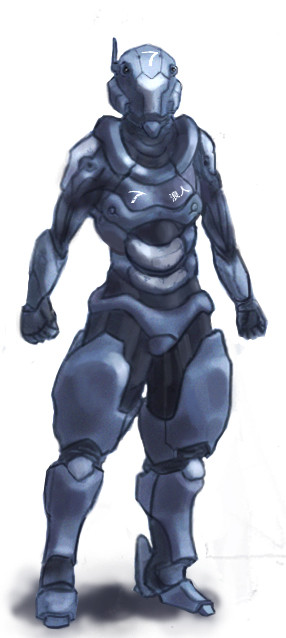
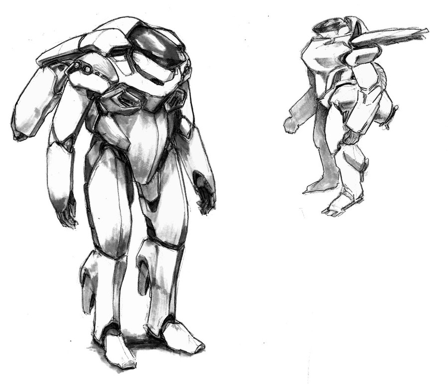
Done as a commission and hopefully a portfolio piece. Feedback and crit are highly appreciated!Related content


Comments: 64


I like the heavy unit in the center the best. it reminds me of a snapping turtle, especially with the eyes so far apart. I also like its high stance, standing on its "toes" it gives it a maneuverable/spry feel, as if it might be faster on its feet than the heavy-weight build would usually be. I am also a fan of heavy infantry in general haha. great work, all around!
👍: 0 ⏩: 0


looks like it would be called the Rhino Suit or something like that
great job
👍: 0 ⏩: 0

")


thamks haha, ill do him for sure.
👍: 0 ⏩: 0

very different, reminds me a bit of Shimmering swords works. hopefuly this will result in more unique armors since everyone else just seems to copy halo.
👍: 0 ⏩: 0

man...that is really nice. I could see it divided into multiple boards
👍: 0 ⏩: 1
really? where do you think.
👍: 0 ⏩: 0

These are epic awesome, I think these would look amazing battle scarred as well.
👍: 0 ⏩: 0

Wow, it is really awesome! I love the helmet design you went with. I also like the different sizes you experimented with, reminds me of one of those bomb disposal suits. Really really cool! Sorry, I can't offer more of a crit because I'm rusty on the finer points of art but it is FRICKEN COOL! XD
👍: 0 ⏩: 1
Haha, its all good as long as you like it!
👍: 0 ⏩: 0

I'm prolly gonna do that one next
👍: 0 ⏩: 0
looking really cool!
the head variation sketches are very neat ad add a lot variety to this sheet. one thing strikes me tho. some are helmet deisgns , the rest looks like robot heads. so the continuity of a topic (armoured suit) seems to get a crack here.
the presentation is a bit too messy (dont know if it was just a time problem on your side) i would prefer it more clean and well arranged. try different values of grey:
-might look better with a darker bg tone?
-very subtle gradient?
hero design on the left:
i like the design a lot. there is a clean read to it. shapes are similar and share a connection in terms of design.
the first thing that striked me:
cover the legs and look at the torso, then cover the torso and only look at the legs. there sure is a difference in the density of detail. caused by the multiple smaller shapes in the torso area and the more simple structred legs you might want to bring them both together more
- adding some more repeatative smaller shapes in the leg section
- connecting some of the many shapes of the upper body to create more simple and bigger ones.
the croach area is to eye catchy ")
maybe tone down the croach piece there or alter its shape . make it more belt looking so it doesnt stand out that much. the dark shapes all around it create a thick contrasty outline for it.
i would also suggest to add some more love to the head. it could use some more detail to become a main focus point. as stated already the whole upper body has a high detail density which makes it for the head to stand out.
- maybe a quick solution would do the trick: accentuate the eyes for example. add very fine crisp panel lines to the head shapes. add some tiny decals there: modelnumber? unit number? use jet planes and military weapons as reference. sometimes a well put little triangle works charms
oh i like the four bolts on his under arm. it makes the whole thing look factory built and not THHHHHHHHHHAT advanced looking. you could try to add some more bolts here and there. ah! the little ones on the feet! just noticed them! see it really adds to it  (Smile)")
both silhouettes and the other too sketchy design look great. nothing to say about these


👍: 0 ⏩: 0
i'm with frost. i like the left one as well. the two in the middle resemble isaac clarke from DS2 a bit as well.
👍: 0 ⏩: 1
The helmet you mean?
👍: 0 ⏩: 1
yeah that's right. sorry for not being clear about that.
👍: 0 ⏩: 0

I like the one on the far left the best. Nice job!
👍: 0 ⏩: 1

Bottom Box on the Right.
👍: 0 ⏩: 0

The whole image, but i like the horned bots
👍: 0 ⏩: 0

hard to figure out the 'theme' of the armor-are the helmets suppesed to resemble hercules beatles? if so, them wouldn't desiging the rest of the armor in an insectoid manner be good?
👍: 0 ⏩: 2
Haha, nah I didnt really go with any theme xD They just ended up that way >3>
👍: 0 ⏩: 1

sweet bro, like how you show how some of the helmet designs open up. cool designs.
👍: 0 ⏩: 1

man, they're a TONE! better than mine!...yes...exactly one tone....not a pound more...I'm designing a better suit for the U.R.F "Footsy" M 1, gona be called M 2.
👍: 0 ⏩: 1
Cool man, and thanks!
👍: 0 ⏩: 1
Mind if you take a look at the "footsy" and tell me things I should change?
👍: 0 ⏩: 1
mmm all I can say is, for this and most of your other designs. Focus more on the form and like gesture and then on the detail. A lot of what I see here is a bit overwhelming.
👍: 0 ⏩: 1
alright, thanks! I wanted to cram a lot of detail I guess. Although, I'm working on cartoons with my friends now, so I guess I won't be doing much of them soon. Or I won't upload em.
👍: 0 ⏩: 1
Just always remember, no matter how much detail you add, or how much you polish the image, it wont look good if the base is off. Cheers mate
👍: 0 ⏩: 1
alright! I'm going to start drawing with a base now, I never did.
👍: 0 ⏩: 0

I really like the amount of variety that's in the armor concepts, and they all look very believable while still looking futuristic. Great job!
👍: 0 ⏩: 1

Like walking into your favorite store and finding powered armor. Bliss!
👍: 0 ⏩: 1

This is the kinda concept art id want to be doing great work!
👍: 0 ⏩: 1

| Next =>