HOME | DD
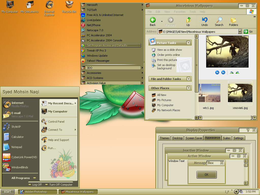
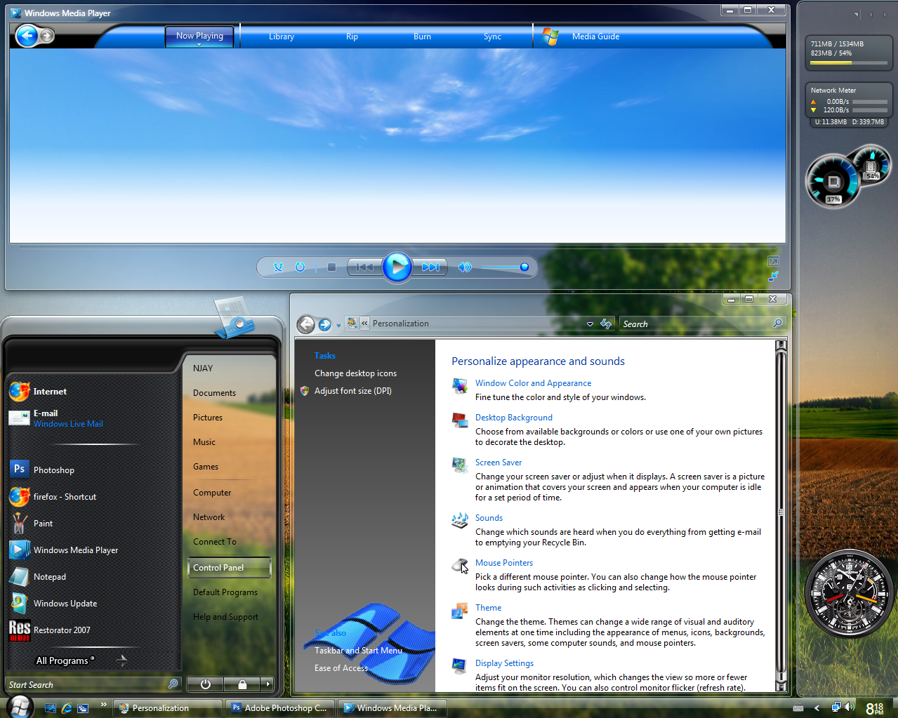
 MohsinNaqi — Pristine OS 1.2

Published: 2006-08-01 15:11:57 +0000 UTC; Views: 449982; Favourites: 441; Downloads: 161445
Redirect to original
Description
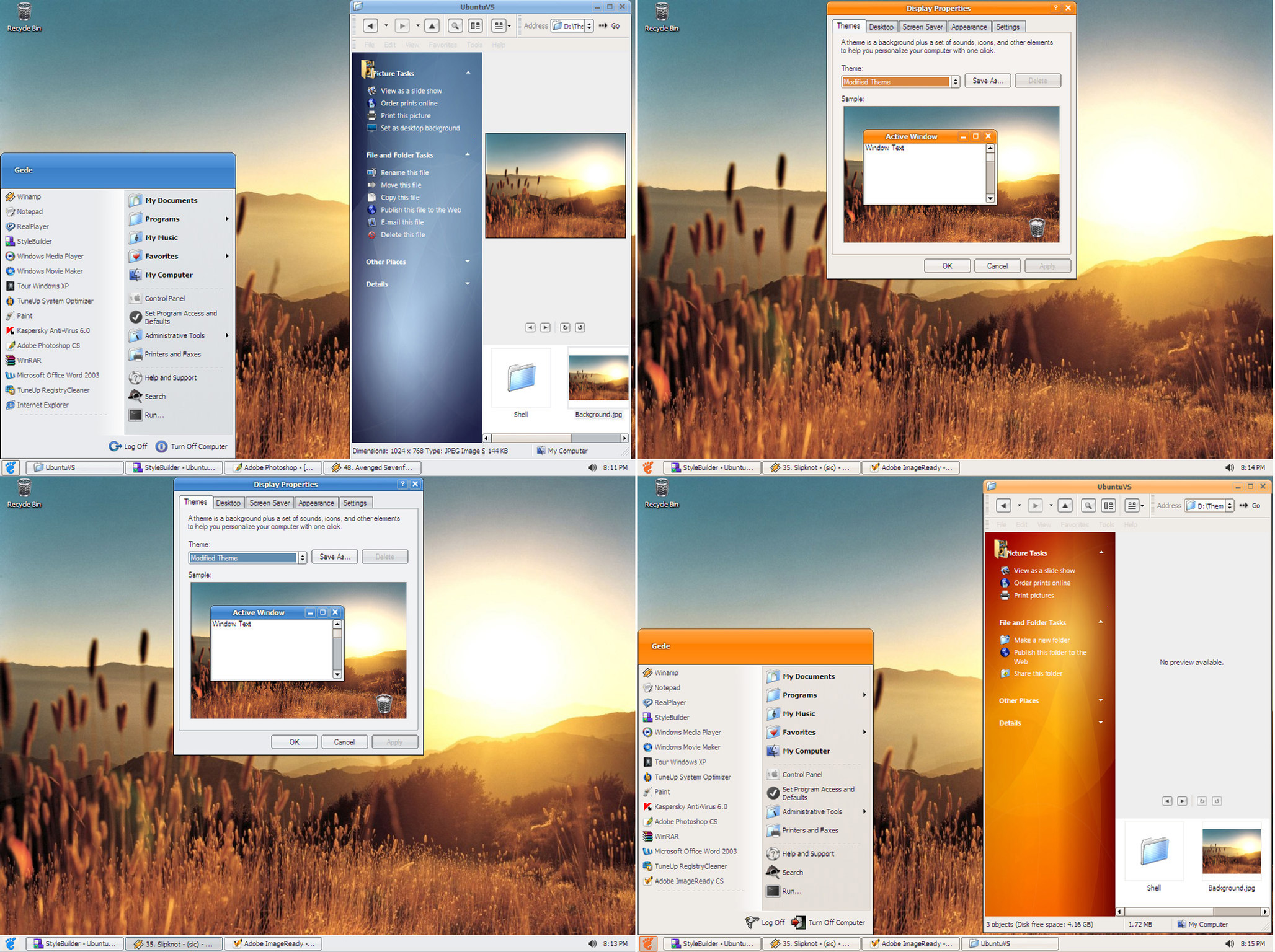
Pristine OS 1.2WAIT! before you dismiss this theme as one of those innumerable vista clones being released everyday, I ask you
to download and apply Pristine OS. I am sure you'll find it somewhat 'different'. In one word it's 'my' version of
windows vista (theme)
 (Smile)")
Part of inspiration came from Royale Vista [link] by dobee.
CHANGE LOG
Update: Added two substyles with 2 font choices; Segoe UI and Calibri
Big Update 03/08/06: Added another substyle with a new start panel
Improved the smaller start panel as requested
Improved Taskbar buttons as requested
Removed all the glitches reported as yet
Improved the corners and borders to give pristine OS a more crispy look
Update 08/29/06
Added two sub-styles with two different compact start panels
Added tahoma font for all four sub-styles
Fixed a few bugs here and there
-------------------------
Notes:
1) You can switch between segoe ui, calibri and tahoma via font size menu
2) Download fonts from here [link] if you don't already have them installed.
3) Enable 'clear type' font setting for best results.
------------------------
The monitor icon used in shellstyle will be released soon.
New ideas and suggestions are most welcome.
Welcome to my website [link]
Enjoy!
Related content


Comments: 255


oh very bad, i like both Tener and Pristine just awesome bful. great going buddy thanks
👍: 0 ⏩: 0


nice..i really like it..n i use it..really like the fake glow effect..i feel like use windowblinds..i give 10/10..
👍: 0 ⏩: 0


I like it, I just wish I was able to change the blue glow to something else (like, a different color for the Windows Icon). I mean, I really like it right now, it just seems a tad too blue for me.
👍: 0 ⏩: 0

wow I love this theme. Too bad i'm too used to having the taskbar on the top.
Amazing work though
👍: 0 ⏩: 0


it looks nice but i dont wanna install a rar thing to unrar it
👍: 0 ⏩: 0

i love this skin, it's fast, beautiful, don't takes so much resources like windows blinds glass themes!
👍: 0 ⏩: 0

 (Wink)")

Better than a Vitsa theme.
I like the new start button.
👍: 0 ⏩: 0

what font am i missing if my internet brower (Opera 9.0) is not displaying properly?
👍: 0 ⏩: 0

I would love it more than anything if you would make a thin taskbar version of this, possibly with smaller fonts. Perhaps a 7 pt. Tahoma?
👍: 0 ⏩: 0

Most impressive!
I like the blackk/blue aqua feel a lot. Kudos
👍: 0 ⏩: 0


miranda im message area arrow-buttons don't display properly with your vs.
👍: 0 ⏩: 0


hey i liked MiVista (never-ending + re-duplicating 4xxx 5xxx) series of visual styles by leosss
but now i say PristineOS is cooler by heaps
fug i also love the wallpaper
mohsin. u r the guy
👍: 0 ⏩: 0

I loved your theme but I'm just a little bit dumb.
How can I upgrade my XP theme to yours? I've donwnloaded your file but I just don't know what to do...
👍: 0 ⏩: 0


Thank you for your kind words
👍: 0 ⏩: 1

love all but the font that firefox now has.... why does it change the firefox font? it doesnt fit with the rest.
👍: 0 ⏩: 0

Excellent skin, I agree Vista should include a skin similar to this one. Nice & Simple. Love every bit of it, this is going into my fav's for sure ")
👍: 0 ⏩: 0

Ever thought of making a red, insted of blue, version of this? That would be really great. There a to few good looking VS's with black and red. This one would look fantastic with red I think.
👍: 0 ⏩: 0

Can i request that you include a regular default font such as Arial? I think arial is such a nice font and would accomodate this theme very well. The reason why i ask for this request is becuase i dont want to install the fonts thats specify and Segoe UI doesnt meet my fancy. Overall, the theme is flawlessa and beautiful. Please implement a arial font for the next update
👍: 0 ⏩: 1


Very nice
👍: 0 ⏩: 0


Great! Keep improving it! For now I'm not using it (I'm with Royale Vista) but it's a fav
👍: 0 ⏩: 0


This theme is class, my favourite to date. I love the perceived simplicity-it works very well! Your efforts very much appreciated.
👍: 0 ⏩: 0

I love it!!! Would just like a start bautton that doesnt use the globe format - basicall a normal shape, but well done!!!
👍: 0 ⏩: 0

Beautiful theme!
One wonders why the good people at Redmond simply don't pluck some of the talent here at DA and employ them in their Windows UI department.
Anyway, this one's a keeper for sure, its been used on my PC since its release, most themes don't last more than a day or so because of usability issues.
Keep up the good work!
~Rogue
👍: 0 ⏩: 0


| Next =>