HOME | DD
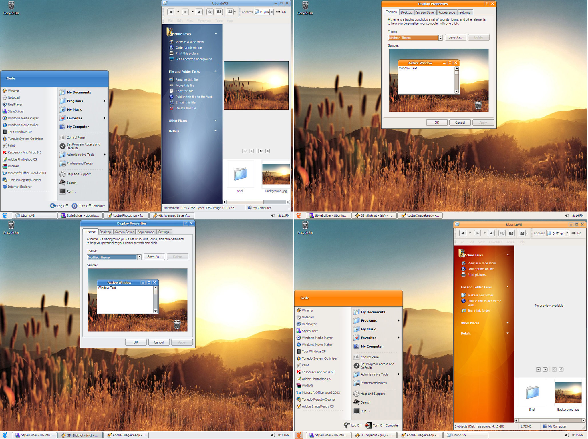
 MohsinNaqi — Pristine OS 1.2

Published: 2006-08-01 15:11:57 +0000 UTC; Views: 449981; Favourites: 441; Downloads: 161445
Redirect to original
Description
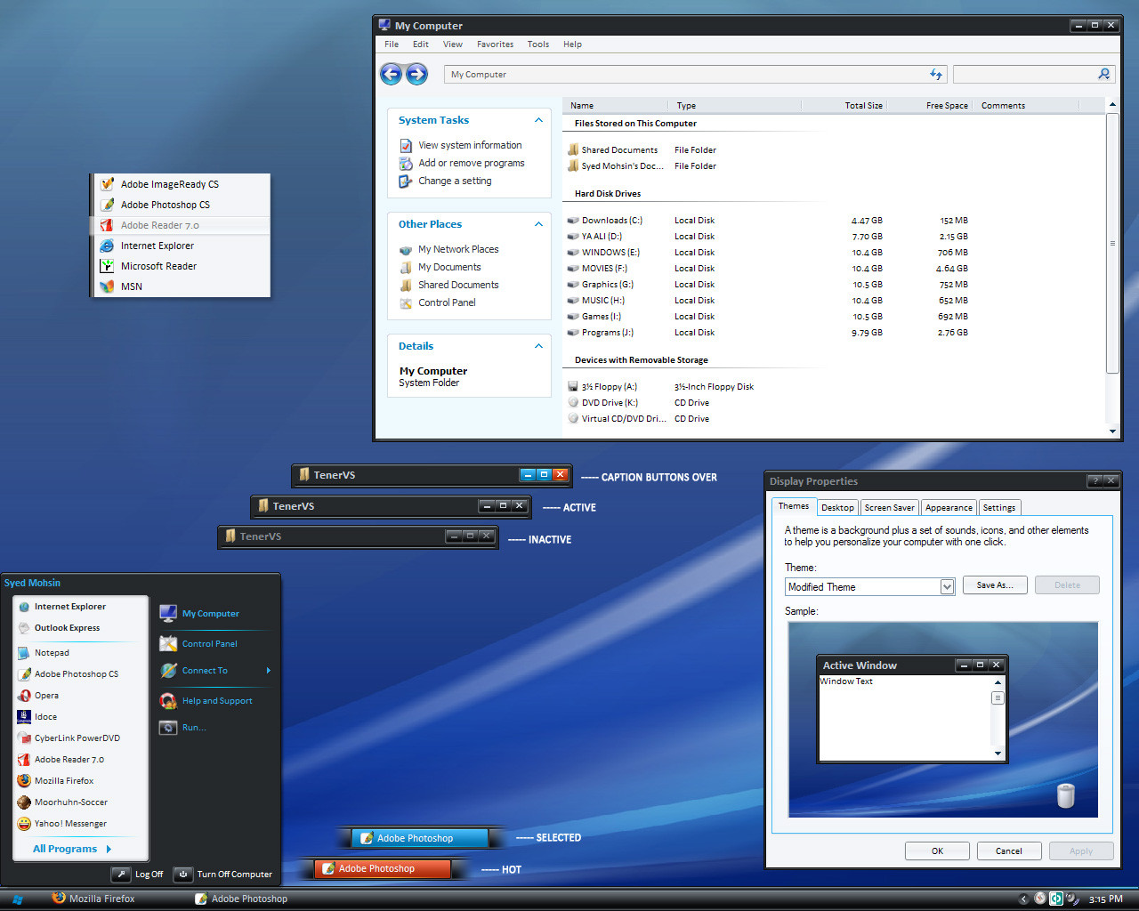
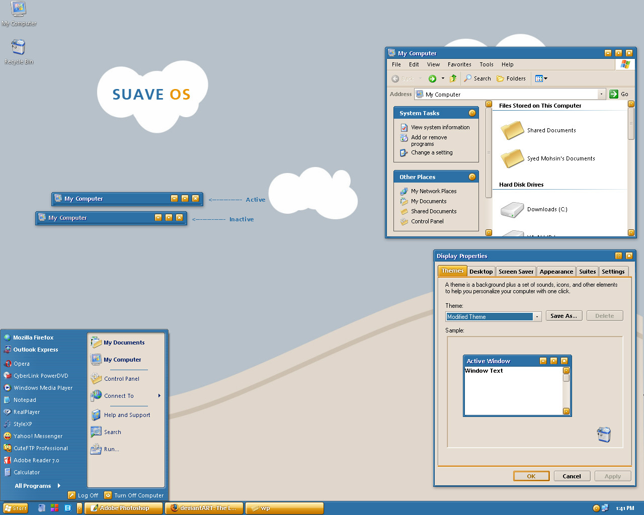
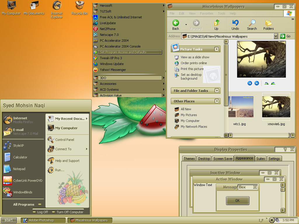
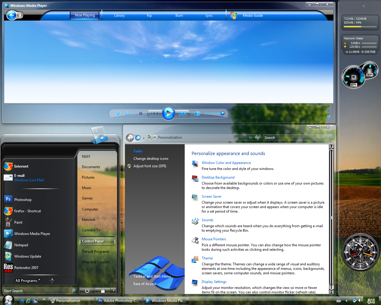
Pristine OS 1.2WAIT! before you dismiss this theme as one of those innumerable vista clones being released everyday, I ask you
to download and apply Pristine OS. I am sure you'll find it somewhat 'different'. In one word it's 'my' version of
windows vista (theme)
 (Smile)")
Part of inspiration came from Royale Vista [link] by dobee.
CHANGE LOG
Update: Added two substyles with 2 font choices; Segoe UI and Calibri
Big Update 03/08/06: Added another substyle with a new start panel
Improved the smaller start panel as requested
Improved Taskbar buttons as requested
Removed all the glitches reported as yet
Improved the corners and borders to give pristine OS a more crispy look
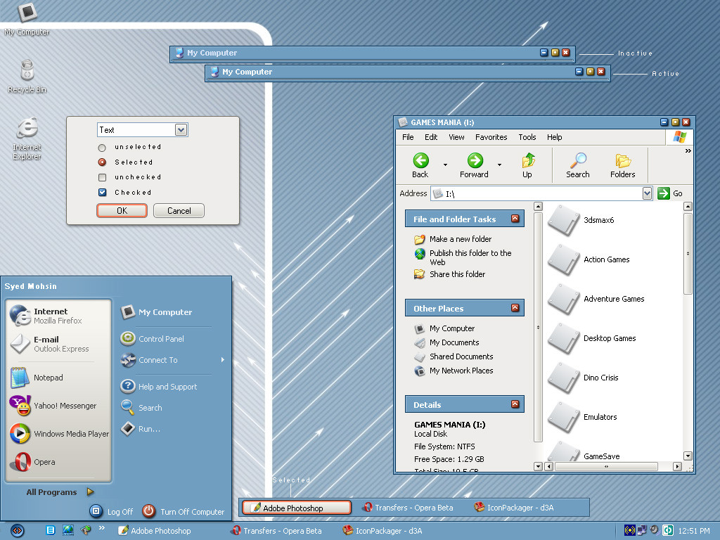
Update 08/29/06
Added two sub-styles with two different compact start panels
Added tahoma font for all four sub-styles
Fixed a few bugs here and there
-------------------------
Notes:
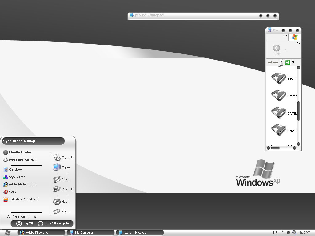
1) You can switch between segoe ui, calibri and tahoma via font size menu
2) Download fonts from here [link] if you don't already have them installed.
3) Enable 'clear type' font setting for best results.
------------------------
The monitor icon used in shellstyle will be released soon.
New ideas and suggestions are most welcome.
Welcome to my website [link]
Enjoy!
Related content


Comments: 255

um awesome, love the start button way better than the crappy vista standard orb.
👍: 0 ⏩: 0

I'm not usually into these Vista-inspired skins at all, but I love this. It's that round blue start button -- gorgeous. I've been using a different VS for a long time, but I think it's time to switch.
👍: 0 ⏩: 0

a really great vs, the colors are nice and the style...-fav
👍: 0 ⏩: 0


This is REALLY good. My standard style for a long time to come.
One question: where can I get that beautiful wallpaper you have in your screenshot? Thanks!
👍: 0 ⏩: 0


Question: The font in my start panel (I'm using compact) doesn't match the way the screenshot displays, and that means the right part of the panel's graphic is broken. I can take a screencap if need be... but what I'm wondering is, how in the world do I fix this? Is there a way I can go in with, say, Resedit or something, and set a font type? I've got all of the fonts installed... but my desktop is widescreen (and I seem to run into problems with visual styles often, because of it. Especially in the start panel.)
👍: 0 ⏩: 0

I relaise this simple wallpaper by your VS : [link] by my computer...
Also I like where found the capture wallpaper
👍: 0 ⏩: 0

Cooool~~~I like it.Font is calibri and Tahoma don't use?Let me try.hehe~
👍: 0 ⏩: 0

pls consider adding support for the tahoma font. i only have a crt monitor and the clear type smoothing together with the fonts Segoe/Calibri is making my eyes bleed thanks
👍: 0 ⏩: 0

I've tried probably every theme on DA, all were good in different ways. Then I came across this, and it fits me like a glove. Fantastic job on this theme, love the colours, taskbar, everything. very easy on the eyes at 4am. I Think I'll be using this for a loooong time... well, until Pristine 2
 (Wink)")
👍: 0 ⏩: 0


this looks great...I especially like that the start button circle is completely round, unlike most of the other vista styles where it is flat at the bottom, which I really hate and makes me refuse to use vista themes because of it. I also like the colors. This is very unique!
👍: 0 ⏩: 0

One of the most original takes on the Vista craze I've seen yet. I love the look of it.
Kudos.
👍: 0 ⏩: 0

Great Update! I still can't say what makes this theme special. I just can't avoid to use it. ")
👍: 0 ⏩: 0

Text in Opera 9 (Non default skin) is very messed up (Bold "old school" font)
👍: 0 ⏩: 0

I really like this one, very sleek and uncluterd.
Iam going to be using this for quite some time!
Well done
👍: 0 ⏩: 0

just...awesome...i hate vista themed visual styles, but this one...doen's look so shinny, so....
congrats
👍: 0 ⏩: 1
a little update, about an hour with this VS, the whole VS is as good as it looks, really beautiful, but the buttons....hm...the minimize, close....bla bla bla buttons seems to be very small and very closed to the end of the bar...it would be nice if u move them a little bit more to the left, the size could be the same, but i guess it would be nice to move them ")
bye **
👍: 0 ⏩: 0

do you know where you can download the fonts for free because i went to the link and it asked for a payable account?, can i still use the style without the prescribed fonts?
👍: 0 ⏩: 0

Great VS! However, the taskbar looks "cut", when I have it on the top side of the screen.
Here's an example:
[link]
👍: 0 ⏩: 1

Start button optimized for single height taskbar.
👍: 0 ⏩: 0

Bug report continued:
Firefox dialog box: grayed out item is gray on gray. Both grays are almost identical and the text is invisible. However under normal Windows dialog box, gray out items looks OK. Don't know what is specific with Firefox but can you please fix this? I'd like to use this VS.
Please also add a Tahoma version.
Thanks very much in advance.
👍: 0 ⏩: 1
Firfox usually messes up everything i.e. scrolls bars are often oversized and/or glyphs usually don't change color on mouse over. It's an application specific issue.
👍: 0 ⏩: 1
Can you have a look at it please? This issue could be Firefox specific, but it rarely happens with other VS.
👍: 0 ⏩: 0
Exceptionally beautiful. Thank you.
Bug report on Pristine 1.1:
- Change The "Font Size" combo box to reflect the exact name of the font
- Font Size = "Extra Large Font": there is a sizing problem. The Min/Max/Close buttons fall outside of the titlebar.
Request:
Is it possible for having another color substyle other than black?
👍: 0 ⏩: 1
Thanks for reporting bugs.
👍: 0 ⏩: 0

so nice!
can i got this iconpackager and toolbar?
nycjian@gmail.com
thx!
👍: 0 ⏩: 0

hey.. how to make those fonts work??? just put them in the fonts folder.. and now???
👍: 0 ⏩: 1
That's all you don't need to do anything else, just apply the VS.
👍: 0 ⏩: 1
huu... I think I did the font thing after the installlation.... I reinstalled it again... so now it should be fine... dont it?
👍: 0 ⏩: 0

WOW! This thing is awsome, thx alot prob. the best Vista Look-A-Like I have seen!
👍: 0 ⏩: 1

You ROCK! Thanks for the requested updates...looks great!
👍: 0 ⏩: 1


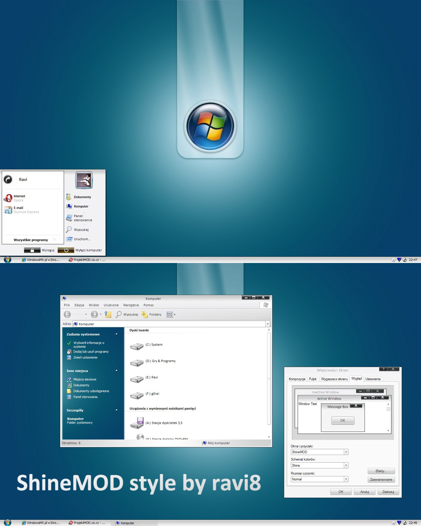
Beautiful ! I love the Royal Vista theme by Dobee, and your theme is very nice too.
👍: 0 ⏩: 1


Very nice, and different from those Vista clones out there
👍: 0 ⏩: 1
Cool, am glad you likke it
👍: 0 ⏩: 0

<= Prev | | Next =>