HOME | DD
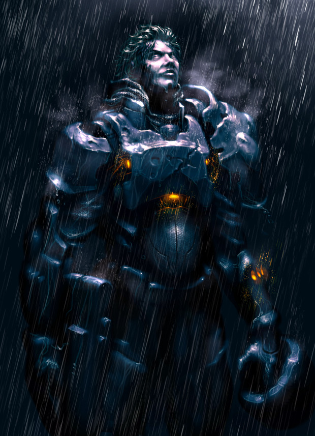
 mohzart — Father's Golem
by-nc-nd
mohzart — Father's Golem
by-nc-nd

Published: 2009-11-23 22:03:09 +0000 UTC; Views: 20239; Favourites: 435; Downloads: 439
Redirect to original
Description
Once a King's Golem Stable, now only dust remains.But a boy activated the main guardian golem to seek revenge from those who bullied him.
EDIT: I updated the painting
 (Smile)")
Related content


Comments: 56

I found this image while searching up inspiration on my Warforged character, and I was so stricken by this piece that I tracked down its source to let you know that it's beautiful! The boy's expression is raw, and the golem's face is endearing and I love its design! The usage of blue in both characters is really pleasant, and the whole piece tells such a great story, I'd be happy to see more! "A picture's worth a thousand words" at its finest!
Excellent work!!
👍: 0 ⏩: 0

Wow, As one who works in education I can see this all to easily.
Bullying is horrible.
👍: 0 ⏩: 0

this is inspirational i'm writing a book a book with a Golem as the main character
👍: 0 ⏩: 0


i wouldent mind an avatar of that Golem in second life lol
👍: 0 ⏩: 0


can I write a book about this pic? probobly revenge for something drker than bullies though
👍: 0 ⏩: 1
oops, I meant darker "but" you likely guessed that.
👍: 0 ⏩: 1
and I misplaced quotations.
👍: 0 ⏩: 1
I use auto correct and spellcheck when I'm writing books, this does not happen often.
👍: 0 ⏩: 0


A thought provoking piece mohzart, I like your use of blue.
👍: 0 ⏩: 0


Hi ...Dear ... mohzart ...!!!
Your Fantastic Art work
... Father's Golem
is featured in Action-Portraits...!!!
if you don't mind...
best regards.....................You're most welcome in Action-Portraits...!!!
👍: 0 ⏩: 0

Those bullies might want to start running.
...Like, now.
👍: 0 ⏩: 0


I really like the color and the feel of this. it's really cool how you can see the dust in the blue light and I like the story behind it. awesome work <3
👍: 0 ⏩: 0

oh Ok But this is still very cool
👍: 0 ⏩: 0

Muito Bom Adorei Vou pegar emprestado para uma historia que estou criando ...rpg
👍: 0 ⏩: 1


that is so freaken awesome. the glowing eyes and the pendant remind me of the knights from hell gate london, that armor is so freaken cool.
i didnt have to deal with bullies thankfully when i was a kid, but as of right now it would just be out of this world to have a golem like that as a lackey.
👍: 0 ⏩: 0

Pretty slamming stuff man, Ive actually been showing some of my students your work as an example of the level they should be at when the course is finished!
👍: 0 ⏩: 1

Make sure they keep studying!
👍: 0 ⏩: 0


Also did you sketch this out before you digital painted it? Or can you explain the process please I have been wanting to get into digital painting myself but have been finding myself in a few bumps that i need to get straightened out.
👍: 0 ⏩: 1
No I dont work for a studio ")
I sketched it out first. If you want to follow the making of this you can follow my online sketchbook
[link]
👍: 0 ⏩: 1
How do you blend stuff together like that all I can get is something blotchy and I really don't like it.I'm trying to get it to a smooth shading any tips please?
👍: 0 ⏩: 1
If youre using photoshop then press F5, it'll bring up the Brush settings. Now, in the list tick the Other Dynamics box, if nothing happens then click on it and itll show you more options. Now set the Control to Pen Pressure. Now you can get nice smooth marks.
If you want it even smoother then youll have to change the spacing to 1%, in Brush Tip Shape in the same window.
But other than that youll have to use those tool to merge the colours together to get a nice smooth blend. Just like in oil painting
👍: 0 ⏩: 1
I have some of those on elements sorry i didn't clarify earlier but still great tips! I'll try to apply the best way I can! Thank you I send you a showing of a couple of sketches if that's okay?
👍: 0 ⏩: 1
you should make a sketchbook on conceptart.org
A lot of people will help you out
👍: 0 ⏩: 1
Thank you I'll make one some time this week!
👍: 0 ⏩: 1
you should ")
👍: 0 ⏩: 1


I think the child's expression on this shows a much more cartoon aspect to your art. He's slightly exaggerated and I think it adds to the piece.
Only criticism I have is the Azure text on the tag, the font has been really nicely incorporated on the shoulder pad and yet seems a bit tacked onto the tag!
As usual though the colours and the textures and the feel are wonderful, especially if you've done this along with all the others in such a short timeframe!
👍: 0 ⏩: 1
I can rely on you for great crit unlike many others.
I'm still in the process of polishing this painting. I'm not happy at all with the child. and my style does clash quite often due to having realistic rendering of metal textures and other elements, yet my human/flesh rendering is really still in it's rookie stages...
And about the name tag. I wanted to have it there as well as the name on the plate, because I wanted to show a story of the Golem's creator tagging him after noticing the name on the plate is worn out.
Anyway, I have a lot of work I want to do to this piece. I'm really not happy with it... lol
👍: 0 ⏩: 1
That's understandable. But with the child I think the way you've drawn him works in this piece as it serves to set him off against the golem, making the creature more cold and mechanic due to the child's overly expressionate features.
However I see what you're saying that the difference would probably not work in something bigger like a comic book or actual in-game graphics, but for the purpose of this singular piece it is a nice stand off between these two beings.
👍: 0 ⏩: 1
I suppose so. This painting was originally for a group I joined earlier that have daily topics. I just sort of went overboard with it and am wanting this to be a master piece. A great story for starters
By the way I updated the image.
👍: 0 ⏩: 1
| Next =>