HOME | DD
 monkeYB07 — Mint4Foo preview setup
by-sa
monkeYB07 — Mint4Foo preview setup
by-sa

Published: 2010-10-17 02:57:25 +0000 UTC; Views: 12413; Favourites: 16; Downloads: 2660
Redirect to original
Description
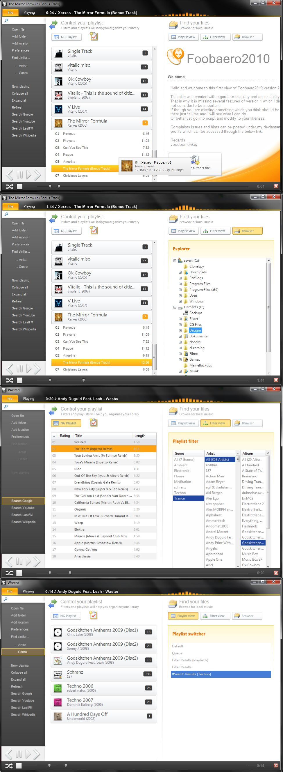
Finally I was able to combine all my scripting into one working layout which features some new design elements which you might not have seen in other foobar skins. Yet this is only preview and intended to gain response from a broader mass of users. Hope you do so (Wink)")
Related content


Comments: 21

I have no idea if you're still working on this but I tried it out and I love it. I do have a question though, is there any way to change the color of the text? Would prefer it to be something brighter as it blends in too well with the background.
👍: 0 ⏩: 0


resembles ribbon-UI of MS office '07 and '10.
cool man!
👍: 0 ⏩: 0

love the progress bar<3, not much into all the rest though.. sorry :/ diffrent taste i guess ^-^
👍: 0 ⏩: 0

Is there any way to get simple biography to show lastfm playcount and love status?
👍: 0 ⏩: 1

Well as long as all three are wsh scripts you can try to mix them together. I am doing this right now to create an ultimate lastfm panel. But you run into issues there since they share some information and thus you need to be careful in what to copy over.
👍: 0 ⏩: 0

Hi man, the design is really awesome! The skin is really outstanding!!!
The only things that I dislike are the orange buttons on the left...and the shadow
why don't you try something different? maybe blue or grey or maybe glass...
about the shadow ...it's to dark for me... try reducing the opacity
I think that the rest is perfect! this one could be one of the best foobar skins!
(sorry for my bad english)
")
👍: 0 ⏩: 1
Well reducing the opacity of the shadow results in an ugly grey tone which didnt look good to me. However. You can try to reduce it yourself by either creating a different tab_bg.png or by right clicking on the top tab panel - configure - go to line 25 and change the last figure to a lower value like 100 then apply
👍: 0 ⏩: 2
I changed the shadow color to white and changed font color to dark one. For me now it looks eve better
 (Smile)")
👍: 0 ⏩: 0
ok thanks...I'll try to do something on it
👍: 0 ⏩: 0

whats foobar version you use?
nice workk!! superb
👍: 0 ⏩: 1
1.0.3 - i did not test it with newer or older
👍: 0 ⏩: 0


tested and working perfectly, keep up with this fantastic job
👍: 0 ⏩: 0

Works just fine...I am wondering what the empty white slate after the Menu button is for.
Note: For the mouse-over caption..I would suggest adding the bitrate setting preceeding the MP3 label. (e.g. V0 VBR MP3, or 192 CBR, 1048 FLAC)
👍: 0 ⏩: 2
Another note, when I select an album via the Library Grid Menu and it selects the tracks on the playlist, I try to remove them with the delete key and they don't. I have to manually drag and select them to be able to delete them. Either it's a bug or a it's native design, but it'd be good to have it run like your fooAero skins when I click the album portrait and it selects all the tracks.
👍: 0 ⏩: 0