HOME | DD
 MonoFlax — 26 Shades of Nick (ABC Expression Meme)
#zootopia #challlenge #expressions #ink #traditionalart #nickwilde
Published: 2016-08-08 03:32:09 +0000 UTC; Views: 7394; Favourites: 193; Downloads: 83
Redirect to original
Description
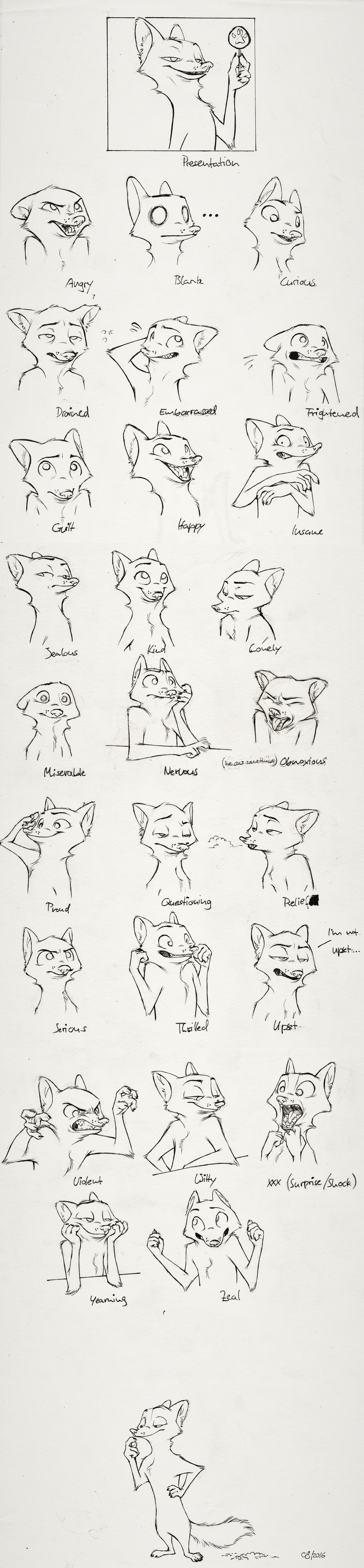
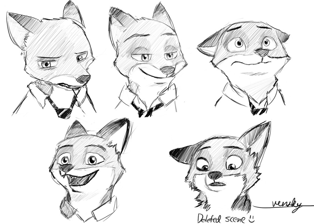
Did a meme, and dang, this took forever >:IGot the single expressions from 33Snickerdoodle33 - Here's the template.
Dunnow if I nailed "blank" xD Same thing about Zeal. I am especially proud of "Frightened" and "Proud". Chose "Surprise/Shock" for "XXX" because I feel like it's an essential expression that was left out. And "Witty" is basically Nick's face in the entire movie xD
Related content


Comments: 63

Beautiful art Now can I learning from this face
👍: 0 ⏩: 1

I'm sorry, what do you mean?
👍: 0 ⏩: 1
Never mind but this is beautiful
👍: 0 ⏩: 1

ahh I really missed seeing your art,
your nick drawings are getting better and better( heck, not just nick drawings, all of your art is amazing!)
👍: 0 ⏩: 1
Thanks ^^ I am also glad that you are back xD
👍: 0 ⏩: 1
")
are you gonna do inktober challenge?
👍: 0 ⏩: 1
I'm gonna try ^^ Not making any promises though
👍: 0 ⏩: 1
awesome, same with me
can't wait to see what you draw
👍: 0 ⏩: 1


This is brilliant! You've shown each expression so well!
I really want to do something like this with one of my characters cuz y'know... My expressions suck XD
👍: 0 ⏩: 1
Thank you! I can clearly say that it helped me in that regard. You might not nesseceraly like the end result, but it is definitely good practice. You should also look into what parts of the face speak for which emotion. For example, I noticed that (especially with Nick) that the parts of fat and muscle below the eyes (namely the cheeks xD) have a very large effect on what makes us feel like a character is smiling. With Nick it's almost like a roll of fat that comes from the root of his nose and collides with the mouth and the eyes. Try looking into details like that and experiment with that.
👍: 0 ⏩: 1
Thank you for the little tips! I'll definitely give it a go at some point! I see lots of referencing ahead XD
👍: 0 ⏩: 1
Definitely. Reference has been crucial for my development C:
👍: 0 ⏩: 0

 (Smile)")


I have missed seeing your art man
👍: 0 ⏩: 1
Thank you! It's good to have you
👍: 0 ⏩: 0

This. Is. Awesome.
I wish I could draw expressions as well as you! I wonder how long this took you?
👍: 0 ⏩: 1
Thank you QwQ This took two or three days from start to finish, didn't expect it to be that much of a challenge, but it was propably only because of the ink that it took so long - I really like taking my time with ink C:
👍: 0 ⏩: 1
That's not long at all especially since you inked it! And you captured them so beautifully too.
I'd take at least over a week if I tried drawing any character with all those expressions. I'm really bad with them

👍: 0 ⏩: 1
Nah, wouldn't say that. You actually captured those expressions from the screens you redrew rather eloquently if you ask me C: But I'm still thankful nonetheless x3
👍: 0 ⏩: 1
Thanks! That makes me really happy
But that's the thing... whenever I go beyond actual scenes I'll need to draw the same face maybe a dozen times to get the expression right. It's more of a trial and error for me
👍: 0 ⏩: 1
Hm... what do you know about the character of Nick for example. There are a few basic patterns you should refer to when you draw Nick. And to draw his expressions, you must first learn how to draw his face, and how it fits into his head. This video oughta help: www.youtube.com/watch?v=Gymbbh…
Howard knows his stuff about this character, he had a hand in creating him afterall^^
👍: 0 ⏩: 1
Haha I've watched that video and followed it at least a dozen times now and have no problem drawing the Byronesque Nick... I love it. But I can't get the movie version "just right", probably because I'm used to flat toons and Nick is the first 3D character I've tried so hard to draw.
Cory's drawings in the art book has been very helpful since they're a bit truer to the 3D version, but of course there are just that many expressions I can practice sketching before I run in to problems inventing my own ")
I really should have paid attention in art class in high school too
👍: 0 ⏩: 1
Hmm... perhaps you should try not to "copy" their version of the characters but instead take the principles he explains and carry them over into what might develop into your version of the character. The "flattened football shape" of the head for example is ESSENTIAL no matter which version of Nick you're looking at - and so is Judy's "gum-drop shape. Try using that as a starting point.
Also, I see you know your Zootopia contributors
👍: 0 ⏩: 1
Yup I definitely agree. The basic principles are the same, but I really have some big troubles getting the proportions right on the first go. It's more like just generally not being good at drawing characters without lots of erasing. I guess it's a few more years of practice for me and one day, just one day I'll be able to draw up a character in any setting like you're doing now.
And of course I have to do my research! I have a pretty high bar in terms of even going to a theater to see a movie and zootopia is one of the only movies I went for more than once. The art book is a must, and BIOR lurking on reddit also gets me all the extra info  (Wink)")
Lechner is really impressive too. It takes me a while to even just take things in looking at his drawings. But I can't speak on it too much since I've never had experience with scene designs at all left alone an entire city. 
👍: 0 ⏩: 1
Thinking about getting the artbook, too... but it's quite expensive. Still, there's just so much cool stuff in there, you're right, it's a must! To me, Loftis has just such a characteristic shape language, can't rightly describe it but we definitely got a master at our hands with him. He successfully merged the disney style with reality (animal anatomy, human anatomy) and the characteristics of Byron Howard's original vision of the characters (headshapes, expressions,...)
I have similar feelings towards Lechner's work, I am a character artist, too. But the city of Zootopia could be considered his brainchild if you ask me... he put so much effort and thought so much about envirionments, infrastructure, animal culture, etc. there's so much about this film't production that leaves you speechless.
👍: 0 ⏩: 1
Actually for movie art books, this one's on the cheaper side I think. I snatched it before Amazon realized it's a great movie and hiked up the price a little. Don't buy the digital version because the artwork quality is unbearable.
I can't even properly describe Loftis' style, but there surely is something to it that makes characters look both animated and realistic. As you said he is the master of getting anatomy, the expressions, and really everything just right.
The environments and all the details they put into the design is definitely what sets this film apart and Lechner is basically responsible for it. I have a friend in corporate Disney and he told me how crazy lengths the artists would go through to get all the details realistically accurate. (Except Nick - but those are all conscious choices afaik). It's really amazing how they seem to have addressed all of the problems of the entire world and it actually would work if it existed. (Not that I'm saying it doesn't
👍: 0 ⏩: 1
Oh god I am so thankful you sent me this link, I was gonna get the book for references because there are just SO MANY awesome drawings in it, and now I don't have to do that anymore. in the pdf version the image quality is fine imo. Actually pretty great in some parts.
What I like about Loftis painting style is this certain sense of texture he always brings into his illustrations. His artwork always looks just a bit "dirty", almost like traditional artwork in a way.
Loftis and Lechner both had their challenges to face, Loftis came up with this awesome anthropomorphic anatomy (which I think surpasses any other form of anthrompomorphism) while Lechner worked in influences from all over the world to make the city feel more globalized. And they pretty much both had to do with the challenge of depicting hight differences between certain animals realistically, for obvious reasons ")
👍: 0 ⏩: 1
Haha you're welcome! That pdf is actually pieced together from files sent to the publishers for print, not the digital version they sell which is wayyyy worse. Knowing people who work in the studios is always the best
You definitly should buy the book when you can though; some things just don't look the same on a monitor. It's also missing the inner covers which have dozens of business logos created for the city. The "cover" is also actually the dust jacket (and so the fold-in parts are missing), and the actual cover is a plain color with the logo embossed on it. You can't really add "touch" to a pdf lol.
You've probably seen more of Loftis' work than me, but actually among the Zootopia concepts I've seen I actually think his drawings are actually some of the cleanest. They definitely do still look like traditional animation which I love, but also quite polished. If he actually drew the frames I'm pretty sure they'd be more than qualified to go on cels. And yes, it really is unimaginable to me how they could turn these ideas into designs that just work. I've watched it at home several times more now and ever time I'm still finding little design details they put in that make me go "that really makes sense" or "so this is where that came from". I'm running out of words to describe this film... probably awe is it.
👍: 0 ⏩: 1
Gotta say, I envy you a little bit for that opportunity xP having access to first-hand information about a job I would personally LOVE getting into myself.
I am still thinking about it - though I must say that my main reason to get the book in the first place was for reference, which it provides splendidly no matter which version you posess.
That's not what I meant. "dirty" was propably the wrong word to describe it - what I mean is that there's always a certain sense of texture to his digital paintings that's very reminiscent to the way traditional paint looks on a canvas:
66.media.tumblr.com/062ce79ef3…
I really admire when digital artists manage to do this. Besides that, I am inclined to agree - his work looks definitely more polished and propably had more effort put into it in that regardthan, say, Nick Orsi's or Shiyoon Kim's work - which are incredible too by the way, but they are a lot more loose and to-the-point- which is incredibly interesting to look at, too.
"I'm running out of words to describe this film... probably awe is it." You read my mind on this one
👍: 0 ⏩: 0
Ist mir halt so in den Sinn gekommen xD
👍: 0 ⏩: 1

Da kommen komische Gedanken hoch.. o.O"
👍: 0 ⏩: 1


This is really cool!! I love his expressions. Great artwork!!
👍: 0 ⏩: 1

| Next =>