HOME | DD
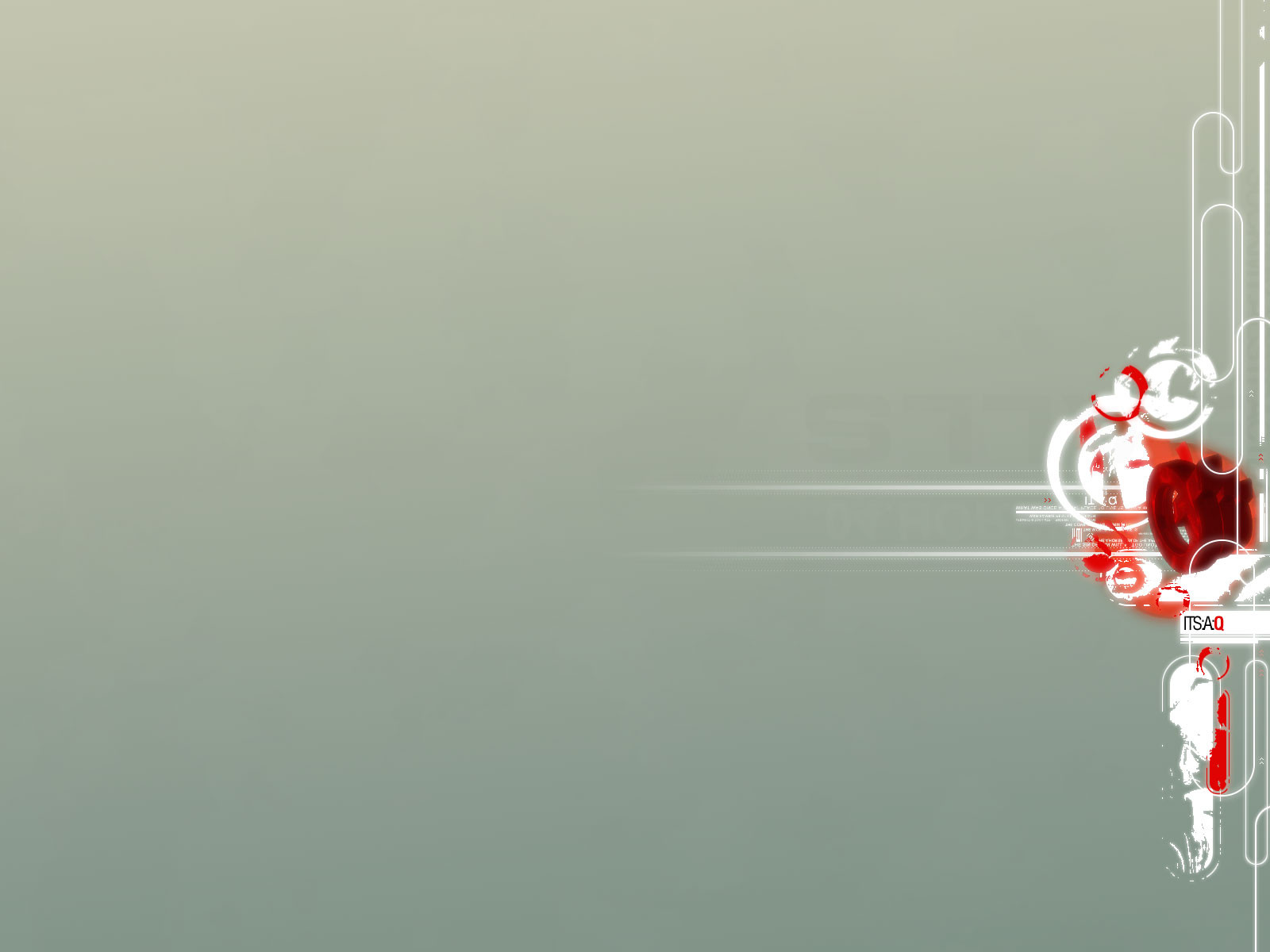
 monoxism — imaginary forces

Published: 2002-11-23 20:28:45 +0000 UTC; Views: 7427; Favourites: 85; Downloads: 481
Redirect to original
Description
Collaboration with Marcus Frödin aka ~cokineComments and favs are appreciated as usual
Related content


Comments: 95

the shattering/explosion look and the colors kinda contradict each other... it looks pretty nifty too.
👍: 0 ⏩: 0


Oooo. Okay by you if I use it in the layout for a roleplaying site, crediting it to you?
👍: 0 ⏩: 1

No, please refrain from doing that.
👍: 0 ⏩: 0


HEY HEY this one's really fantastic.
it REALLY looks like as if glass is shattering
Loved it
👍: 0 ⏩: 0


Love it this 0wns!!! Loads of detail but scince im a n00b im still a bit astounded at the quality of the stuff u guys produce.... I am intermediate with Photoshop and im usung the tuts to get a bit better but scince im a WWE freak most of my art will feature WWE wrestlers and logos... lol.
👍: 0 ⏩: 0

I may be getting sick of this trendy style, but it's still awesome. There's quite a lot of detail in this.
👍: 0 ⏩: 0


Very sweet...as stated before it'd make a sweet wallpaper. Nice work.
👍: 0 ⏩: 0


very nice i like it alot colors and everything great job !
👍: 0 ⏩: 0


that's simply awesome man! I love the chaotic feel it has, and the futuristic colors.
👍: 0 ⏩: 0


pretty nice burst. i like the dark coloring, not so sure about the focal point of the burst, but still a great piece.
👍: 0 ⏩: 0


nice contrast, sharp
There's just one thing in this kinda stuff, the thing that I find rather funny, it's like everything's done with same formula, the exploding center
I find the exploding center in almost every one of these pieces, Iguess it's cool you know, it looks powerful but it gets repetitive. But I like the contrast and depth in this.
But why not take my advice and try something a bit different next time...
👍: 0 ⏩: 0


nice concept and ,
pretty darn cool if i may say so myself
👍: 0 ⏩: 0


o i love this excellent very sweet nice contrast and oringal idea love the colors bro very detialed deffebntly a +fav gj
👍: 0 ⏩: 0
| Next =>