HOME | DD
 MrBadger — Design.
by-nc-nd
MrBadger — Design.
by-nc-nd

Published: 2008-04-16 18:50:33 +0000 UTC; Views: 63722; Favourites: 1219; Downloads: 3449
Redirect to original
Description
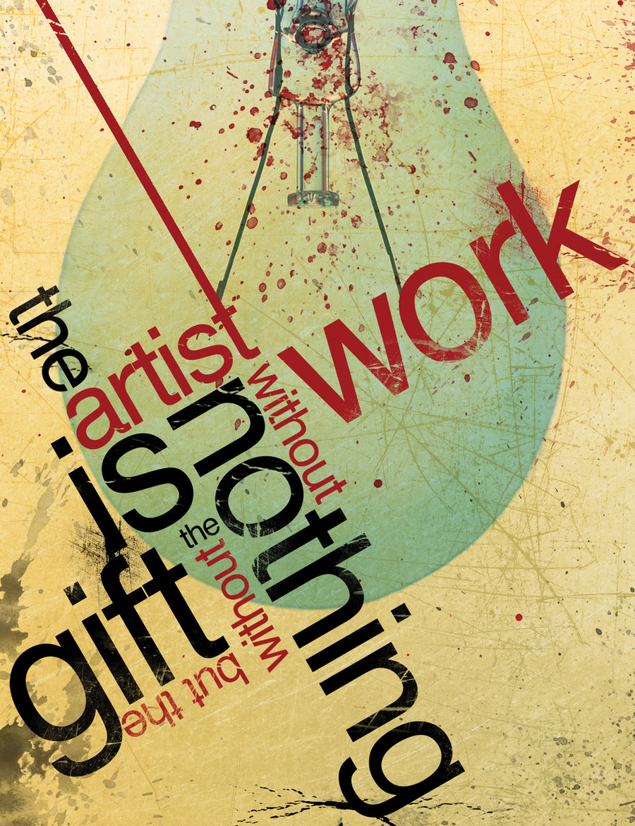
"Design is what you do when you don't yet know what you are doing"Comments and critiques are welcome! Enjoy!
")
Oh, this is not my quote by the way. I simply found it online
 (Smile)")
Related content


Comments: 165

Hi there! I've featured this work in a blog article here:
[link]
👍: 0 ⏩: 0


yes.. unplanned design..
and it works for me..
just play around and u will end up with great designs..
thumbs up!
👍: 0 ⏩: 0

i love this message, so I use it as my wallpaper, thanks u for sharing and hope u dont mind.
👍: 0 ⏩: 0

Pretty darn true!
Love the simple colour scheme. Its easy and adds to the flow of type on screen. The jaunty angle really adds something to it.
👍: 0 ⏩: 0


I used your photo here!!! [link] thanks!! I gave you all the credit!!!
👍: 0 ⏩: 0


Even this phrase is hard to understand
but very powerful for grahic designers.
i love it!!
👍: 0 ⏩: 0

Lol I like how the text hierarchy makes it easy to read! It's a very cool idea ^^ Though the statement it says is also not that true, at least in my opinion. For most, the design process has a certain flow. Each thing put into a project or job has to have a specific reason for being there.
👍: 0 ⏩: 0

this is greatly designed. it looks like it would be confusing to read but some how your eyes read the words it te order intended
👍: 0 ⏩: 0

DD Material all the way man.
I mean, this is what is disappearing: Simplicity! Everyone wants to create the most complex thing, and when they do, they don't like it too much, and go back to something simple and sketchy, yet it looks better!
👍: 0 ⏩: 0


Wooooaaahhh!thats really cool.. you have like inspired me
👍: 0 ⏩: 0

i really think you're mixing up design and art. design is much more intentional, because it's secondary to something else. and the picture is yours could be either one, depending on wh's the author of the quote.
👍: 0 ⏩: 1
oh, btw. the pic itself seems a little bit too simple. in this particular case I would add something else to it. + the bottom edge looks really cut off, draws too much attention.
yes, i always prefer to critisize. : )
👍: 0 ⏩: 0


I do my best drawing and stuff when I'm not really trying hard also.
Maybe it's because your expectations aren't as high when you don't plan, because you don't have this unattainable mental image in your head to begin with, you just go for it.
Does that make sense?
Anyway, love this!
👍: 0 ⏩: 0

Good typography = <3 I love the colors and how you made the spacing perfect and even.
👍: 0 ⏩: 0

excellent the handling of the Tipography woow>.

i should follow this quote more often... i try too hard to come up with something when it's easier to just 'go with the flow' of whatever comes to mind first, then 'tweek' it.
👍: 0 ⏩: 0


Aye, design starts as unplanned and wildly creative, yet a good design is also one that has thinking behind it; good thinking. Not just "oo that looks nice over there." I mean, it DOES look nice over there, which is why you put it there in the first place, but sometimes a design will need to convey something other than just good aesthetics.
But yeah I agree. Some of the best designs are guess and check, which is what's so great about computerised design programs. It's so easy to move elements around to try to get that 'feel' you're looking for.
Nice piece, I like it.
👍: 0 ⏩: 0


I believe in premeditated design, bit I just don't work like that too ")

👍: 0 ⏩: 0


HOOOOO TRUTHT !!!!!!!!!!!!!!!!! JAJAJA DESIGNER RULES"!!!!!!!!!1
👍: 0 ⏩: 0


A great piece of work but i have to disagree with the quote. my family says the same about abstract art but to understand the abstract qualities of form you have to have a greater understanding of naturalistic form.
I think that if you didn't know what you were doing you wouldn't have come up with a layout like this that flows so easily.
👍: 0 ⏩: 0


very nice and so true.
just a little fyi... unless you're posting a deviation at the exact size the file is, it will always come out off-colored. check out your download. its a completely different shade - which is very nice btw.
👍: 0 ⏩: 0


Amen to that!
Nice work in typography, composition and placement!
👍: 0 ⏩: 0

lol i like the message, it is the truth, good job on this piece
👍: 0 ⏩: 1

Much agreed. Definitely a great message. This statement applies to a large amount of my work
Thanks for commenting. I'm glad you could enjoy.
👍: 0 ⏩: 0

I appreciate the comment. Thank you very much for the support.
👍: 0 ⏩: 0

I like the way you put two different colors on the letters wich makes it far mor interesting ^^
👍: 0 ⏩: 1
I try to use 3 different colors in my designs now. (background, and 2 colors for the fonts) and it seems to make images far more compelling. I'm glad you could enjoy! Thank you for the support!
👍: 0 ⏩: 1

<= Prev | | Next =>