HOME | DD
 MrBadger —
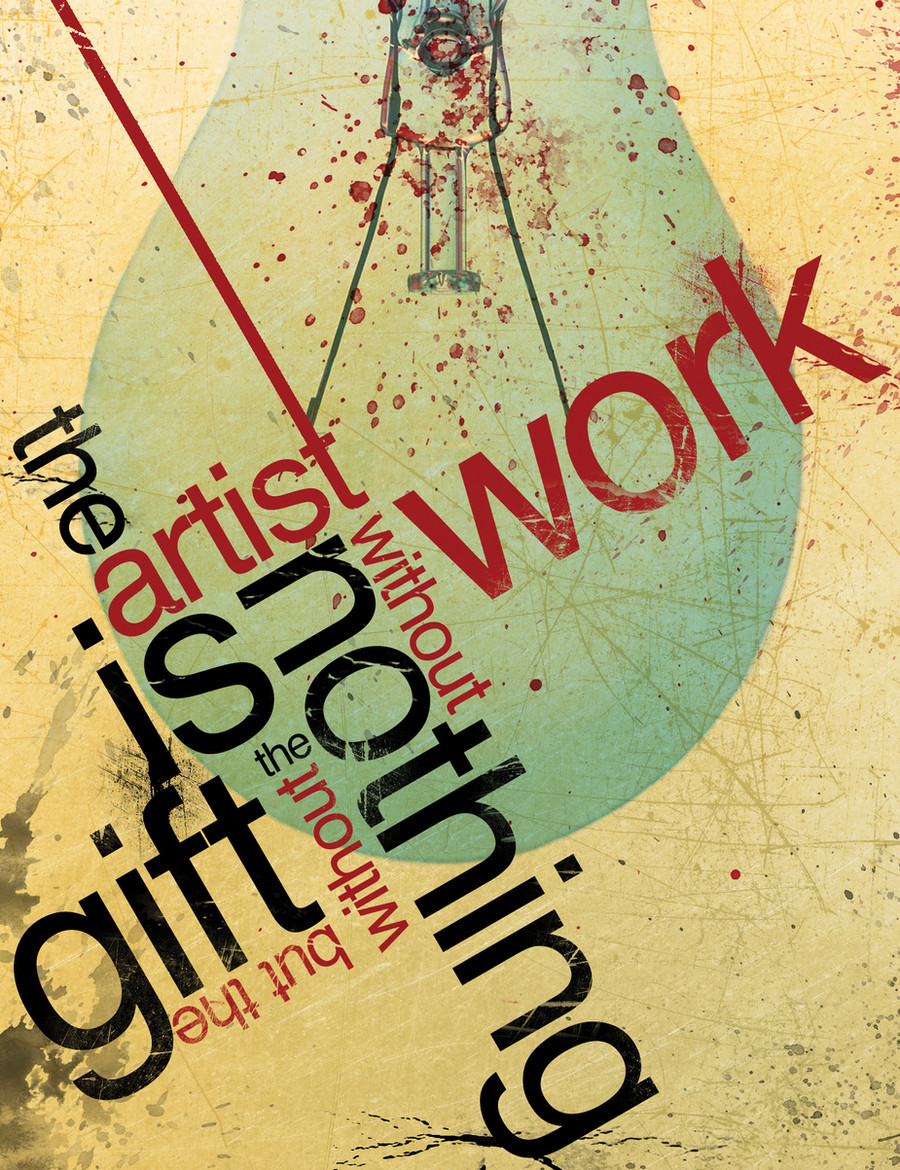
The Gift v2
by-nc-nd
MrBadger —
The Gift v2
by-nc-nd
Published: 2007-12-13 00:43:50 +0000 UTC; Views: 122944; Favourites: 1787; Downloads: 7456
Redirect to original
Description
This is just another version of my deviation "The Gift".The artist is nothing without the gift but the gift is nothing without work
The light bulb was added by me because of the thought process involved with creating this piece.
My friend was saying how hard it was to create digital works because he has no idea how to and described creating these works as a talent or "gift", and thus, putting the idea in my head for this design.
Light bulb=idea popping into head.
Please note, I understand that you cannot read the quote instantly, or maybe at all for that matter, as this was not intended. The overall composition was the key here, and also the open interpretation of the piece itself. For instance, you may be able to pull multiple phrases from within the contents of the design and also play a little guessing game if you did not know what the original quote was. It's meant to be fun, not to stress you out!
 (Wink)")
Let me know what you all think!
 (Smile)")
Related content


Comments: 163

Your work is amazing..Super love the style..Is this available for purchase or it is for free? Thanks.
👍: 0 ⏩: 0


I read it perfectly the first time- I think it's brilliant! Is this design available for purchase?
👍: 0 ⏩: 0

Wow [as u can see i pretty like most of ur work = = i cant stop commenting xD]
👍: 0 ⏩: 0


JUst because it 'looks good' this cannot be passed off as a good design... Its a ridiculously poor design. What is the point of it if we cant read it properly? You need to spend more time on it and make it legible!!
👍: 0 ⏩: 1

Didn't say it "looks good" anywhere. Was just having fun a few years ago
👍: 0 ⏩: 0

If i had not read your description, i would've been completely lost. The two colors especially confused me, because after failing to read it the first time, I tried reading one color at a time, which obviously doesn't work. I can read "The artist is nothing" completely fine, but after that my eyes go directly to the "without" on top instead of the one on the bottom like you wanted. I do like the colors, textures, layout, graphic elements and the layout of the type itself, but I just don't think it works in trying to get its message across.
👍: 0 ⏩: 0

The dulled colours actually give a nice feel to this piece. Very nice design!
👍: 0 ⏩: 0

I love the colors, but I don't think the layout is working with the type and legibility. I read it as, "the artist is nothing without work, the without but the gift" that area is hard to read because the view have to turn their heads way too much you've got text facing the left, right, and upside down. Its visually interesting but very hard to read.
👍: 0 ⏩: 0

i really like this and am trying to figure out how to make stuff like this - do you have a good tutorial i can learn from?
👍: 0 ⏩: 0

like the whole artwork and the quote ! (: keep it up!
👍: 0 ⏩: 0


👍: 0 ⏩: 0

")

i love it!! how did you do that?? the letter "t" thing, nice! any tutorial??
👍: 0 ⏩: 0

Did you use photoshop?? Cuz, those are mad skills
")
👍: 0 ⏩: 0


i love it, it kind of just sums artists on a whole. i have just done my art exam an im so proud all my class mates keep telling me how gifted i am. i feel so lucky. with out my art i really am nothing i get grumpy an sad. so i think its brill an would you mind if i borrow the words to create a triditional peice i will link it to you. i have a light bulb now thanks xxxxx
👍: 0 ⏩: 0

Hello!
Do you have a tutorial teaching how to do it? Well done!
👍: 0 ⏩: 0

I really like this.
What program do you use to create these?
👍: 0 ⏩: 0

mazing... simply put to its own vice and to its own verse. great job bravo
👍: 0 ⏩: 0

Absolutely LOVING the design. I think I might buy a print of this!
👍: 0 ⏩: 0

It's not only the concept which I absolutely agree... it's the design! Preety good work
👍: 0 ⏩: 0


Very true and very deep...I'll add another one.
The work is nothing without the love.
👍: 0 ⏩: 0


Not only wise but really clever!
Congratulations to the DD 
👍: 0 ⏩: 0

This is rather hard to read - I wouldn't have known what order the words were to go in had I not read the transcription in your note there - but I like the design! It's postmodern in an interesting and raw way.
👍: 0 ⏩: 0


I had a tough time recognizing the order of the text but once I got it it was cool
")
👍: 0 ⏩: 0

People have commented that the arrangement is confusing, but that's actually what I liked about this piece. The fact that it can be read several different ways, and they all lead in a circle illustrated the connected nature of creation. One comment in particular struck me, about the ADD audience who will move on without grasping the message...haha, I think it's my lovely ADD brain that allowed me to see the entire thing at once as a united concept...
👍: 0 ⏩: 0


=what she wrote
the composition is pretty cool.. but the reading direction is bad and too confusing... the words lead the eyes to no where...you can build many confusing sentences here.. all contradicting each other... the color are very nice.. but the message is still half way
👍: 0 ⏩: 0

this reminds off those adverts you see on the hallmark channel for monk and house :>
👍: 0 ⏩: 0


It looks nice, but I had no idea what it said without reading the comment. I think this would be a more powerful piece if the words were arranged in a slightly more readable way.
👍: 0 ⏩: 1
=what she wrote
the composition is pretty cool.. but the reading direction is bad and too confusing... the words lead the eyes to no where...you can build many confusing sentences here.. all contradicting each other... the color are very nice.. but the message is still half way
👍: 0 ⏩: 0

this is rlly cool it caught my eye on daily deviantion haha(:
👍: 0 ⏩: 0


I love the way it's supposed to be read it's like a maze<3 I love it, btw.
👍: 0 ⏩: 0

Great job, love the dinamic and the use of typography!
Congrats!
👍: 0 ⏩: 0

Amazing... simply put to its own vice and to its own verse. great job bravo
👍: 0 ⏩: 0

Im doing type 1 at uni at the mo and this is very amazing and makes me want to go do some work lol
👍: 0 ⏩: 0
| Next =>