HOME | DD
 MrBadger —
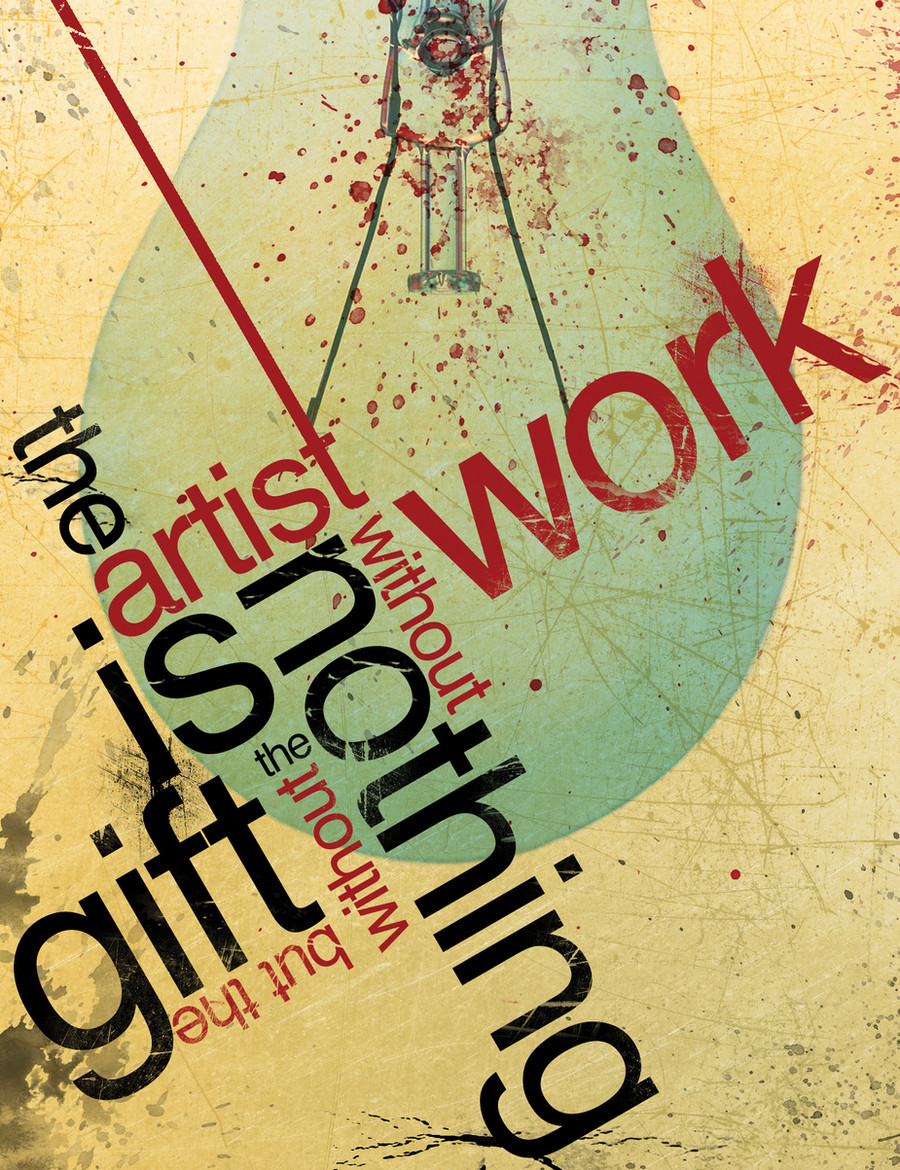
The Gift v2
by-nc-nd
MrBadger —
The Gift v2
by-nc-nd
Published: 2007-12-13 00:43:50 +0000 UTC; Views: 122946; Favourites: 1787; Downloads: 7456
Redirect to original
Description
This is just another version of my deviation "The Gift".The artist is nothing without the gift but the gift is nothing without work
The light bulb was added by me because of the thought process involved with creating this piece.
My friend was saying how hard it was to create digital works because he has no idea how to and described creating these works as a talent or "gift", and thus, putting the idea in my head for this design.
Light bulb=idea popping into head.
Please note, I understand that you cannot read the quote instantly, or maybe at all for that matter, as this was not intended. The overall composition was the key here, and also the open interpretation of the piece itself. For instance, you may be able to pull multiple phrases from within the contents of the design and also play a little guessing game if you did not know what the original quote was. It's meant to be fun, not to stress you out!
 (Wink)")
Let me know what you all think!
 (Smile)")
Related content


Comments: 163


It couldn't understand which way to read it for a while...then I read the description and I was enlightened :3
This is really inspiring, actually ^^ I'd like to show this to my friends sometime...to make them stop feeling ignorant and talentless when they see me draw my simple cartoons...
👍: 0 ⏩: 0

So true and blindingly obvious, yet a message that many people overlook.
👍: 0 ⏩: 0


")


This was a tricky one for me to figure out, but I love it 

👍: 0 ⏩: 0


it is eye catching and elegant, the rough part of the image gives a special touch to the general design! congrats!
thanks for visiting my gallery on deviant [link]
don't forget to leave a comment
👍: 0 ⏩: 0

This has got to be one of the best messages I`ve read in DA!!! And really, I love the presentation, texture and overall effect!!!

👍: 0 ⏩: 0

I really like the arrangement you have here; the composition is really interesting. As for the word choice, it really is a nice confidence booster for those who need it.
👍: 0 ⏩: 0

Amazing. Apparently I need to push myself harder on the typography front. I'd love to be able to do stuff like this.
Are they your own words?

👍: 0 ⏩: 0

hey there.
I've featured this here: [link]
I hope you don't mind.~
~Redeemer-of-light
👍: 0 ⏩: 0

Wow, that's actually really cool to read the whole sentence. Nice work, I turned my head upside down multiple times!
👍: 0 ⏩: 0

nice design and colors, however the organization of the words could've been better. I found, without knowing what its supposed to say, its nearly impossible to dissect it. Reading the sentence in the description, then looking back, you send the readers eyes darting all over the work in no logical order or pattern.
It looks awesome, but its really hard to read
👍: 0 ⏩: 0

not bad, good composition, size contrast, texture but it looses some of it's readability
👍: 0 ⏩: 0

Wow it is amazing. I personally love typography art. One question, how did you make the background look dirty? Do you have some sort of picture that you start out with, or what. Because I would really like to be able to do the same thing but I dont know any good way of doing it.
And how do you create the effect of "destroying" the typo? Im reffering to the "cutts" that goes through the letters.
👍: 0 ⏩: 0

I love this, might actually have to buy it! Well done
👍: 0 ⏩: 0


I actually like the dulled down colors.
It works for this one.
This really struck me, I like it very much!
👍: 0 ⏩: 0


Yeah this is really awesome!
Love the blue in the bulb - really .balances the whole image
It takes a while to figure out the phrase though. I didn't get it until I read the description. Great work nonetheless!
👍: 0 ⏩: 0


looks nice but readability is a bit off... I mean turning back and rereading is something not many people would think of. I couldn't personally understand it.
otherwise i feel the bulb colour is a bit wrong.. maybe it needs to be darker? or redder?
anyway, great job
👍: 0 ⏩: 0


awesome job. i love the message; though i bit confusing to read.
(: 
👍: 0 ⏩: 1

I think it works better than the first version. Nicely done.
👍: 0 ⏩: 1

Again, beautiful! I love the way you stacked the text on each other, creating a composition within itself.
👍: 0 ⏩: 1

I appreciate your words. Always glad to know that a design is appealing!
👍: 0 ⏩: 0


I like the rough effects on the background and the way the typography is laid out. Good work.
👍: 0 ⏩: 1
Thank you very much for the feedback. I really appreciate it!
👍: 0 ⏩: 0

really good arrangement of typo....like it a lot...and like the phrase too...good work!!
👍: 0 ⏩: 1
thank you very much. I really appreciate the feedback!
👍: 0 ⏩: 0


very intersting work
👍: 0 ⏩: 1
Thank you! The quote itself I did not create, but the entire piece is my own creation.
👍: 0 ⏩: 0

I personally make is my business to try and have some sort of a message involved in my art. I think each piece needs to have a script and soundtrack.
you've done a good job implementing that here. good job
👍: 0 ⏩: 1
Much agreed. A concept and message is always needed somewhere, whether it be simple things or not, it is a necessity.
Thank you for the compliment.
👍: 0 ⏩: 1
<= Prev | | Next =>