HOME | DD
 MrBadger —
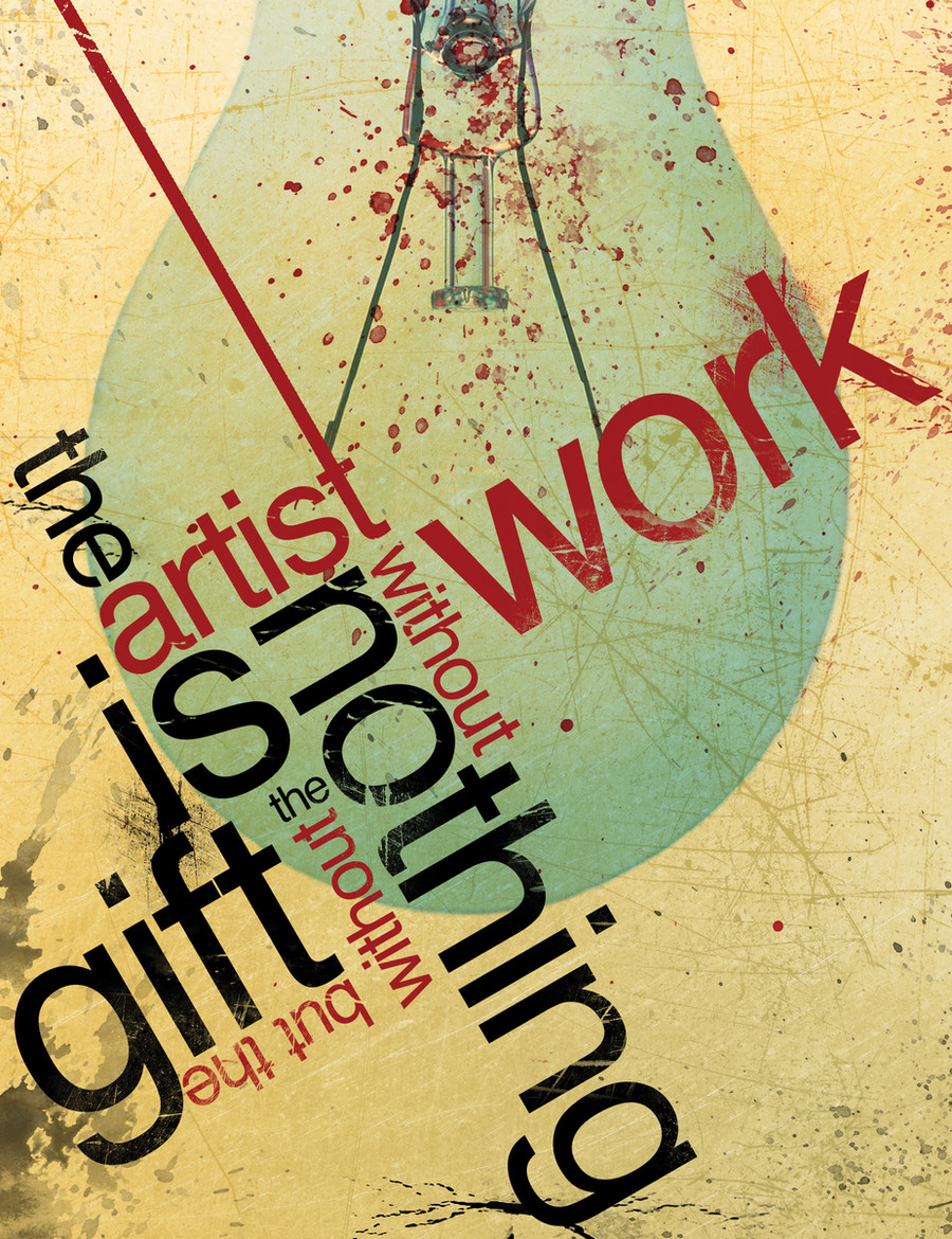
The Gift v2
by-nc-nd
MrBadger —
The Gift v2
by-nc-nd
Published: 2007-12-13 00:43:50 +0000 UTC; Views: 122947; Favourites: 1787; Downloads: 7456
Redirect to original
Description
This is just another version of my deviation "The Gift".The artist is nothing without the gift but the gift is nothing without work
The light bulb was added by me because of the thought process involved with creating this piece.
My friend was saying how hard it was to create digital works because he has no idea how to and described creating these works as a talent or "gift", and thus, putting the idea in my head for this design.
Light bulb=idea popping into head.
Please note, I understand that you cannot read the quote instantly, or maybe at all for that matter, as this was not intended. The overall composition was the key here, and also the open interpretation of the piece itself. For instance, you may be able to pull multiple phrases from within the contents of the design and also play a little guessing game if you did not know what the original quote was. It's meant to be fun, not to stress you out!
 (Wink)")
Let me know what you all think!
 (Smile)")
Related content


Comments: 163


i really like the way this looks!..the colors, textures, and the way the typography was handled technically, is really nice...
though, i don't think i would've understood what it was supposed to say right away, if you hadn't included the quote in the artist's comments

👍: 0 ⏩: 0

Very beautiful in its own sense and style, the message speaks louder than anything!
👍: 0 ⏩: 0

So true. Wonderfully said, but on its own, it isn't entirely clear that you re-read some of text, so that makes it a little difficult to understand without reading your comment. But it's still really nicely done.
👍: 0 ⏩: 0


best typography ive seen in a looooooong time! great work
👍: 0 ⏩: 0
best typography ive seen in a looooooong time! great work
👍: 0 ⏩: 0


soooo good. thank u so much for this words. i think say just came in time to remember me what i have to do if i wanna go somewhere. thank u!!!!!!!!!!
👍: 0 ⏩: 0

perfect my eyes were lead directly into the order you wanted to say. And its that movement that gives this piece its energy. EXCELLENT.
👍: 0 ⏩: 0

I likes very much ^^
The thing that you wrote is very very touching and completely true. I think that the light bulb was really clever. ^^
~葉
👍: 0 ⏩: 0

Hey Mr.Badger,
This is really a beautiful design. Nice movement and use of space. The line from the entry point on the upper left takes me right to the text and the circular arrangement of type keeps me moving around and around in the design. The texture helps to unify the design and the primary colors are manipulated enough so that they don't compete as much as they work well together. The text is a little hard to follow. I can see where you are using color and scale to place emphasis on certain words but I'm lost when I try to read the message. Overall I can understand what you are trying to say, but I can't really read it. That may not be a bad thing, I think you will encounter two different audiences, the ones who will be intrigued by the mystery and stick around to grasp your meaning and the A.D.D. audience who will move on before they grasp what you are saying. Nice work.
👍: 0 ⏩: 0


I love how Half of all these DDs are all from years ago and aren't recognized till now, when the Artist probably improved by a lot by then.
👍: 0 ⏩: 0
Hints of Russian Constructivist posters...nice job. I like the muted colors. Gives it a vintage feel.
👍: 0 ⏩: 0


hehe, it's accurate and amazing, extra points xD
👍: 0 ⏩: 0

I think it's a little difficult to read, but when I read the description, it straightened things out.
This is a very cool piece. ^-^
👍: 0 ⏩: 0

Wow ..
good work
I like this design so much
Keep it up !!
👍: 0 ⏩: 0

i love your digital art of gift is very good ")
👍: 0 ⏩: 0


Wonderful work, i love the colors as they appear here, and the textures and the positioning of the words. i did have to read what you said it said before i got it though ")


👍: 0 ⏩: 0


em... i can not read it Oo
i thought that it should be "frtist work without gift, but..."
👍: 0 ⏩: 0


Brilliant! It's a well deserved DD indeed.
I always wanted to see an example of good typography with a simple yet dynamic composition and again simple but highly thoughtful message in it. and I'm so so so glad I got to see it finally!
👍: 0 ⏩: 0


Love this. Well-done and has a great message.
Congrats on the DD!
👍: 0 ⏩: 0

I think this is very well done and interesting... really caught my eye. Congrats on such a great piece.
👍: 0 ⏩: 0

it was the first thing to draw my eye in the DD. really neat colours and stuff! it ws kinda hard to read, but its still cool!
👍: 0 ⏩: 0

I agree the Lightbulb's a really nice touch compared to the first version, and I don't know about you but I'm digging the faded colors a lot. Though I wouldn't mind seeing the more "vivid" version.
Good Stuff dude.
👍: 0 ⏩: 0

Great balance on the type!
I wouden't worry about the dulled out colours....I love them as is.
👍: 0 ⏩: 0

Ok... This is pretty f*ing cool!
Great colors and love the design
👍: 0 ⏩: 0

First thing I clicked when I see the DDs today. 
Great quote, concept, and brilliant typography. Although, if you haven't say the quote in your Artist comment section, I wouldn't have guessed what you have written there. I don't know where to start reading actually..

👍: 0 ⏩: 0


really nice composition! looks really nice and the message is awesome. couldn't agree with it more. however, for me at least, i find it hard to follow the words and complete the sentence by the way you've organized it. it involves going back and forth, which i'm not used to doing while reading. now that could just be me, and that might be something you aren't even concerned about. (i actually like the way it's laid out aesthetically, but its just hard to read that way.)
in any case, i was drawn to the piece because it looked so nice, and then i found out the message which made me like it even more.
overall, a really nice piece here. good work!
👍: 0 ⏩: 0

Nice typography! It kind of took me a moment to figure out what it said because it kind of wraps around the paper, but that doesn't matter, and that makes the art better in my opinion anyway since it's probably supposed to look like that! I did kind of look funny tilting my head to see what it said.
Anyway, nice work! ^_^
👍: 0 ⏩: 0


very nice
like the bauhaus feel to it
but i think the colours look perfect dulled, gives it a darker and grittier look
👍: 0 ⏩: 0

love it-land love the subtle bauhaus tribute too
👍: 0 ⏩: 0
| Next =>